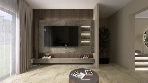
Throughout my career as a designer, I've witnessed living room color trends evolve from striking jewel tones to serene neutrals. Currently, the focus is on warm, earthy tones and soothing colors inspired by nature. In my experience, even a small living room can unleash significant creativity—sometimes a fresh coat of paint can entirely transform the atmosphere. In this article, I'll share ten exciting paint color ideas for your living room, combining my personal insights with established trends to inspire your next renovation using Homestyler.
Soft Greige Warmth
My Perspective: Greige has consistently been my top choice for clients seeking a sophisticated yet welcoming ambiance. I applied it in a compact apartment where light was limited, creating a cozy and seamless backdrop.
Advantages: It works wonderfully in both traditional and contemporary spaces. Greige enhances layered lighting and complements natural materials like linen and wood effectively.
Disadvantages: Without added texture, it can appear flat—incorporating a textured rug or wall art can remedy this.
Tip: Combine it with wooden accents to add warmth and dimension.
Moody Navy Depth
My Insight: Applying navy to an accent wall instantly grounded my client’s narrow living area, giving it a more defined and anchored feel, all while bringing a touch of drama without overwhelming the space.
Benefits: Ideal for emphasizing built-ins or fireplaces and serves as a striking backdrop for metallic decor and lighter upholstery.
Drawbacks: When applied to all walls without careful lighting, it can make smaller rooms feel even more confined.
Sun-Kissed Terracotta
My Insight: Following a trip to Tuscany, I introduced terracotta into a client’s bohemian living space. The outcome? A warm, inviting atmosphere that made evenings reminiscent of sunset gatherings.
Benefits: Introduces an earthy vibe and boosts the aesthetic of indoor plants. Terracotta pairs beautifully with woven textures and ceramic decor.
Drawbacks: If not balanced with area rugs, it may clash with cooler flooring tones.
Muted Sage Green
My Insight: Sage green establishes an immediate connection to nature, which aligns with color psychology research from the Pantone Color Institute. I’ve found it effective in calming lively households.
Benefits: It embodies a restful and timeless quality, making it excellent for Scandinavian or rustic designs.
Drawbacks: Needs the right lighting to prevent appearing dull in dimly lit spaces.
Case Study: It pairs seamlessly with rattan furniture for a cohesive, organic appearance.
Classic Crisp White
My Perspective: White remains a cornerstone for a valid reason. In a recent open-concept loft project, it dramatically increased the visual square footage.
Advantages: Brightens small spaces immensely and works with nearly any accent color.
Disadvantages: Can feel sterile if not complemented with textiles, plants, or artwork.
Charcoal Grey Elegance
My Take: The dark grey living room I designed for an urban bachelor emanated elegance. This color fostered an intimate environment suitable for evening gatherings.
Advantages: Adds a level of sophistication and depth, and is versatile with both warm and cool accents.
Disadvantages: Requires sufficient natural or artificial lighting to avoid a gloomy ambience.
Design Tip: Combining it with brushed brass fixtures can create an upscale contrast.
Soft Blush Comfort
My Reflection: I had my reservations about pink until I observed how a muted blush infused warmth into a minimalist living room. It’s both subtle and rich.
Advantages: Fosters a cozy environment without feeling juvenile. It pairs wonderfully with grey and cream.
Disadvantages: Under strong yellow lighting, it may appear too warm.
Warm Mustard Accent
My Insight: Applying mustard on a single wall introduced a vibrant personality to a retro-themed living area I recently completed, reflecting light differently throughout the day.
Advantages: Energizing and pairs well with mid-century furnishings, making it perfect for eclectic and creative interiors.
Disadvantages: Overdoing it may dominate the space, so balancing with neutrals is key.
Coastal Light Blue
My Feedback: A soft blue refresh I assisted with instantly uplifted the atmosphere, with clients expressing it felt like breathing in the fresh sea air at home.
Advantages: Visually expands the space and pairs excellently with white trim and natural fibers.
Disadvantages: May appear washed out in overly bright rooms without deeper accent colors.
Deep Forest Green
My Experience: I once painted all four walls of a library-style living room in this shade. It felt luxurious, enveloping, and rich.
Advantages: Exudes sophistication and pairs effectively with darker woods, leather, and brass.
Disadvantages: Requires confident styling and proper lighting to avoid an overly heavy appearance.
Tip: Think about harmonizing dark green with walnut shelving to create coherence across different areas.
Conclusion
These ten paint color ideas demonstrate that selecting colors for your living room is less about adhering to strict rules and more about storytelling. A small living room offers an opportunity for smart, intentional design rather than constraints. As noted by Elle Decor, while color trends change, the right hue will always express your unique personality. Which of these color inspirations are you eager to experiment with first?
FAQ
1. What are the popular paint colors for living rooms in 2024?
According to the Pantone Color Institute, warm earthy hues, muted greens, and rich blues are currently trending.
2. How do I select the appropriate paint color for my living room?
Consider factors like lighting, furniture shades, and the atmosphere you wish to create. Testing swatches on various walls is recommended.
3. Does dark paint contribute to smaller-looking living rooms?
It can, but with layered lighting and thoughtful decor, dark colors can create a cozy feel instead of a cramped one.
4. Is white still a viable option for living rooms?
Definitely; it remains a timeless choice that complements almost any style and accent colors.
5. What colors can make a living room feel warmer?
Warm neutrals, terracotta, mustard, and deep greens bring warmth and intimacy.
6. Is it okay to use multiple colors in a living room?
Absolutely, combining an accent hue with a primary neutral can add depth and visual interest.
7. How does lighting impact paint colors?
Both natural and artificial light can significantly change color perception; it's essential to view samples under both types of lighting.
8. What’s the most cost-effective way to refresh a living room?
Painting an accent wall or updating decor elements are budget-friendly approaches—using tools like Homestyler can aid in visualizing changes before making decisions.
Homestyler is your go-to online home design platform, perfect for anyone looking to bring their vision to life. With an easy-to-use design tool, stunning 3D renderings, and a wealth of inspiring DIY video tutorials, transforming your space has never been easier or more enjoyable!