
 50 designs
15 Designs · 0 Likes
DESIGNED WITH
Homestyler Floor Planner for Web
New York Apartment
This is a [not very good] New York Apartment.I'm okay at designing and I've made loads of houses but this is the first I've rendered and added to public so it's not that great as I haven't got the hang of it yet.
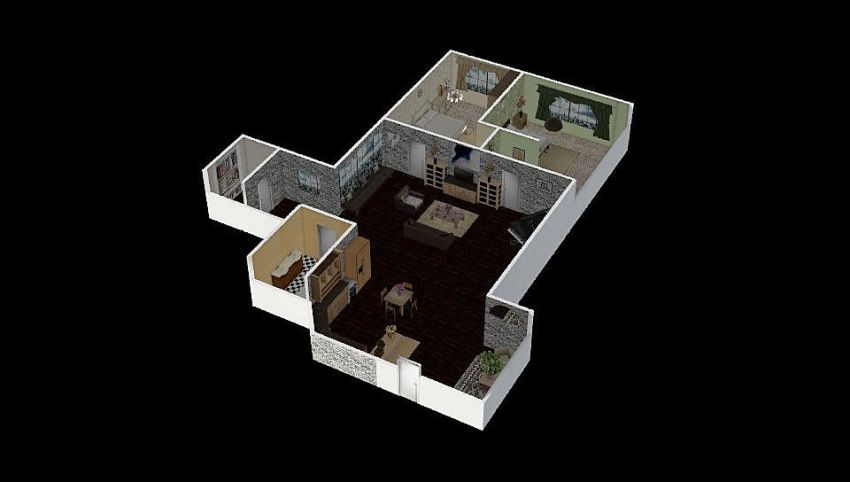
Floor Plan 207.53㎡

web
Space Showcase 8 Renders
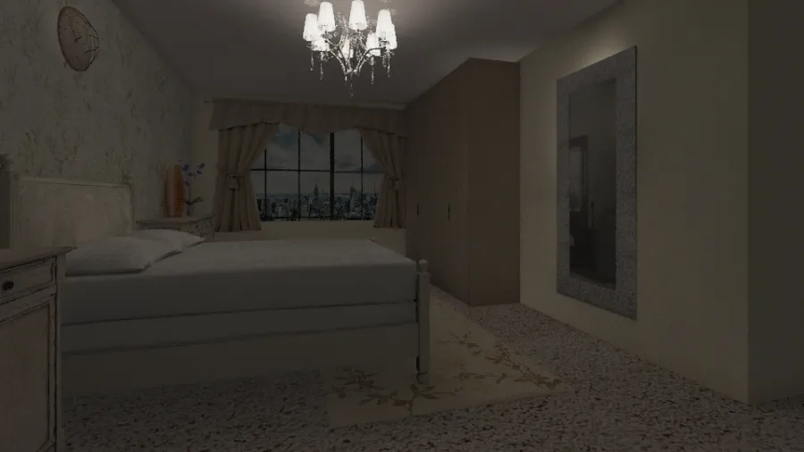
This is the first bedroom. It looks okay whilst actually editing the design (it's too fancy though) but on here the lighting is appalling.
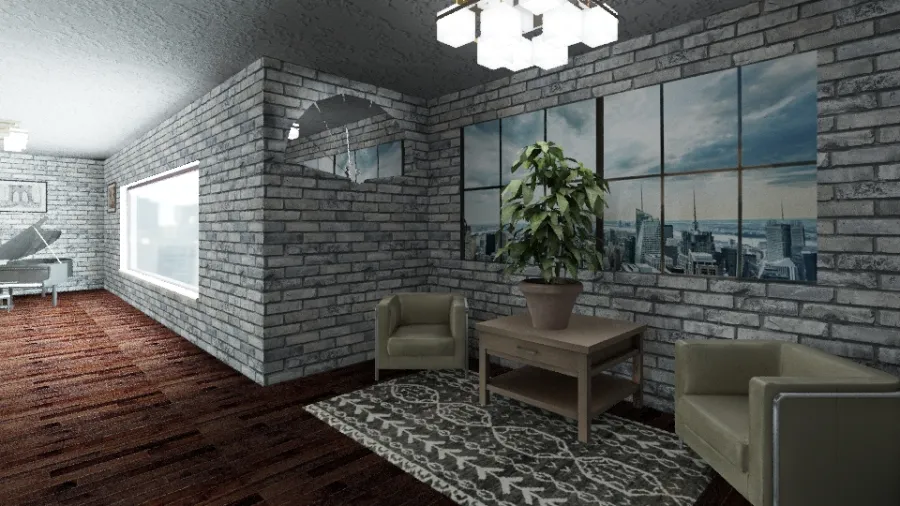
This is the entryway. It includes some nice looking furniture and looks okay when I'm editing but it's all rather ugly in the photos.
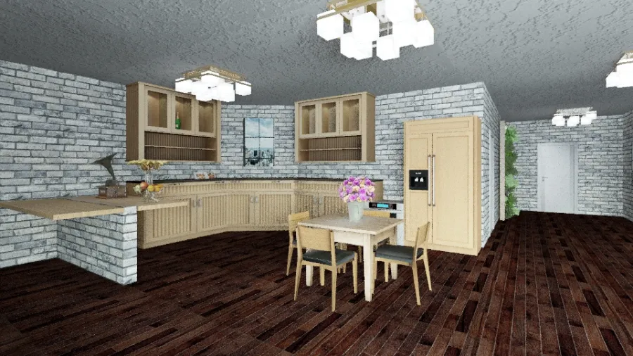
This is the kitchen/dining room. I liked the colours of all appliances but it doesn't really go with the grey walls.
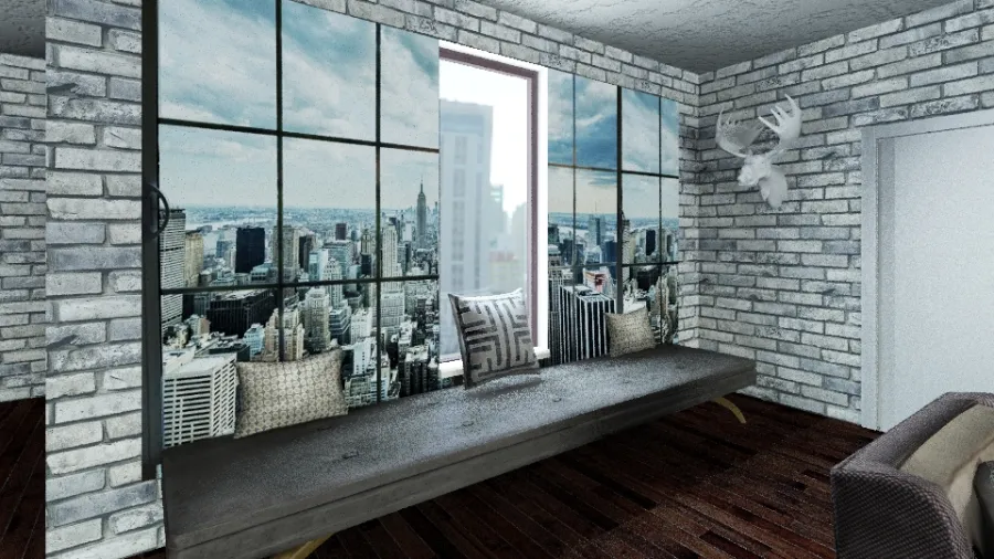
This is a little lookout bench. I HATE THIS!! It looked fine until i needed to have more light in the room for (ish) okay photos and now it looks a mess so just imagine it without the window in the middle. :(
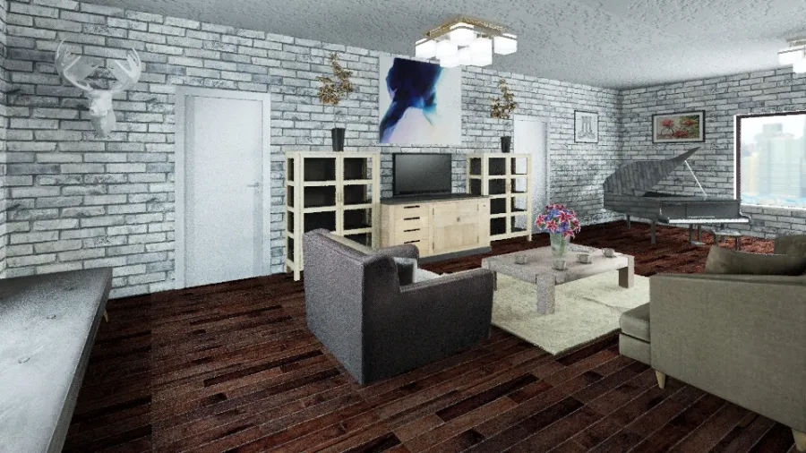
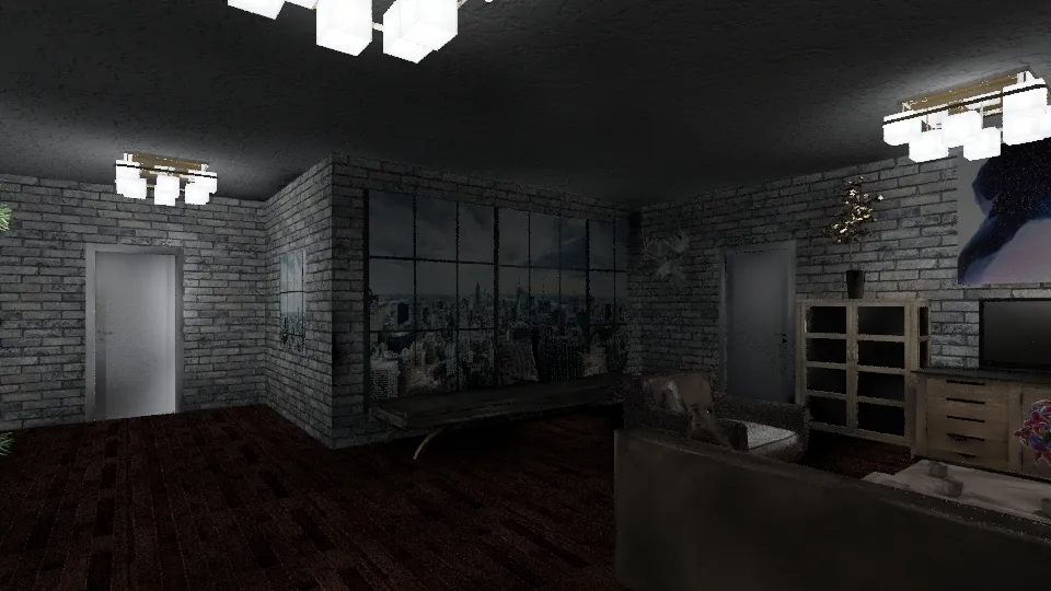
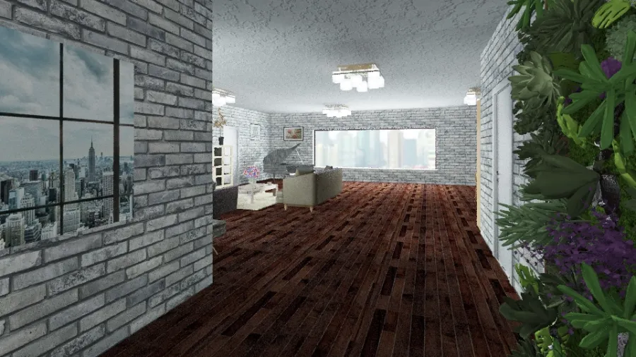
This is the living area, i sort of like this, but the window at the far end isn't supposed to be there, it's just to let in light and instead there would be another NYC image.
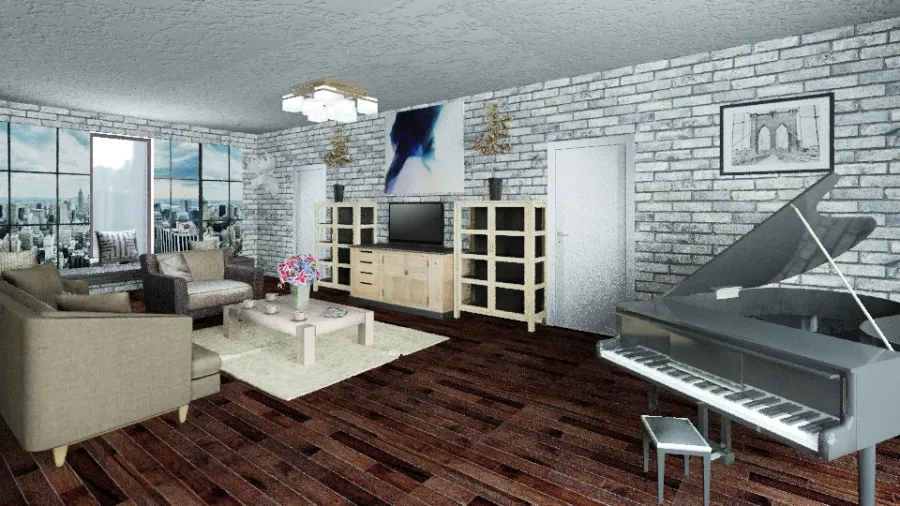
View of the living area.
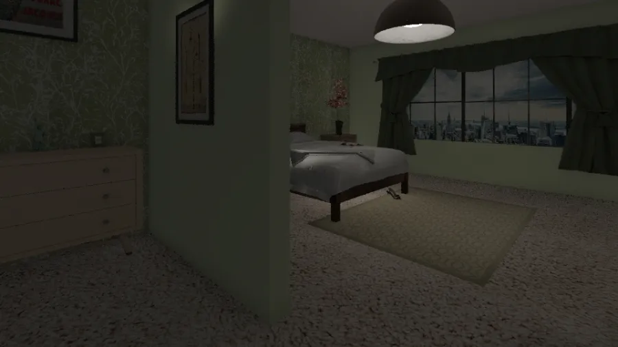
This is the second bedroom. The lighting is terrible in here because I liked to keep the window looking onto a gorgeous view of New York City. I don't like the colours or the design in this room.
This home design project - New York Apartment was published on 2019-03-23 and was 100% designed by Homestyler floor planner, which includes 8 high quality photorealistic rendered images.
0
0
497
Updated:2019-03-23


Comments