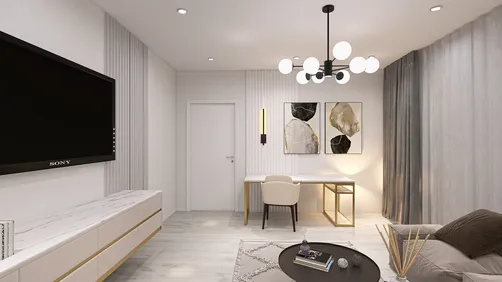
I view the ceiling as the understated hero of a room. A carefully designed plaster ceiling can enhance proportions, control lighting, conceal services, and establish an elegant ambiance without visual clutter. In living areas, I utilize plaster not merely as a surface, but as a sophisticated instrument that influences light, sound, and the overall feel of space. The utilization of design tools such as Homestyler can help visualize these concepts effectively.
Prioritizing performance is essential. The WELL v2 framework suggests sustaining a comfortable ambient light level while alleviating glare, emphasizing lighting strategies that align with circadian rhythms for improved brightness and comfort. Research from Gensler highlights that a vast 90% of workers consider access to natural light as the top amenity at their workplace—a finding that seamlessly translates into enhancing residential comfort and spaciousness. By aligning ceiling designs with these guidelines, I ensure a bright, soothing, and intentional outcome. For additional insights, refer to the WELL v2 Light documentation and the Gensler Research Institute studies.
The influence of color psychology is often understated. According to Verywell Mind, light cool shades can enhance spatial perception and offer tranquility, whereas warmer whites project a welcoming vibe but might reduce perceived height slightly. In practice, I maintain ceiling finishes in a matte or ultra-matte off-white (LRV 80–90) to optimize light reflection and diminish glare, following basic IES recommendations for effective luminance.
Design Principles for Plaster Ceilings
• Proportion and rhythm: I ensure plaster reveals and coffers are aligned with key furniture placements and window configurations. A narrow living room benefits from elongated recesses that extend perspective, whereas a broad square room typically requires a centered design with a slender perimeter trough to create balance.
• Light as structure: I incorporate indirect LED coves at temperatures of 2700–3000K for a warm ambiance during evenings, along with 3500K task lighting near reading areas. Dimming capabilities from 1–10V or DALI facilitate circadian-friendly transitions as suggested by WELL v2 Light principles.
• Glare control: Matte plaster finishes and recessed optics help maintain a low UGR. I prefer downlights that are deep-set with 35° cutoffs to ensure visual comfort.
• Acoustic comfort: While smooth plaster tends to reflect sound, I counterbalance this with micro-perforated gypsum panels in select areas or by combining the ceiling design with soft textiles and area rugs to achieve the desired reverberation time in typical living spaces.
Plaster Ceiling Typologies That Work
• Perimeter cove ceiling: A delicate 3–5 inch drop along the room's edge establishes a floating plane for indirect illumination. This design visually elevates the center of the area while concealing curtain tracks or wiring.
• Coffered plaster grid: Shallow 2–3 inch coffers introduce a sense of rhythm, lessen the visual impact in tall rooms, and create areas suitable for concentrated accent lighting. It is crucial to align coffers with principal furniture arrangements to minimize visual disorder.
• Integrated beam-and-plaster hybrid: For homes featuring structural beams, I envelop them in plaster and carve slim reveals between bays to conceal track or linear grazers. This method preserves the architectural character while creating a refined lighting canopy.
• Central recessed tray: This design is perfect for rooms centered around chandeliers. The tray creates depth for wiring and driver storage, while a gentle cove perimeter provides ambient light to soften harsh shadows cast by decorative fixtures.
Planning the Layout and Services
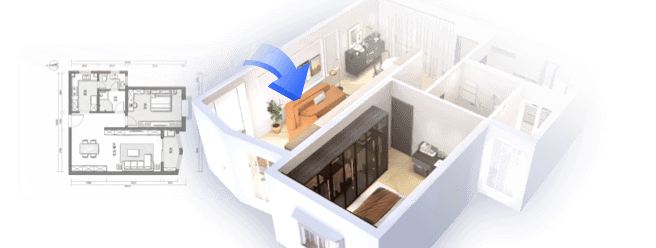
Before creating coves, I outline the placement of HVAC diffusers, speakers, sprinklers, and access panels. Grouping these services along a straightforward axis lessens visual disturbance. If you’re evaluating seating arrangements, TV perspectives, and traffic flow prior to finalizing your lighting plan, utilizing a room layout tool is invaluable for simulating various zones, soffit depths, and fixture sightlines, making use of visual tools like Homestyler can enhance this process.
Light Layers and Specifications
• Ambient: Indirect coves with LED strips rated at 8–12 W/ft, preferably in the 2700–3000K spectrum, CRI 90+, and R9≥50 to accurately render natural skin tones. Ensuring even luminance is crucial; employing diffusers prevents diode imaging.
• Task: Deep-set downlights above reading chairs or console surfaces should produce 800–1200 lumens each, with beam spreads of 30–40°. Dimming down to 1% allows for smooth transitions between day and night settings.
• Accent: Wall washers or small spotlights to highlight artwork should maintain a 3:1 contrast ratio for focal points without causing glare spikes. Considering adjustable snoots can assist in refining angles effectively.
• Decorative: Pendants or chandeliers should be prominently hung within a tray or coffer center, adequately balanced with ambient illumination to eliminate harsh transitional edges.
Material Choices and Finishes
For a subtly elegant appearance, I opt for a level-5 gypsum finish or polished lime plaster for the prominent surface, using more robust gypsum board for drops and coves. In humid environments, moisture-resistant boards and careful vapor consideration prevent unsightly cracking. Utilize flexible compounds and tape at joint areas to accommodate minor movements. The finish sheen remains matte to keep glare in check; I only employ eggshell for accent bands where cleanliness is paramount.
Color Psychology and Perceived Height
For ceilings below 8 feet, cooler off-whites (those with a hint of blue or gray undertones) help the space feel larger. In contrast, taller spaces can accommodate warmer off-whites or soft sand tones to evoke a sense of closeness. Guidance from Verywell Mind backs the use of cooler tones to amplify spaciousness and warmer tones for comfort; I adjust the final paint choice based on available light—northern light can support warmer shades, while strong western sunlight pairs well with neutral or slightly cooler bases.
Acoustic Comfort in Hard-Finish Rooms
Plaster ceilings can be refined without sacrificing sophistication. I often incorporate micro-perforated plaster panels within coffers, backed with black acoustic fleece, then painted to match. This is complemented by heavy drapery, cushioned seating, and thick rugs to achieve a desirable living-room reverberation time (RT60) in the range of 0.4–0.6 seconds, tailored to the room’s volume.
Common Proportions and Detailing
• Cove depth: 3–5 inches is standard for living rooms; deeper coves should be reserved for larger or taller spaces to avoid a heavy feel.
• Reveal width: A shadow gap of 1/2–3/4 inch provides a clean separation of planes and helps manage hairline cracks effectively.
• Fixture spacing: Downlights should typically be spaced 4–6 ft apart for uniform ambient light distribution; maintaining symmetry with major axes and art walls ensures a balanced look.
• Access: Plan unobtrusive hatches near driver clusters; avoid placing essential controls in hard-to-reach recessed areas.
2024–2025 Design Directions I’m Seeing
• Ultra-slim frameless linear slots that become invisible when not illuminated.
• Soft-edged coffers with rounded corners to create a more tactile, intimate feel.
• Warm-dim LEDs that transition from 3000K to 1800K for a cozy candlelight effect during evenings.
• Diverse textures: a polished lime plaster central area framed by a matte gypsum border to provide subtle contrast.
Execution Tips and Sequencing
Establish the lighting plan before framing the drops. Rough-in wiring and drivers should include sufficient service loops. Conduct a complete mock light-up prior to final plaster application to identify any hotspots or uneven lighting. After painting, realign adjustable fixtures in the evening; lighting can appear differently after sunset.
Budget and Value
Utilizing perimeter coves alongside a minimal grid of downlights yields the best cost-effective result. Higher-priced details like coffers or specialty plaster should be reserved for focal areas or to resolve challenging proportions. Quality lighting combined with crisp lines can elevate even tighter budgets.
FAQ
Q1: What height is recommended for a plaster drop in a typical living room?
A: Maintain a perimeter drop of 3–5 inches for standard ceiling heights of 8–9 ft. Taller spaces (10 ft+) can allow for drops of 6–8 inches, but be sure to provide a light reveal to maintain an airy look.
Q2: Which color temperature is best for evening relaxation?
A: A range of 2700–3000K provides a warm, soothing light. Pair it with dimming options of 1–10% to meet the WELL v2 Light suggestions on visual comfort.
Q3: How can I minimize glare from recessed lights?
A: Opt for deep-recessed trims with a 35° cutoff, matte reflectors, and properly spaced fixtures to prevent overlapping beams. A matte plaster finish further diffuses reflections.
Q4: Do plaster ceilings help with acoustics?
A: Absolutely, especially when combined with selective micro-perforated areas or balanced soft furnishings. It's advisable to target a modest RT60 around 0.4–0.6 seconds for clear conversation.
Q5: Is a coffered ceiling appropriate for compact rooms?
A: Opt for shallow coffers (2–3 inches) with fewer, larger bays aligned with furniture arrangements. Overly intricate grids can make small rooms feel overcomplicated.
Q6: How can I discretely integrate HVAC and fire sprinklers?
A: Integrate linear diffusers within coves and align sprinkler heads with lighting pathways. Use shadow gaps to visually separate service clusters from the main ceiling area.
Q7: What type of paint finish should be ideal for plaster ceilings?
A: A matte or ultra-matte finish minimizes glare and conceals imperfections. Higher sheen finishes should be reserved for easily maintained wall areas, not ceilings.
Q8: How can I synchronize lighting with furniture arrangement?
A: Begin with seating placements and circulation paths, then layer lighting to support these arrangements. A digital interior layout planner helps evaluate sightlines, cove placements, and fixture distances, such as using tools like Homestyler.
Q9: What CRI should I aim for with living room LEDs?
A: Aim for CRI values of 90+ coupled with a strong R9 to accurately reflect natural skin tones and authentic colors in art.
Q10: Are warm-dim LED lights a worthwhile investment?
A: If you frequently host guests or relax in your living room, warm-dim options (such as 3000K to 1800K) create an inviting ambiance without compromising daytime brightness.
Q11: How can I prevent cracks along coves and joints?
A: Employ flexible joint compounds, ensure proper backing, and maintain expansion gaps for long sections. Shadow reveals also help disguise slight movements.
Q12: What is the suggested spacing for downlights?
A: A good starting point is to place downlights 4–6 ft apart in living areas, tightening spacing over task zones and relaxing it in locations close to TV walls to minimize reflections.
Homestyler is an outstanding online home design platform perfect for anyone looking to create stunning spaces. With its user-friendly design tool, realistic 3D renderings, an array of inspiring design projects, and helpful DIY video tutorials, transforming your home has never been easier!
Diseño ahora GRATIS


