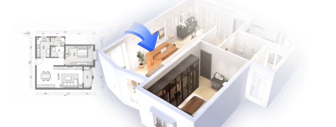
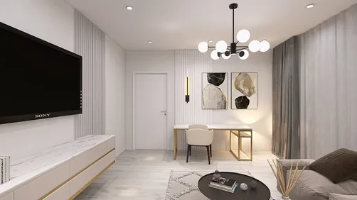
As an interior designer, I've observed a noticeable trend in contemporary homes over the past few years: open-plan living areas and kitchens have become the central feature. Whether the space is small or large, these interconnected zones present tremendous opportunities for expressing individuality through color. I am convinced that compact spaces inspire vast creativity. In this article, I'll present 10 paint suggestions I've implemented in various projects—integrating design insights with expert advice—to help your living room and kitchen harmonize effectively. Plus, utilizing tools like Homestyler can make the visualization process even easier.
1. Soft Greige for a Cohesive Flow
My Perspective: Greige—a perfect blend of gray and beige—has become my preferred choice for achieving continuity between living and kitchen spaces. In one compact loft renovation, it contributed to an atmosphere that felt tranquil yet elegant.
Benefits: This neutral shade harmonizes beautifully with warm wood furnishings and cool stainless steel elements. According to Sherwin-Williams' 2023 color trend report, greige is still regarded as one of the most adaptable paint colors for open-concept residences.
Drawbacks: Under dim lighting, this color can appear flat—incorporating textured decor is key to enhancing the atmosphere.
Suggestion: Combine it with a minimalist kitchen design to maintain an airy and uncluttered appearance.
2. Warm Taupe with Crisp White Trims
My Insight: While designing a Scandinavian-style open kitchen and living area, I found that warm taupe walls paired with stark white trims provided just enough contrast to captivate without overwhelming the senses.
Advantages: Taupe complements wooden furniture and flooring, contributing a cozy ambiance. It pairs exceptionally well with soft textile fabrics like linen or wool.
Disadvantages: In spaces lacking natural light, taupe could feel a bit heavy—consider limiting its application to a single accent wall instead.
3. Muted Sage Green
My Experience: This color was a standout choice in a recent project aimed at creating a tranquil, nature-inspired open plan. Muted sage provides a subtle ‘bring the outside in’ effect.
Advantages: It pairs wonderfully with white counters and brass accents, boosting the modern farmhouse aesthetic. Studies from the Pantone Color Institute show that green is psychologically tied to relaxation.
Disadvantages: It may clash with certain reds or orange-toned woods—always test samples under various lighting conditions before making a decision.
4. Deep Navy as an Accent Color
My Experience: For a client who appreciated nautical themes, I once painted the kitchen island and a living room wall in deep navy, and it quickly became a focal point for conversation.
Benefits: This color infuses depth and elegance into the space; it makes lighter furniture stand out and is excellent for creating color zones without barriers.
Drawbacks: Dark shades are more likely to show dust or grease, thus requiring careful consideration of finish and placement.
5. Warm White with a Soft Matte Finish
My Thought: This timeless color choice has made its way into countless open layouts where the aim is simplicity paired with versatile decor options.
Benefits: It brightens spaces, suits any design style, and enhances the sense of space—especially crucial in small open layouts.
Disadvantages: Vulnerable to showing marks easily; opting for a high-quality washable paint is essential.
6. Charcoal Gray for a Contemporary Touch
My Take: In an urban loft project, applying charcoal gray on the main TV wall created a luxurious backdrop that paired perfectly with the kitchen's glossy finishes.
Advantages: This shade delivers striking contrast, making it ideal for industrial or modern interiors. It enhances the sharpness of stainless steel appliances.
Disadvantages: Overusing it can make areas feel constricted; it's best used in accent sections.
Suggestion: Pair it with glass backsplashes to maintain a sense of openness if you're concerned about darkness.
7. Soft Blush Neutral
My Insight: This subtle blush looks almost neutral during the day but radiates warmth in the evening—as a result, it's perfect for spaces meant for cooking and relaxing.
Advantages: It harmonizes beautifully with natural wood and rattan elements, fostering a welcoming, homely vibe.
Drawbacks: Not everyone appreciates pink hues, even in muted tones—ensure that all household members agree before proceeding with this color choice.
8. Two-Tone Separation
My Experience: I've executed designs where the kitchen is painted in a bold hue while the living area features a softer, complementary tone. This effectively defines spaces without needing physical walls, especially useful in smaller apartments.
Strengths: This approach visually differentiates functions and highlights unique architectural features, adding interest for viewers.
Weaknesses: Requires meticulous color matching—be sure to collect samples and observe them in both day and night lighting.
9. Earthy Terracotta
My Insight: The richness of terracotta invokes a grounded, Mediterranean feel. In one remodeling project, it highlighted the dining area, creating an inviting retreat.
Advantages: Terracotta beautifully complements greenery and neutral furniture, and delivers warmth throughout the seasons.
Drawbacks: Strong colors may dominate smaller spaces if applied to all walls.
Tip: Consider using it in an L-shaped layout to maximize counter space while balancing the color's warmth.
10. Striking Black Feature
My Insight: A black board-and-batten wall on the dining side of an open layout served as a stunning focal point in a recent project I worked on.
Pros: It beautifully frames artwork and shelves while hiding scuffs and marks far better than lighter shades would.
Cons: As it reflects less light, it’s important to pair black with adequate overhead and task lighting.
Conclusion
Choosing paint for your open living room and kitchen entails harnessing smarter design rather than succumbing to limitations, regardless of space size. Color can define zones, forge connections, and alter the atmosphere of a home. As the experts at Architectural Digest advocate, treating color as an integral component of architecture can transform your space. So, which of these 10 color ideas are you eager to explore first? Don't forget to check out design tools like Homestyler to visualize your options better!
FAQ
Looking to transform your home? Homestyler has you covered! This user-friendly online design tool offers stunning 3D renderings, a wealth of inspiring design projects, and comprehensive video tutorials. Bring your creative vision to life effortlessly and make your dream space a reality!
Design Now for FREE


