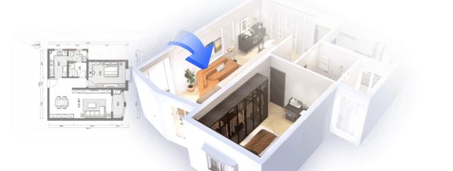
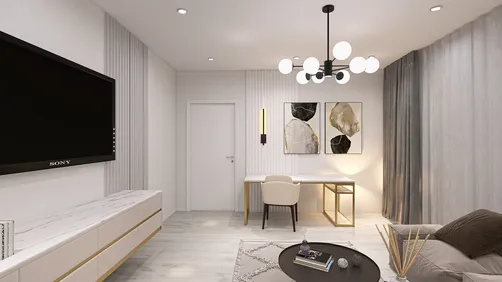
In the past few years, the combination of open-plan living rooms and kitchens has emerged as a leading trend in interior design. From my extensive experience redesigning small apartments, I've learned that the right color choices can dramatically alter how spacious and inviting a home feels. Small areas often ignite incredible creativity, so in this article, I’m presenting 10 inspiring color schemes for your living room and kitchen, drawn from my own projects and supported by design principles. At the heart of this discussion is how tools like Homestyler can help visualize these changes effectively.
1. Soft Greige for Smooth Transitions
My Experience: Using a soft greige palette in a cozy loft last year created a stunning unity between the living and kitchen areas. This warm yet neutral base not only opened up the space but also retained an inviting feel.
Advantages: Greige combines warmth with elegance, making it a flexible choice for furniture and accessories while maintaining a timeless appeal. Architectural Digest highlights that continuing neutral tones is one of the most efficient strategies for making interconnected areas appear larger.
Disadvantages: Without additional textures, greige might come across as dull. It’s essential to incorporate varied fabrics, wood tones, or matte metals to create visual depth.
Tip: Pair it with minimalist kitchen storage solutions for a streamlined appearance.
2. Navy Blue Feature Wall
My Experience: I transformed a small galley kitchen into a striking focal point by adding a deep navy wall behind open shelving in a client's home. This design element elevated the entire space to a sophisticated level.
Advantages: Navy offers a touch of drama without shrinking the room's visual appeal, particularly as a single accent wall. It harmonizes beautifully with brass hardware, adding richness.
Disadvantages: An overabundance of navy can make a dim area feel overwhelming, so it’s best suited for locales that receive ample natural light.
3. Sage Green for a Tranquil Ambiance
My Experience: I adore muted greens; they impart a natural and restorative atmosphere to any open space. My personal kitchen-living area features this color, and guests frequently remark on its calming vibe.
Advantages: It pairs exquisitely with light oak cabinetry and cream furnishings, and as noted by Color Psychology Today, green hues are effective in reducing stress.
Disadvantages: In overly bright environments, sage may appear washed out – opting for a matte finish can help mitigate this issue.
4. Warm Terracotta Accents
My Experience: In a previous project, I introduced terracotta through bar stools and backsplash tiles, creating warmth without overwhelming the environment. This detail instantly brought a Mediterranean charm to the design.
Advantages: It adds an earthy depth that complements white or cream base palettes beautifully.
Disadvantages: Excessive use can render the space feeling outdated; it’s best as an accent rather than a primary color.
5. Monochrome Black and White
My Experience: During a modern apartment remodel, I paired sleek black cabinetry with bright white walls. This striking contrast engaged the eye throughout the space, enhancing its structure.
Advantages: This high-contrast scheme delivers a clean, graphic aesthetic and is ideal for contemporary open-plan designs.
Disadvantages: It may come off as harsh if not softened with textures, greenery, or wooden elements.
Tip: Combine with L-shaped configurations for added counter space, blending functionality with style.
6. Soft Blush Pink Details
My Experience: In a studio apartment project, we incorporated blush pink bar stools and cushions to subtly connect the kitchen and living space, creating a fresh and lively look.
Advantages: Blush introduces warmth without heaviness and pairs surprisingly well with greys, whites, and even navy.
Disadvantages: If not balanced with contrasting tones or bolder shapes, it risks feeling overly sweet.
7. Charcoal Gray Sophistication
My Experience: In a recent luxury condo, we opted for charcoal cabinetry in the kitchen while leaving the living area walls light cream. This contrast created richness in the design without compromising openness.
Advantages: Charcoal is rich and stylish, making it forgiving when it comes to stains – a significant benefit in kitchen areas.
Disadvantages: Requires adequate artificial lighting; otherwise, it may make the room feel heavy during evening hours.
8. Bright Mustard Accents
My Experience: A mustard rug under the coffee table in one of my bachelor pad designs injected vibrancy into the entire open floor plan, introducing fun without the need for wall paint.
Advantages: Energetic and inviting, mustard is a fantastic color for fabrics or accessories, particularly in kitchens with cooler tones.
Disadvantages: If overused, this color can quickly date a space; keep it as an accent piece.
Case idea: Combine mustard highlights with wooden accents for a warmer ambiance to soften the boldness.
9. Sleek All-White Design
My Experience: All-white interiors can be far from dull if you diversify textures, such as using matte cabinets, glossy backsplashes, and linen curtains. I’ve applied this approach in smaller homes to enhance light reflection.
Advantages: This palette makes even the most compact spaces feel larger, brighter, and cleaner; it serves as an ideal backdrop for seasonal decorations.
Disadvantages: Maintenance can be challenging—fingerprints and stains can become quite noticeable.
10. Two-Tone Cabinetry
My Experience: A favorite design of mine involves staining lower cabinets walnut and painting upper cabinets cream, allowing for a grounded yet open appearance in the kitchen.
Advantages: This design method defines the kitchen space while maintaining a cohesive look with the living area; it's versatile for incorporating other colors as well.
Disadvantages: Careful color coordination is necessary; poorly matched tones can appear disjointed.
Summary
Choosing colors for your living room and kitchen is about strategic design rather than restrictions. Thoughtful palettes can make even the smallest spaces look cohesive and expansive. As noted by Houzz, color continuity is crucial for successful open-plan layouts. Among these 10 ideas, which would you consider implementing in your home? Using resources like Homestyler can help visualize your choices beautifully.
FAQ
1. What colors work best for a small living room and kitchen?
Soft neutrals like greige, white, and sage green are optimal as they create a sense of openness without overwhelming the visual space.
2. Are dark colors suitable for small open-plan areas?
Definitely, but limit their application to accents or lower cabinetry to keep the room feeling light.
3. Which color combinations can make a living room appear larger?
Light wall shades paired with slightly darker flooring or lower cabinetry can foster an illusion of height and space.
4. Are bold colors appropriate for the kitchen?
Absolutely – tones like mustard, terracotta, or navy can infuse personality if applied thoughtfully.
5. Should the living room and kitchen share the same color?
Ideally, yes, or at least use complementary shades to enhance flow and cohesiveness across the space.
6. How can I introduce warmth to an all-white kitchen-living area?
Incorporate wood textures, warm metals, or textiles in earthy tones to add comfort.
7. What color schemes are trending for dual-space designs in 2024?
Natural greens, warm earthy reds, and monochromatic contrasts are popular according to trends highlighted by Elle Decor.
8. Can color zoning be effective in open plans?
Certainly – utilize rugs, accent walls, or variations in cabinetry to subtly distinguish between living and kitchen areas while maintaining a fluid look.
Discover the joy of home design with Homestyler! This user-friendly online platform offers a powerful design tool, stunning 3D renderings, and a wealth of inspiring design projects and DIY video tutorials. Unleash your creativity and transform your space effortlessly!
立即免费设计


