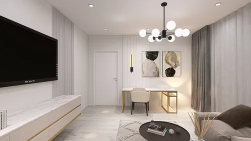
I once almost changed the entire color of my living room due to relying on a small paint chip and poor evening lighting. This experience taught me a valuable lesson while integrating a new room layout into my design scheme. Utilizing tools like Homestyler can help visualize such changes more effectively.
1. Assess the Lighting First
My process always begins with observing how both natural and artificial light interact with the walls throughout the day. For instance, a warm bulb can transform a cool gray into a muddy appearance, while north-facing light can dilute colors. Thus, a swatch that appears ideal at noon might look significantly different during dinner time. Tools like Homestyler can assist in evaluating these light changes.
2. Utilize Actual Swatches Instead of Just Chips
Peelable swatches and larger paper samples provide a much clearer view of undertones compared to a tiny chip. I often apply at least three samples to the wall and take a step back to assess — it’s cost-effective and can prevent the hassle of repainting later. Admittedly, it requires some patience to live with these samples for a few days, but it’s how you can avoid future regrets.
3. Paint Sample Pots and Assess at Scale
Acquiring small test pots and applying 2-foot squares on your wall is essential; the paint will appear differently when viewed at scale, and texture plays a crucial role. I also advocate for examining the samples from your typical viewing angles at various times. This practical method often resolves more dilemmas than theoretical discussions. Integrating Homestyler alongside this practice allows you to visualize results in a digital format.
4. Visualize Before You Make a Commitment
If you're like me and need a 'preview' of your choices, using mockups can help immensely. I frequently create quick digital mockups using Homestyler to test colors against walls and furniture. This simple photo-based preview expedites decision-making and minimizes paint waste. For a more realistic view, I may also develop a 3D color mockup, which effectively illustrates how different sheens and shadows interact.
5. Leverage Color-Matching Services and AI Tools Wisely
When a client presents a fabric swatch or an old paint chip, modern color-matching tools and AI technologies can formulate a close approximation to start with. While these tools aren't infallible — testing with a pot is still essential — they can streamline the color selection process, especially when dealing with intricate undertones. Be aware that AI may overlook subtle textures, so it is advisable to combine these suggestions with real-world samples.
FAQ
Q: What’s the most crucial step in color-matching paint on a wall?
I'd assert that testing at scale is paramount: applying paint sample pots directly on the wall and observing them in various lighting conditions. Small chips can be misleading; actual patches give a clearer picture.
Q: Can a phone photo assist me in matching color?
Phone photos can provide quick ideas but may misrepresent colors because of the camera's white balance settings. Utilize photos as a rough reference rather than a definitive measure.
Q: How long should I keep swatches before making a choice?
It’s wise to give it at least two days while observing the swatches during morning, afternoon, and evening. Lighting can shift, and your perception will modify too — this is completely natural.
Q: Do paint finishes influence color?
Absolutely — different finishes like matte, eggshell, and satin reflect light in distinct ways, which can alter the appearance of the same color. Choose your sheen early in the process and perform tests using that finish.
Q: Can I trust color-matching machines found in stores?
They tend to be accurate in analyzing pigments; however, variances in base paints and local mixing can affect the outcome. Treat the machine's suggestion as a starting point and always test a pot.
Q: Are there reliable brands for color advice?
Renowned manufacturers like Sherwin-Williams offer solid advice and testing recommendations; check out their guidance on color matching and samples at https://www.sherwin-williams.com/ for industry-standard tips. Always adhere to the manufacturer’s guidelines for optimal results.
Q: How do undertones influence matching?
Undertones, such as blue, yellow, green, and red, are the invisible factors that cause two different 'whites' to appear dissimilar. To identify undertones accurately, comparing swatches side by side is essential; a direct comparison reveals what the eye may miss when viewed alone.
Q: Any budget-friendly tips for matching on a tight budget?
Begin with paper swatches and a single test pot instead of sampling multiple full cans. I have helped clients save significantly by narrowing down their options first with swatches before committing to a single small test pot.
Homestyler is your go-to online home design platform, perfect for bringing your creative visions to life. With its user-friendly design tool, stunning 3D renderings, and a wealth of DIY video tutorials, you can easily explore and realize your interior decoration ideas, regardless of your experience level!
Design Now for FREE


