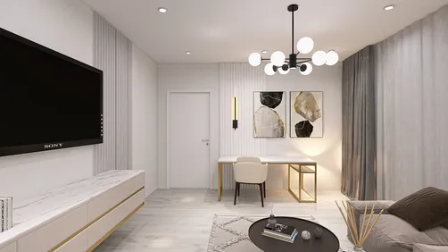
I once dedicated an entire afternoon to harmonizing a client's living room with a cherished mustard pillow, only to discover that the pillow's color had faded over five years. We had a good laugh over it, and this taught me the importance of advising clients to thoroughly test colors before investing in full paint cans. I now utilize tools like Homestyler to visualize layouts, ensuring that paint colors work in the actual room rather than just on a swatch.
Tight spaces impose a certain honesty that fosters innovative solutions: 小空间能激发大创意. In this article, I present five simple yet effective strategies I employ daily to align paint colors on walls, grounded in actual projects and a few humorous blunders of mine.
1. Focus on the undertones rather than just the name
While paint names can be quite lyrical, it’s the undertone (be it warm, cool, green, or pink) that reveals true colors under various lighting conditions. I often hold three paint chips together—up against a sofa cushion, trim, and flooring sample—to identify any conflicting undertones. This low-tech approach is quick and can spare you the trouble of repainting later.
save pin
2. Apply large swatches and observe them at different times of day
A one-inch swatch can be misleading. I prefer painting 12" x 12" patches in full finish on the wall and evaluating them throughout the day—morning, noon, and evening. Direct sunlight can lighten a color by 2–3 shades, while north light tends to cool it, making time-of-day checks paramount.
save pin
3. Ground color choices with real materials and consider a detailed 3D rendering
To successfully match walls with fabrics or flooring, it’s essential to incorporate these materials into your decision-making. I frequently photograph the space and compare the paint chip against these photos and mood boards. For those who seek greater certainty, using Homestyler for a precise 3D rendering can help preview how colors will appear under varied lighting conditions before purchasing paint by the gallon.
save pin
4. Combine a neutral base with an accent color
If you find yourself uncertain, choosing a versatile neutral for primary walls paired with a bolder accent on one wall or trim can minimize risk. This strategy allows furniture or artwork to dictate the overall warmth or coolness of the palette. While this method may feel conservative, it often succeeds in smaller spaces, promoting a relaxed approach.
save pin
5. Utilize applications and smart sample methods, but confirm physically
Mobile applications and artificial intelligence can provide color match suggestions and even propose palettes, which I often utilize for brainstorming. However, keep in mind that digital color serves as a draft—always confirm with real paint samples on-site. In cases where budget constraints exist, smart sampling (using smaller cans or sample jars) and a clear testing routine yield the best return on investment. Ideas garnered from AI tools can be a great starting point, but should be treated as preliminary suggestions, not definitive answers.
save pin
FAQ
1. What’s the quickest method for matching a wall paint color?
I typically begin with paint chips, then apply a 12" x 12" swatch in the room and evaluate it at different times of the day. For greater accuracy, use a photo combined with a 3D render, or take a sample to a paint store for spectrometer matching.
2. Can a paint store perfectly match a color from a fabric or an existing wall?
Generally, yes—most stores can scan fabric or a paint chip and create a matching formula. However, take into account that fabric dyes and worn surfaces may yield imperfect matches, so fresh samples are preferable.
3. How does lighting impact the perception of color?
Warm incandescent lighting shifts colors towards yellow/red tones, whereas cool LED and north-facing light often gives them a bluish tint. Always test colors at the times you’re likely to use the room most.
4. Is relying on an app sufficient for paint selection?
While apps are beneficial for brainstorming and planning, the variance in screen displays can yield inconsistent results. I use apps for inspiration and then verify choices with physical samples to avoid unexpected surprises.
5. How many paint samples should I try before making a final decision?
I typically start with about 3-5 finalists applied on the wall or on large boards. Too many choices can lead to decision fatigue, so it’s best to narrow down quickly and test the remaining finalists.
6. Can I determine a paint color by using a photo?
Photos can be helpful, yet camera white balance and screen settings may distort the actual color. If deciding based on a photo, make sure to compare it against physical samples and consider requesting a professional color match service if feasible.
7. Are there professional standards for accurate color matching?
Absolutely. Paint manufacturers and color specialists commonly use spectrophotometers and standardized systems. For consumer advice, refer to resources provided by companies such as Sherwin-Williams or Benjamin Moore; Sherwin-Williams offers technical documents explaining how light and surfaces affect color perception.
8. What’s an economical strategy to avoid the need for repainting?
Purchase sample jars or small quantities, paint sizable swatches, live with them for a week, and only then make a commitment. Acquiring samples is a more affordable option than repainting an entire room if the color doesn’t work out.
save pin
Homestyler is your go-to online home design platform! With an easy-to-use design tool, stunning 3D renderings, and a wealth of inspiring design projects and DIY video tutorials, you can effortlessly create the home of your dreams, regardless of your experience level.
تصميم الآن مجانا


