Ranch-style homes exhibit a sleek, understated elegance, and when paired with the right choice of exterior colors, they can significantly enhance their curb appeal. I seek out color palettes that create an illusion of space, add dimension to flat facades, and harmonize with the roof lines and surrounding landscaping. The selection of colors goes beyond mere preference; it influences perception, upkeep, and even safety during nighttime when combined with appropriate lighting.
Research consistently underscores the importance of carefully considered color and light choices. According to WELL v2 guidelines, suitable outdoor pathway lighting should aim for an illuminance level between 10 and 20 lux for safe movement around residential areas. This also guides the necessary contrast between your exterior trim and siding under night lighting conditions, ensuring readability. Studies by Herman Miller suggest that visual comfort correlates with lower cognitive load; similarly, using calmer mid-tone color schemes outdoors can reduce glare and visual strain at entry points, thus making arrivals feel more welcoming. These practical insights help me merge aesthetic appeal with everyday functionality.
The psychology of color is another important factor to consider. As noted by Verywell Mind, shades of blue and green often evoke feelings of calmness and stability, while warm neutrals create an inviting atmosphere without overwhelming the senses—particularly vital for smaller homes where a restrained visual approach keeps the facade neat rather than chaotic. I prefer balanced contrasts, ideally around a 3:1 ratio of light reflectance between the main body color and trim, which sharpens architectural features without generating harsh transitions.
Color Palette Strategy: Main Body, Trim, and Accents
For modest ranch houses, typically a two- or three-color scheme suffices. I begin with a body color in the mid-range of Light Reflectance Value (LRV)—around 40 to 60—to ensure it captures enough daylight without appearing washed out. Trim can lean towards the brighter spectrum (LRV 70–85) for cleaner edges, while focal points like the front door or shutters can be in richer tones (LRV 10–30) to draw attention at the entryway. This approach helps subtly enlarge the facade: lighter trims enhance the visibility of roofs and eaves, and a slightly darker body color can minimize visual bulk.
Light and Glare Management: Ensuring Colors Perform Around the Clock
Exterior hues interact continuously with changing light. Morning sunlight on east-facing ranch fronts can render colors cooler, while those facing west can appear warmer and more intense by late afternoon. I favor neutral undertones that remain stable—avoiding too much green or purple—as light transitions throughout the day. Also, nighttime considerations are crucial; complying with IES recommendations about outdoor luminance uniformity means steering clear of high-gloss paints near porch lights to prevent glare. Opting for matte or low-sheen finishes helps diffuse light and maintain the intended color perception after dark, enhancing visibility around steps and thresholds.
Five Bold Color Approaches
A greige palette provides warmth without leaning towards yellow, complemented by bright white trim to accentuate the eaves and fascia, while a slate or charcoal door introduces a sophisticated element that balances the entryway. This scheme pairs beautifully with concrete pathways and aluminum gutters.
Using blue not only calms but also gives the illusion of expanded spaces, making smaller elevations feel more expansive. Soft cream trim is gentler than stark white, and the addition of a stained wooden door injects organic warmth that complements xeriscaping or native plant landscapes.
Sage green blends seamlessly with the lower plantings common in ranch-style yards; using a putty-colored trim minimizes contrast and glare, while terracotta pots or subdued door colors contribute an earthy, humble aesthetic.
Taupe effectively withstands sun exposure, while off-black trim elegantly defines roof lines without harshness. Brass or aged bronze fixtures elevate the appearance and pair well with tan aggregate driveways.
High-reflectance white revitalizes older ranch exteriors. A mid-gray trim maintains clean lines, preventing the house from appearing stark, while a vibrant red door serves as an inviting focal point, especially under well-placed porch lighting.
Aligning Roof, Masonry, and Siding Colors
Choosing colors must consider integral materials. Asphalt shingles in a weathered gray favor cooler palettes, whereas brown roofs are more compatible with warmer body colors and cream trims. If your home features brick, it’s wise to compare paint swatches against both the brick and the mortar’s color—often, the mortar's tone dictates whether the facade should lean towards warm or cool neutrals. Color applications differ on fiber cement and wooden siding: wood’s grain can intensify colors, so opting for a slightly lighter test swatch than your desired final look is advisable.
Visual Tricks for Compact Ranch Facades
Smaller homes benefit from precise color placement. Opt for darker vertical elements to ground the facade while employing lighter hues on horizontal accents (like eaves and fascia) to create a sense of width. Painting downspouts in the main body color can reduce visual distraction, and if the facade appears flat, adding a somewhat darker skirt board or wainscoting can impart depth without breaking up the mass.
Highlighting the Entrance: Doors, House Numbers, and Lighting
I view the front door as a pivotal color anchor. A rich hue signals the arrival zone while ensuring that other elements remain understated. It's essential to coordinate house numeral and mailbox finishes to match the exterior hardware's sheen for a cohesive appearance—satin or aged finishes resist sunlight better than mirror-polish surfaces, diminishing glare and fingerprint visibility. Also, combine these features with porch lighting that provides an even distribution across the door area and steps, aligning with WELL v2 guidance for safe and approachable nighttime navigation.
Harmonizing Landscape and Hardscape
The colors of driveway surfacing, edging, and plant selections should complement the facade rather than contrast with it. Cool exterior colors work well with blue fescue, lavender, and river stones; conversely, warm exteriors harmonize with ornamental grasses, rosemary, and decomposed granite. If a concrete stoop has yellow undertones, avoid icy whites on trim, as they may read as blue in contrast. Staining fences and pergolas to match the wood tone of the front door maintains continuity from the curb to the entryway.
Choosing Finish Sheen and Ensuring Durability
Beyond just the color, the choice of sheen significantly affects the home’s daily appearance. Satin or low-sheen finishes for siding help conceal imperfections while minimizing reflections. Semi-gloss is ideal for doors and trim, adding cleanability without generating glare. In high UV or coastal areas, consider UV-stable pigments and lighter tones; darker colors can absorb a lot of heat, which may lead to substrate issues over time.
Evaluating, Observing, and Adjusting
Always test paint colors in at least two different areas of the facade—one shaded and one in direct sunlight—and evaluate them throughout the day. If your property faces west, you may want to adjust body colors towards cooler shades to counteract evening warmth. Nighttime checks under porch lighting will ensure that contrast and readability remain comfortable for bystanders.
Planning Colors Using Visualization Tools
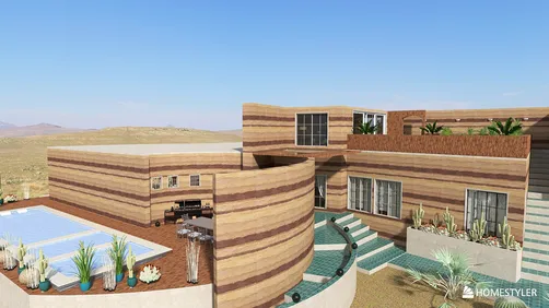
When repainting coincides with minor updates—such as new porch posts, added shutters, or a low planter wall—I utilize various visualization tools like Homestyler to verify massing and color balance before making final decisions. Such tools help assess trim width, post alignment, and accent placement that directly impact color perception across the facade.
room design visualization tool
Frequently Asked Questions
A 3:1 lightness contrast is sufficient to define eaves and openings without causing sharp edges. Opting for a mid-tone body with a lighter trim provides more forgiveness under sun exposure while ensuring a crisp appearance from the street.
Choose neutrals with balanced undertones, and steer clear of high-gloss finishes. Facades facing west benefit from slightly cooler body hues and cream rather than pure white trims to mitigate the effects of late-afternoon warmth.
Using a dark door can create a focal point that enhances visibility and navigation, especially when paired with porch lighting based on WELL v2 recommendations.
Soft greys, muted blues, and sage greens pair beautifully with weathered gray roof styles. Maintain creamy or bright white trims depending on the level of contrast your masonry can support.
Match undertones starting with the mortar color. Warm mortar favors taupe, putty, and cream hues, while cooler mortar leans towards greige, slate blue, and crisp white. Test coloring samples against both the brick and mortar under sunlight for accurate assessment.
Satin or low-sheen finishes for siding, while semi-gloss is perfect for doors and trim. These choices reduce glare, supporting visual comfort, while remaining easier to maintain.
Indeed—streamlining plant textures and reflecting a single accent color in floral displays or containers enhances overall harmony. Cohesive tones in hardscapes (like mulch, gravel, or pavers) simplify the composition and calm the facade.
Always try large swatches on both sunlit and shaded sides, monitor how they look in the morning and late afternoon, and review appearances at night under porch lighting. Adjust the undertones and contrast based on these evaluations.
While dark colors can be effective, they might seem too stark on smaller facades. A more muted off-black trim paired with a soft white body offers a dramatic yet comfortable alternative minimizing glare.
Utilize color strategically: brighter fascias and soffits alongside slightly darker skirt boards, and a pronounced door color, assist in creating dimension without introducing physical adornments.


Homestyler is your go-to online home design platform! It offers an easy-to-use design tool, stunning 3D renderings, a plethora of inspiring design projects, and helpful DIY video tutorials. Transform your space effortlessly and unleash your creativity today!