| Palette | Main colors | Works well in | Design note |
|---|---|---|---|
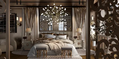
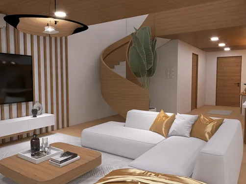
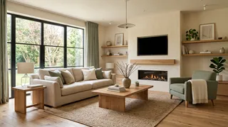
| Warm minimal | Soft ivory, sand, pale oak | Living rooms, open plans | Add texture so the neutrals do not feel flat. |
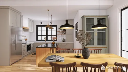
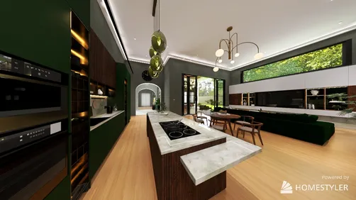
| Sage and cream | Muted sage, warm white, walnut | Bedrooms, kitchens | Keep green subdued if the room has limited daylight. |
| Earth and clay | Terracotta, oatmeal, dark wood | Dining areas, entryways | Use clay as an accent when the room is small. |
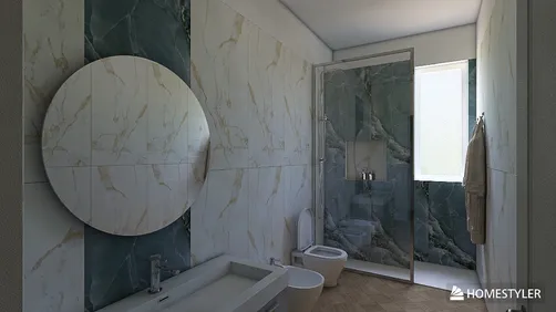
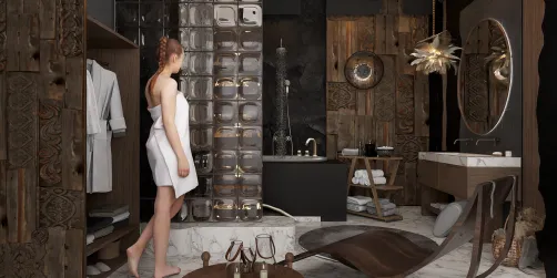
| Blue and natural | Dusty blue, chalk white, light oak | Bedrooms, bathrooms | Repeat blue in textiles or art for cohesion. |
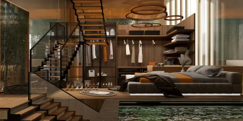
| Charcoal and soft white | Charcoal, warm white, brushed metal | Studies, contemporary living rooms | Balance dark surfaces with generous light tones. |
| Olive and ochre | Olive, muted ochre, cream | Dining rooms, reading corners | Let one of the two saturated colors lead. |
Modern interiors are not limited to white walls and gray sofas. The most successful modern home interior colors combine a restrained base with a few deliberate accents, then repeat those colors across rooms and materials. That approach creates continuity without making every space look identical.

What makes a modern home interior color palette work?
A modern palette is less about a single fashionable shade than about proportion, undertone, and contrast. Warm whites, muted greens, clay tones, deep blues, and natural wood can all feel contemporary when they are used with intention. A room usually needs a dominant color, supporting colors, and a small number of accents—not a different statement hue on every surface.
Before choosing paint, look at fixed finishes such as flooring, stone, tile, and cabinetry. Their undertones will remain in the room, so the wall color should work with them rather than compete. I usually test paint samples on more than one wall and observe them in morning and evening light; a color that looks balanced at noon may turn too cool or too yellow after sunset.
Modern home interior colors: six combinations to try


Warm neutrals without a blank-room effect
Cream, beige, and greige are useful foundations because they sit comfortably beside wood, stone, and many textiles. To keep a neutral room from feeling unfinished, vary the surface qualities: matte paint, woven fabric, grainy timber, and a smoother metal or glass detail. A tonal palette can still have depth when its light and dark values are clearly separated.
Green, blue, and earthy accents
Muted greens connect naturally with wood and plants, while dusty blues can make a room feel quieter without relying on stark white. Terracotta and ochre bring warmth, but they are visually strong; use them on a chair, rug, artwork, or a limited wall rather than automatically covering every surface. In my experience, repeating an accent in two or three small places feels more considered than adding several unrelated colors.
A practical way to plan colors across rooms
Start with the largest fixed or expensive elements, then build outward. This keeps a palette grounded in the home you actually have, not just a sample image.
- List what cannot easily change. Note flooring, counters, tile, large furniture, and the direction of natural light.
- Choose a base family. Decide whether the home leans warm, cool, or balanced; avoid mixing undertones at random.
- Set a simple proportion. A 60-30-10 split can be a useful starting point for dominant, supporting, and accent colors, not a strict rule for every room.
- Repeat colors selectively. Carry one or two hues through adjoining spaces using paint, upholstery, art, or accessories.
- Test real samples. View swatches beside flooring and furniture, at different times of day, before committing to a full room.
- Check the whole view. From a doorway or open-plan sightline, make sure neighboring rooms relate without becoming duplicates.
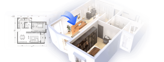
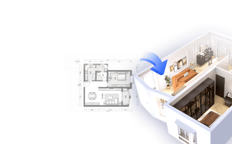
If you are unsure how a palette will read with your actual furniture and room proportions, sketching the space in Homestyler can help you compare wall colors and furnishings before buying paint. A visual mock-up is a planning aid, not a substitute for testing physical samples under your own lighting.
Light and finish can change the result
Color is perceived in context. North-facing or shaded rooms may make some colors appear cooler, while strong direct sun can shift how saturated surfaces look. Artificial bulbs also affect the impression, so check samples under the lighting you use at night. Paint sheen matters too: glossier finishes reflect more light and can make surface imperfections more noticeable, while matte finishes tend to soften reflections.
Do not assume that a pale color will always make a small room feel larger or that a dark color will always make it feel smaller. Contrast, sightlines, ceiling height, and lighting all contribute. A continuous wall color through a compact open area may feel calmer than several abrupt changes, while a darker, carefully lit nook can feel intentional and comfortable.
Common palette mistakes to avoid
- Picking paint before considering fixed finishes. A sample may look appealing alone but clash with the floor or countertop.
- Using too many competing accents. Choose a lead accent and let the rest support it.
- Copying a palette without checking light. Online photos are affected by exposure, editing, and screen settings.
- Making every room identical. Shared undertones and repeated details create flow; each room can still have its own emphasis.
- Treating a color formula as law. Proportions such as 60-30-10 are guides, not building or design standards.
For a more reliable preview, plan a room in Homestyler with the dimensions and major furniture pieces in place, then compare a few restrained color options. I recommend changing one variable at a time—such as wall color while keeping the flooring and sofa constant—so you can see what actually improves the room.


Make the palette yours
The best modern home interior colors are the ones that suit the architecture, daylight, existing materials, and people who use the space. Begin with a flexible base, add one or two supporting hues, and reserve stronger colors for places where you want attention. Test the combination in the room before painting, then adjust the balance rather than chasing a trend that does not fit your home.
Homestyler's roots trace back to Autodesk, the global leader in design and engineering software. That heritage lives on in every feature we build. Today, with a community of more than 20+ million registered users (platform data, 2026) worldwide, Homestyler continues to make professional-quality interior design accessible to everyone — from first-time decorators to seasoned architects.
When a decision is hard to picture, use Homestyler to explore the room layout and color direction. Pair that preview with physical paint samples and a view of the room at different times of day for a more dependable final choice.
Zaprojektuj teraz za darmo