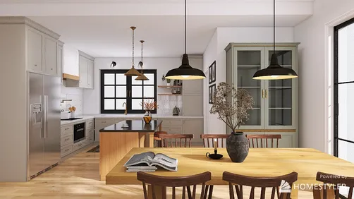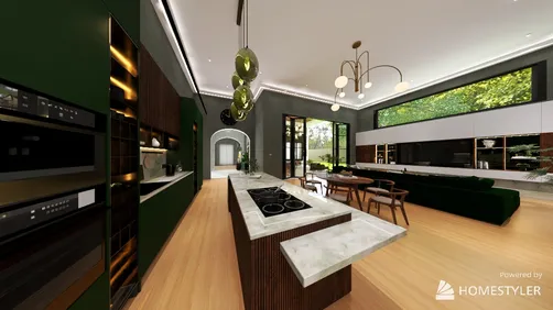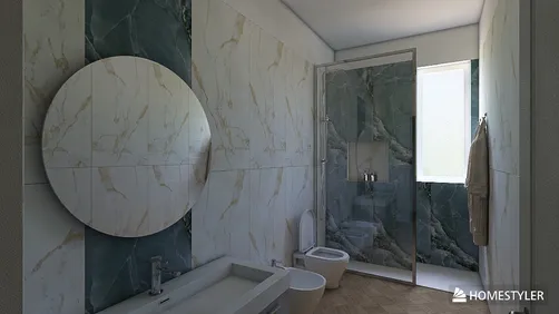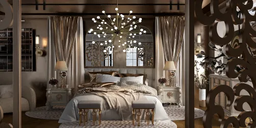
- Identify the fixed finishes and note their warm, cool, or mixed undertones.
- Choose a mood and a palette relationship before narrowing down paint shades.
- Select a dominant color, a supporting color, and a limited accent rather than treating every hue equally.
- Test large samples in several locations and at different times of day.
- View samples beside flooring, trim, counters, and the furnishings that will stay.
- Check the palette from adjoining rooms and main sightlines, not only from one wall.
- Reassess the color under the actual bulbs used in the room.
A successful interior color scheme is not simply a collection of attractive paint chips. It is a set of connected decisions about light, existing materials, room use, and the way one space leads into another. Start with what cannot easily change, test colors where they will actually live, and build a palette in layers rather than choosing every shade at once. This approach makes interior color choices feel intentional without forcing every room to look alike.

Begin with the room, not the paint deck
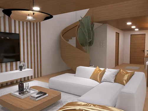
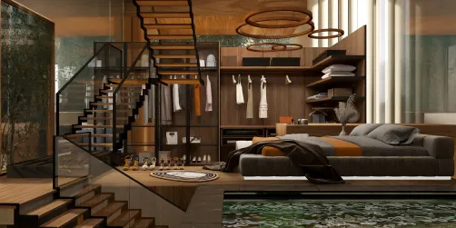
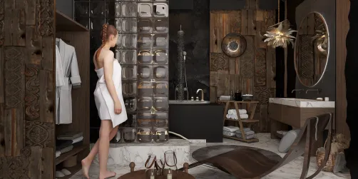
Before looking at paint, note the room’s purpose and the elements that will remain: flooring, stone, cabinetry, large furniture, and window treatments. These fixed or costly-to-replace finishes already contain undertones. A beige floor may lean pink, yellow, or gray; a white countertop may look cool beside a warm wall. The wall color should work with those undertones instead of competing with them.
Then decide what the room needs to feel like in daily use. A bedroom might call for a quieter, lower-contrast palette, while a kitchen or work area may benefit from clearer contrast and brighter accents. These are preferences, not rules: a dark bedroom can feel restful, and a pale living room can still feel warm if its textures and lighting support it.
I usually begin by writing down three words for the desired atmosphere—such as calm, grounded, and bright—before selecting any specific hue. That small step helps distinguish a color that looks appealing on its own from one that supports the room’s purpose.
Build an interior color palette from fixed finishes and a color relationship
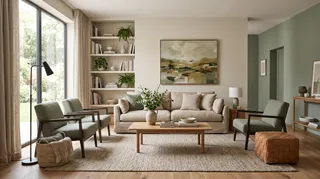
Choose one anchor: a rug, artwork, patterned fabric, tile, or a natural material already in the room. Pull two or three colors from it, then decide which will occupy the largest visual area. A palette can be built from neighboring hues for a gentle transition, opposing hues for stronger contrast, or several values of one hue for a restrained, layered effect.
Warm and cool are useful descriptions, but they are not a complete palette plan. A room can combine both successfully when one undertone leads and the other appears in smaller, deliberate touches. For example, warm oak and creamy walls can sit comfortably beside a blue-gray textile if the blue is repeated in a few details and the overall contrast is controlled.
A familiar 60/30/10 guideline can help with proportion: roughly 60% of the visual field for a dominant color, 30% for a supporting color, and 10% for an accent. Treat it as a starting point, not a measurement requirement. Open-plan rooms, patterned rugs, and collections of books or art rarely divide neatly into percentages. The useful principle is hierarchy: one color leads, another supports, and a smaller note adds emphasis.


Read light before committing to a paint color
The same paint can look different as daylight changes and under different lamps. North-facing light often appears cooler; direct afternoon sun can make a color look warmer or more intense. LED bulbs also vary in color appearance, so a sample viewed only in a store or on a screen cannot predict the final result reliably.
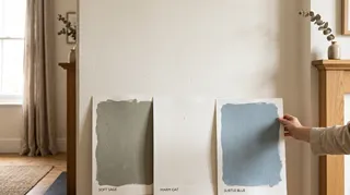
Test a few candidate colors on large movable boards or generous sample areas. Place them on more than one wall, including near a window and in a shadowed corner. Observe them in morning daylight, late afternoon, and with the room’s usual lights switched on. Keep the sample beside the floor and trim; a color that looks balanced alone may clash next to a fixed finish.
In my experience, the most useful test is not asking whether a sample looks beautiful at one moment, but whether it remains comfortable across the room’s normal lighting conditions. If a shade turns unexpectedly green, pink, or dull, compare its undertone with the materials around it before rejecting the entire color family.
Coordinate rooms without making the whole home uniform
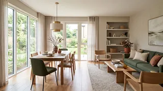
A home feels connected when rooms share a few visual cues, not when every wall is painted the same color. Repeat a trim color, wood tone, metal finish, or accent hue across adjoining spaces. In an open-plan area, use changes in value or saturation to define zones while keeping the underlying palette related.
For a simple whole-home plan, select a flexible base neutral, a small group of supporting colors, and one or two accents that can move between rooms. A hallway can carry the base color; a living room can introduce a deeper supporting shade; artwork or cushions can repeat an accent. This creates continuity while allowing each room to respond to its own light and function.
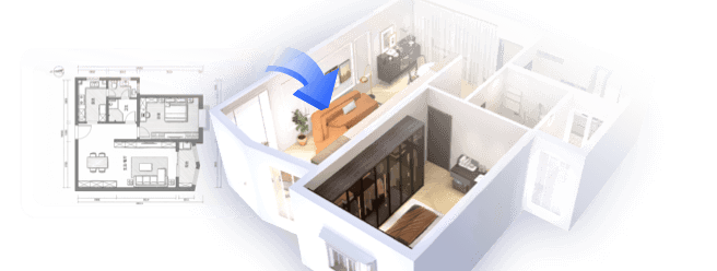
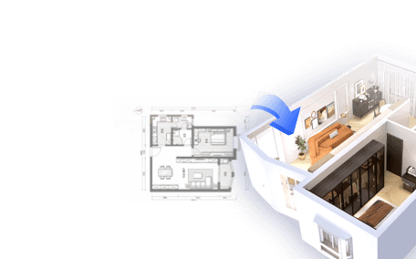
If you are unsure how colors will connect across a floor plan, sketch the rooms and note the sightlines between them. A quick digital layout can help compare adjacent wall colors and furnishings before buying paint; Homestyler is one option for visualizing a palette in a room plan. Use the model to test relationships, then confirm the actual paint with physical samples.
Use accents where they are easy to change
When you want color but are not ready to commit to a saturated wall, introduce it through items that can be replaced or rearranged: cushions, throws, lampshades, art, ceramics, or a small piece of furniture. Repetition matters more than quantity. A color appearing in two or three considered places usually feels more connected than many unrelated bright objects.
An accent wall can work when it has a clear architectural reason, such as marking a bed wall or drawing attention to a fireplace. It is not automatically the best way to add color: a strong wall can make a small room feel visually divided, especially if the other walls and furnishings have no relationship to it. Test the proposed accent against the room’s main view and consider whether the same color could be repeated in a smaller detail instead.
I recommend choosing accents after the larger surfaces and major furnishings are settled. That order keeps a small decorative choice from dictating the entire room and makes it easier to adjust the palette over time.
A practical checklist before painting
Make the final choice with a real-room test
A paint chip is a useful filter, not a final verdict. Narrow the options to a few candidates, test them at scale, and live with the samples long enough to see the room’s ordinary light changes. If the color works beside the permanent finishes and still feels right at the times you use the room, it is a stronger choice than a shade selected because it is currently fashionable.
For a more detailed comparison, create a simple room mockup and try alternate wall, textile, and furniture colors before purchasing. Homestyler can help you compare those combinations in context; a second view from the doorway or adjacent room often reveals clashes that a close-up paint sample misses. Keep the final decision grounded in physical samples, since screens cannot reproduce paint sheen, surface texture, or your home’s exact light.
Homestyler's roots trace back to Autodesk, the global leader in design and engineering software. That heritage lives on in every feature we build. Today, with a community of more than 20+ million registered users (platform data, 2026) worldwide, Homestyler continues to make professional-quality interior design accessible to everyone — from first-time decorators to seasoned architects.
Interior color works best when it supports the architecture and the way people use the space. Start with the room’s existing materials, establish a clear palette hierarchy, and test before committing. The result can be cohesive without being repetitive—and personal without relying on a single trend.
Desain sekarang Gratis