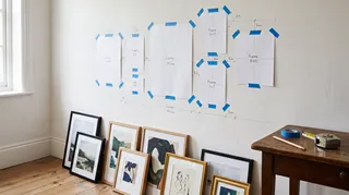
- Arrange the pieces on the floor. Put them in the same relative positions you want on the wall, then photograph the layout from above.
- Make paper templates. Trace each frame onto kraft paper or scrap paper, cut it out, and label the template with the frame’s name and hanging hardware position.
- Tape the templates to the wall. Step back and check the overall shape from the doorway and from the main seating position.
- Adjust the negative space. Look at the gaps between frames as shapes. If one gap is noticeably wider, the group may feel lopsided even when the frames are technically aligned.
- Mark the hardware point. Measure from the top of each frame to its hook or wire’s resting point; do not assume every frame hangs from the same position.
- Check the wall surface and fixings. Choose hanging hardware suited to the frame’s weight and the wall material. For heavy pieces or uncertain wall construction, use an appropriate anchor or ask a qualified installer.
A gallery wall can make a blank wall feel personal, but the best result rarely comes from hanging frames one at a time and hoping they line up. Start with the wall’s proportions, choose a visual anchor, and test the arrangement before making holes. These gallery wall ideas cover flexible layouts, frame combinations, spacing, and practical ways to adapt a display to a living room, hallway, bedroom, or stairwell.

Start with the wall, not the frames
Measure the usable wall area and note nearby furniture, switches, doors, and windows. A display above a sofa should relate to the sofa’s width; a collection in a narrow hallway needs to leave comfortable passage and avoid projecting frames where people brush past. The arrangement should read as one composition rather than a cluster that has drifted toward one side.
A useful first step is to mark the intended outer boundary with painter’s tape. This does not dictate the exact shape, but it helps you see whether the collection will feel too small, too tall, or crowded. Keep the center of the overall composition near eye level when the wall is viewed standing, then adjust for the room: art above a low sofa may sit lower than a display in an entryway.
I usually choose the largest or most visually important piece first. It gives the rest of the arrangement a reference point and prevents the common problem of filling the wall with small frames before discovering there is no room for the anchor piece.
Choose gallery wall ideas that suit the room
The outline of the group has as much impact as the art itself. A crisp grid feels orderly; an organic arrangement feels more collected. Neither is automatically better. Match the layout to the architecture, furniture, and the amount of visual variety in the pieces.
1. A clean grid
Use frames of the same size, or a few repeated sizes, and align their edges in consistent rows and columns. A grid works well with a set of photographs, graphic prints, or artwork that shares a palette. It is especially effective in a dining area or office where a calm, deliberate rhythm is welcome.
For a convincing grid, measure the gaps rather than estimating each one separately. Lay the frames on the floor, align the top edges, and check that the outside dimensions form a clear rectangle. If the frames differ slightly, use paper templates on the wall and adjust until the visual lines feel even.
2. A balanced salon-style cluster
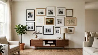
A salon arrangement mixes sizes and orientations while keeping the overall silhouette controlled. Begin with a central piece, then place medium and small works around it. Balance visual weight, not just frame dimensions: a dark image or dense illustration can feel heavier than a pale print of the same size.
This is a good choice when you have art collected over time. Keep one or two elements consistent—such as frame color, mat tone, subject, or a shared accent color—so the variety feels intentional rather than random.
3. A horizontal row
A row of frames suits a long, low wall, a hallway, or the space above a bench. Align the centers or top edges, and keep the gaps consistent. A row can use matching frames for a restrained look or varied artwork inside a repeated frame style for a little more character.
4. A vertical column
A narrow column can make use of a slim wall between windows or beside a doorway. Stack pieces with a clear vertical rhythm and avoid letting the arrangement become so tall that the top frame feels disconnected from the rest. In a stairwell, follow the slope of the stairs with the group’s overall line while keeping individual frames level.
5. A ledge-based display
Picture ledges let you layer frames without committing to a fixed arrangement. Overlap pieces slightly, vary their heights, and include a small object or two if the ledge is deep and stable. This approach is easy to refresh, but secure the ledge properly and avoid placing heavy frames where they could slide or fall.
Plan the composition before hanging

A little planning saves patching and repainting. Use one of these methods to test the arrangement:
Preview Frame Spacing in Your RoomI recommend taking a phone photo of the taped templates before hanging. A small image makes it easier to compare the real wall with the planned composition while you work.
Get spacing and scale right
There is no single spacing number that suits every collection. Small frames with narrow mouldings can sit closer together; large, visually busy pieces often need more breathing room. The important thing is consistency within the arrangement. Pick a gap that looks comfortable at the room’s normal viewing distance, then repeat it rather than changing it frame by frame.
Scale matters too. A tiny cluster above a wide sofa can look stranded, while an oversized display may overwhelm a compact room. Consider the furniture below the art and the wall area around it. If you are unsure, tape out the outer boundary first and compare it with the furniture width before deciding how many pieces to include.
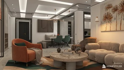
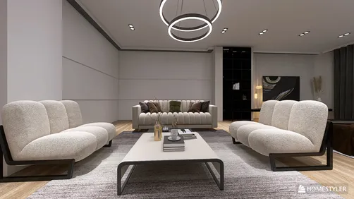
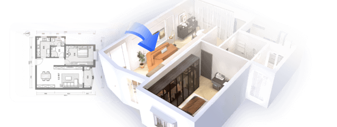
For a more precise preview, you can test the wall and furniture proportions in Homestyler before moving frames around. A digital room view is useful for checking scale and color relationships, though it cannot replace measuring the actual wall or locating studs and wiring.
Mix art and frames without losing cohesion
A gallery wall does not need to be a matching set. Combine photographs, illustrations, paintings, maps, typography, or small textile pieces, but give the collection a thread that connects it. That thread might be a limited color palette, a repeated subject, similar matting, or a consistent frame finish.
Try these combinations:
- One palette, varied subjects: choose art with a shared set of colors, then mix landscapes, portraits, and abstract work.
- One subject, varied treatments: build around botanicals, travel, architecture, or family photographs, using different styles of image.
- Repeated frames, varied art: use a consistent frame profile to make unrelated prints feel like a set.
- Varied frames, repeated mats: keep the mat color and proportions similar while changing the frame finishes.
- Art with a personal object: include a small mirror, a framed textile, or a meaningful keepsake, provided it can be mounted securely.
Before hanging, view the pieces together in both color and black and white. If the arrangement feels unbalanced in grayscale, the issue may be contrast rather than color: one dark frame or image may be pulling too much attention to a corner.
Gallery wall ideas for different rooms
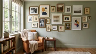

Living room
Above a sofa or console, use the furniture as a visual base. A centered arrangement often feels settled, while an asymmetrical cluster can work if its visual weight is balanced across the width. Keep the lowest frames high enough to avoid collisions with cushions, lamps, or people leaning back.
Hallway and entry
A hallway is a natural place for a sequence of family photographs, travel images, or small prints. Keep the arrangement compact enough that it does not interfere with movement. In an entry, consider how bags, coats, and doors swing before choosing the lowest or most exposed frames.
Bedroom
For a quieter bedroom display, use a restrained palette and avoid placing fragile or heavy objects where they could fall above the bed. A pair of larger works or a small, balanced cluster can feel calmer than a dense arrangement. If you want to preview colors against bedding and wall paint, Homestyler can help you compare options in a room mock-up.
Stairwell
A stairwell display can follow the angle of the staircase, but the frames themselves should remain level. Use paper templates to map the rising line and check the composition from both the bottom and top of the stairs. Take extra care with access and secure fixings; do not improvise a ladder setup on steps.
Home office
A compact grid or a row of prints can add interest without competing with a screen. Choose images that remain pleasant in your peripheral vision and avoid reflective glazing directly opposite a bright window or task light.
Common mistakes to avoid
- Hanging before testing: a floor layout or paper templates reveal awkward gaps before you make holes.
- Ignoring the furniture: the art should relate to the sofa, console, or bed beneath it, not float independently.
- Using inconsistent gaps by accident: varied spacing can work when deliberate, but accidental changes make a group feel unsettled.
- Making every piece the same visual weight: a cluster of equally dark, equally sized frames can look rigid; introduce contrast or a clear anchor.
- Choosing frames only by color: profile, mat width, glazing, and weight also affect the final result.
- Forgetting the wall material: the right fixing depends on the wall and the load. Check the hardware instructions and use suitable anchors.
A simple checklist before you hang
- Measure the wall and the furniture below it.
- Choose a layout that fits the room’s shape.
- Select an anchor piece or a repeated visual element.
- Arrange the frames on the floor and photograph the plan.
- Tape templates to the wall and inspect them from several viewpoints.
- Check spacing, outer boundaries, and visual balance.
- Identify each frame’s hanging point and use suitable fixings.
- Recheck the arrangement after the first few frames, before completing the wall.
If you want to compare a few compositions before committing, Homestyler offers a way to visualize art, furniture, and wall color together. Treat the preview as a planning aid, then verify dimensions and mounting details in the actual room.
Frequently asked questions
How many pieces should a gallery wall have?
There is no required number. A small group of three or four pieces can feel complete, while a larger wall may need more. Let the available wall area, frame sizes, and desired density determine the count rather than adding pieces just to reach a particular number.
Should gallery wall frames match?
No. Matching frames create a more formal, unified look, while mixed frames can feel collected and personal. To keep a mixed set cohesive, repeat at least one feature such as color, matting, subject, or frame shape.
How far apart should frames be?
Choose a gap that suits the size of the frames and the room, then keep it consistent across the composition. The visual result matters more than following a universal measurement. Test the spacing with paper templates before drilling.
Can I make a gallery wall without nails?
Some lightweight frames can be mounted with adhesive picture strips, but suitability depends on the product, wall finish, frame weight, and installation instructions. Do not use adhesive methods for heavy or valuable pieces unless the manufacturer explicitly rates them for that use. A picture ledge is another option when it is securely installed.
How do I make a gallery wall look balanced?
Balance the visual weight of the pieces, not only their size. Distribute dark or detailed images across the arrangement, keep the outer silhouette intentional, and check the negative spaces between frames. A floor layout and a photo from the main viewing angle make imbalances easier to spot.
Make the wall personal, then make it practical
What began as an Autodesk innovation has evolved into a design platform used by more than 20+ million registered users (platform data, 2026) around the globe. Homestyler combines powerful rendering, an intuitive editor, and a vast furniture library to help you turn inspiration into photorealistic designs — whether you're redesigning a single room or planning an entire home.
The strongest gallery wall ideas begin with art you want to live with and a layout that respects the room. Choose a clear anchor, test the composition, repeat spacing deliberately, and use fixings suited to the wall and frame. Once the plan works on paper—and from the doorway—it is much easier to hang a display that feels considered rather than improvised.
Design Now for FREE