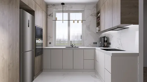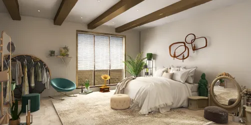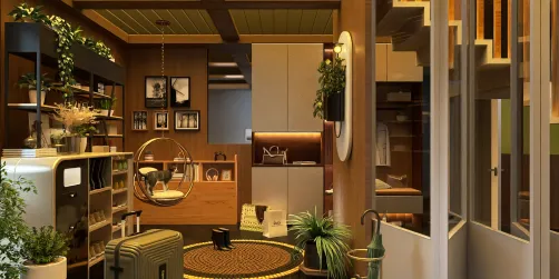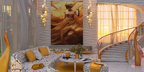

- Need warmth without visual clutter? Add a wood-framed mirror, a side table, or a narrow shelf.
- Need a focal point? Use a slatted wall, a substantial dining table, or a carefully proportioned built-in.
- Need to connect open-plan areas? Repeat one wood tone in two or three places, such as the kitchen island, dining chairs, and living-room shelving.
- Need a hard-wearing surface? Choose a product rated for the location and its exposure to water, heat, and abrasion—not just a species that looks attractive.
- Need a quieter backdrop? Keep the wood grain subtle and let stone, textiles, or lighting provide contrast.
Wood belongs in modern interiors not because every room needs a timber feature, but because it adds grain, warmth, and visual scale to clean-lined spaces. The best use of wood in modern designs is deliberate: choose a role for it, decide how much visual weight it should carry, and pair it with materials that keep the room balanced. A single oak ceiling detail or walnut cabinet can do more than covering every surface.

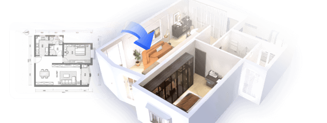
This guide focuses on decisions that affect the finished room—placement, proportion, species, finish, maintenance, and responsible sourcing. If you are testing a layout before buying materials, Homestyler can help compare furniture positions and wood tones in a 3D room rather than relying on a small sample alone.
Vist Design-HerausforderungenStart with the job wood needs to do
Before choosing a species or stain, identify the design problem. Wood can soften a stark room, define a zone in an open plan, add texture to a flat wall, or provide a durable work surface. Those are different jobs, and they do not require the same product.
Use this quick decision map:
In my experience, rooms feel more considered when wood has a clear purpose instead of appearing as a collection of unrelated accents. I usually choose the largest wood element first, then select smaller pieces that support it.
Best use of wood in modern designs: where it contributes most
Walls: texture, rhythm, and a sense of scale
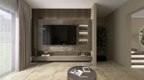
Wood wall treatments work best when they respond to the room’s proportions. Vertical battens can draw the eye upward; horizontal boards can emphasize width; a flush veneer panel can make a media wall feel calmer by concealing visual clutter. The spacing, depth, and shadow line often matter as much as the wood color.
A full-height feature wall is not automatically the right choice. In a compact room, a narrow panel behind a bed or a low run of cabinetry may create enough contrast without making the space feel enclosed. For slats, plan the edges, outlets, and transitions before installation. A feature that stops awkwardly at a doorway can look unfinished even when the material is expensive.
Ceilings: a warm counterpoint to pale walls
A wood ceiling can make a large or tall room feel more grounded. It is especially effective when the floor and walls are visually simple, because the ceiling becomes a deliberate plane rather than another competing pattern. Use a lighter tone in rooms with limited daylight, and check samples at different times of day: warm artificial light can make amber finishes look more orange than expected.
Ceiling installations need practical planning. Confirm the substrate, fixing method, access to services, and any fire or building requirements with the relevant professional. Do not assume that a decorative timber finish can be installed over every ceiling assembly without affecting clearances or maintenance access.
Floors: the broadest wood surface in the room
Flooring usually sets the dominant wood tone, so choose it before adding several other large timber elements. Engineered wood, solid wood, laminate, and wood-look tile differ in construction, repairability, moisture tolerance, and installation requirements. Compare the actual product specifications rather than treating them as interchangeable.
A floor with pronounced grain or strong color variation already carries visual movement. Pair it with simpler cabinetry and furniture. Conversely, a restrained floor can support a more expressive dining table or wall treatment. I recommend viewing full-size samples horizontally in the room; a small upright swatch does not show how a floor’s grain repeats across a broad area.
Cabinetry and built-ins: useful wood, not just decoration
Cabinet fronts, shelving, and window seats bring wood into daily use. Veneered panels can provide a consistent grain across large surfaces, while solid wood is often chosen for edges, frames, or components that may be repaired and refinished. The right construction depends on the design, budget, and exposure conditions.
In kitchens and bathrooms, ask about the complete assembly: core material, veneer or finish, edge sealing, hardware, and care instructions. A beautiful surface does not make a cabinet waterproof. Keep vulnerable edges protected from standing water, and follow the manufacturer’s guidance for cleaning and ventilation.
Furniture: the flexible way to introduce a new tone
A dining table, bench, or coffee table can add wood without committing to built-in work. Furniture is also easier to move or replace if the room changes. For a modern look, combine a simple silhouette with visible grain, or use a sculptural form against a quieter background.
Scale matters. A heavy dark table can anchor a bright room, but several bulky pieces may make circulation feel tight. Before purchasing, map the footprint and walking paths. Homestyler can be used to test a table’s size and position alongside existing furniture, helping you judge whether the wood feature supports the room’s function.


Choose species and finishes by appearance and use
Species names can be useful shorthand, but the final appearance varies with cut, grain, grade, finish, and lighting. Samples from the same species may look noticeably different. Ask to see the actual product or a representative batch, especially for large installations.
| Wood or product direction | Visual character | Often useful for | Check before choosing |
|---|---|---|---|
| Oak | Open grain, from pale to medium brown | Floors, cabinetry, tables, wall details | Grain variation and finish color |
| Walnut | Usually deeper brown with expressive grain | Furniture, feature cabinetry, accents | Cost, color variation, and light exposure |
| Maple | Fine, relatively quiet grain | Contemporary cabinetry and furniture | How the finish changes its pale tone |
| Ash | Clear grain with a light appearance | Panels, furniture, and flooring | Availability and product-specific durability |
| Reclaimed timber | Distinct marks and varied patina | Shelves, beams, statement furniture | Provenance, condition, treatment, and suitability |
| Wood-look porcelain or laminate | Repeats a timber visual in a manufactured surface | Areas where product performance is a priority | Wear layer, slip rating where relevant, and installation details |
Finish changes both color and maintenance. A clear matte finish tends to preserve a natural appearance, while oil can emphasize grain and may require periodic care. Stains shift color but do not erase the underlying grain pattern. For floors and work surfaces, compare the manufacturer’s abrasion, moisture, and maintenance information rather than relying on labels such as “durable” without context.
Modern wood design: choose species and finishes by use
Wood pairs well with stone, metal, glass, plaster, and textiles when each material has room to register. A useful starting point is one dominant wood tone, one secondary material, and a smaller accent. For example, pale oak cabinetry can sit beside a cool stone counter and a few dark metal details. The contrast gives the grain definition without turning every surface into a feature.
Mixing wood tones can work, but repetition helps. Look for a shared undertone—warm, neutral, or cool—or repeat one tone in more than one location. A walnut table and oak floor do not need to match exactly; they should look chosen together. Avoid placing several large, unrelated wood patterns side by side unless the room has enough visual space to separate them.
My advice is to compare samples in the actual room, next to flooring, paint, and upholstery. If you are unsure, create a simple digital mock-up in Homestyler and test the main wood surfaces under a consistent lighting scheme before ordering.
Use wood with restraint in each room
- Living room: Choose one anchor—such as a coffee table, media cabinet, or wall panel—and repeat its tone in smaller details.
- Kitchen: Let cabinetry or an island carry the wood; balance it with a quieter counter and easy-to-clean surfaces where splashes are likely.
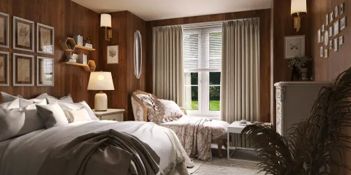
- Bedroom: A headboard, bedside tables, or a modest ceiling detail can add warmth without crowding the room.
- Bathroom: Use products specifically suitable for humid conditions, protect edges, and maintain ventilation. Wood-look tile may be a practical alternative in direct splash zones.
- Entryway: A bench, coat hooks, or a narrow console introduces timber where it can be useful as well as decorative.
- Home office: A wood desk or shelf can soften screens and equipment; keep the work surface appropriate for daily wear.


Avoid common planning mistakes
Using too many competing tones. A room can contain several woods, but each additional large surface adds another color and grain pattern. Start with the floor and the largest fixed element, then limit the remaining palette.
Choosing from a tiny sample. Grain and color shift across a full panel or floor. Request larger samples and view them in the room’s daylight and evening lighting.
Treating every wood product as equally moisture-resistant. Solid wood, veneer, engineered panels, laminate, and tile have different properties. Confirm the product’s intended use and installation requirements.
Ignoring transitions and edges. Plan how a wood feature meets paint, tile, trim, outlets, and door frames. Clean terminations make a modest material look intentional.
Overusing slats or strong grain. Repeated lines and high-contrast grain can dominate a small room. Use them where they add scale or rhythm, not simply because they are fashionable.
Assuming “natural” means sustainably sourced. Ask for credible sourcing information and documentation. Certifications such as FSC can help identify products from responsibly managed forests, but verify the claim for the specific product and supply chain.
Care and sourcing that support long-term use
Wood care depends on the finish and product. Dust with a soft cloth, clean spills promptly, and use only cleaners approved by the manufacturer. Avoid leaving standing water on vulnerable surfaces. For floors, use protective pads under furniture and follow guidance on humidity and refinishing. A finish that can be renewed may extend a product’s useful life, but refinishing is not suitable for every veneer or engineered surface.
For sourcing, consider reclaimed material when its origin and condition are known, or look for documented responsible forestry. Reuse can reduce demand for new material, but reclaimed wood still needs inspection for pests, coatings, structural defects, and suitability for its intended location. Ask suppliers what treatments have been applied and whether the material is appropriate for indoor use.
Plan proportion, light, and visual weight
Wood is a material with a strong visual presence, even when its color is pale. Grain direction, board width, sheen, and the amount of uninterrupted surface all affect how a room reads. A narrow strip of oak can feel like a detail; the same oak across a wall and ceiling becomes the room’s dominant architecture. Decide which effect you want before specifying quantities.
Light changes the result. North-facing rooms and shaded corners can make brown finishes appear cooler, while warm bulbs can intensify yellow and red undertones. Test samples in both daylight and the lighting planned for evening use. If a room has several light sources, check the sample near each one. This is particularly useful with walnut, whose color and grain can vary substantially between boards.
The direction of the grain can also guide the eye. Vertical grain or battens may emphasize height, while long horizontal lines can make a wall feel wider. These are visual effects, not substitutes for changing the room’s actual dimensions. Keep the pattern aligned with architectural features such as door heads, window mullions, or cabinet divisions so the treatment feels integrated rather than applied afterward.
Match construction to the installation
A design image rarely shows the details that determine whether a wood finish performs well. For flooring, ask about the wear layer, installation method, permitted subfloor conditions, and care requirements. For cabinetry, confirm the panel core, edge treatment, hardware, and finish. For wall or ceiling cladding, understand how the product is fixed and how concealed services remain accessible.
Solid wood can be repaired and refinished in some applications, but it can also respond to changes in moisture and temperature. Engineered products are built in layers and may offer greater dimensional stability, depending on their construction. Veneer uses a real-wood surface over a substrate; its repair options depend on veneer thickness and finish. None of these categories is automatically best in every room. The product specification and installation quality matter.
In wet or high-humidity areas, follow the manufacturer’s limits and local professional advice. Do not rely on a generic claim that a species is “waterproof.” Water can enter through joints, cut edges, or damaged finishes, and the assembly behind the visible surface matters. Where direct water exposure is expected, a non-wood surface may be the more reliable choice.
Coordinate wood with color and texture
A modern palette does not have to be white and beige. Deep green, muted blue, charcoal, and warm off-white can all work with timber, but the undertone should be tested beside the actual wood sample. A cool gray wall may make honey-colored oak look more orange; a warm neutral can soften the contrast. Paint chips are small, so compare larger samples before committing.
Texture provides another way to balance wood. Pair a pronounced grain with smooth plaster or honed stone. Use woven textiles to soften a hard-edged cabinet, or a metal detail to sharpen a rounded wood form. The goal is not to add as many materials as possible; it is to give each surface a distinct role. If every element has a strong pattern, the eye has nowhere to rest.
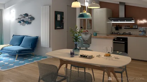
For open-plan spaces, repeat a wood tone across zones to create continuity, but vary the form. A dining table, a slim shelf, and a cabinet can share a finish without looking like a matching furniture set. Repetition works best when it is spaced through the room rather than concentrated in one corner.
Budget for the complete wood feature
Material price is only one part of the cost. Include substrate preparation, installation, trims, finishing, delivery, waste, and any electrical or plumbing coordination. Custom cabinetry and complex wall patterns can require more labor than a simple panel, even when the visible area is modest. Ask for a sample and a detailed scope so quotes can be compared on the same basis.
If the budget is limited, prioritize the surface people touch or see most often. A well-made dining table or a carefully detailed cabinet front may have more impact than a large quantity of low-grade cladding. You can also use a smaller area of premium timber alongside painted cabinetry or a durable wood-look product, provided the transition is intentional.
Plan for future maintenance as well. A finish that needs periodic oiling has a different ownership cost from a factory-finished surface that only needs routine cleaning. Keep the product name, finish details, and care instructions after installation; they make repairs and replacement easier later.
Frequently asked questions
Is wood suitable for a modern interior?
Yes. Modern design is not defined by avoiding natural materials. Clean profiles, restrained detailing, and a considered palette can make wood feel contemporary. The key is to select the right scale and finish for the room rather than relying on a particular species as a style shortcut.
How many wood tones can one room have?
There is no fixed number. A room can combine several tones if they relate through undertone, grain, or repetition. Start with the floor and fixed cabinetry, then add furniture. If the samples look unrelated together, reduce the number of large surfaces or introduce a neutral material between them.
Is reclaimed wood always the sustainable choice?
Not automatically. Reuse can extend the life of existing material, but the source, treatment, condition, and intended application still matter. Ask for provenance and inspect reclaimed boards for damage or contaminants. For new products, request credible sourcing documentation rather than relying on broad marketing language.
What is the easiest way to add wood without renovating?
Start with movable pieces: a side table, dining chairs, a framed mirror, or a shelf. These let you test a tone and scale before investing in flooring or built-ins. Choose one piece that relates to the room’s existing palette, then add another only if the first feels integrated.
A simple selection checklist
- Identify the room’s practical need: warmth, storage, durability, or a focal point.
- Choose the largest wood surface first, usually the floor or fixed cabinetry.
- Compare real samples in the room’s daylight and evening light.
- Confirm product construction, finish, installation, and maintenance requirements.
- Limit strong grain and high-contrast tones to a few deliberate locations.
- Check sourcing claims and keep product documentation for future care.
Homestyler's roots trace back to Autodesk, the global leader in design and engineering software. That heritage lives on in every feature we build. Today, with a community of more than 20+ million registered users (platform data, 2026) worldwide, Homestyler continues to make professional-quality interior design accessible to everyone — from first-time decorators to seasoned architects.
The best use of wood in modern designs is not a single species or trend. It is a considered relationship between material, proportion, light, and everyday use. When wood has a clear role—and its finish and construction suit the room—it can make a modern interior feel grounded without sacrificing simplicity.
Design jetzt kostenlos