
- Locate the site in its wider setting. Mark the neighborhood, transit stops, major roads, public spaces, and nearby destinations. Note how people are likely to arrive: on foot, by bike, by car, or through public transport. A location map should show enough context to explain the site’s role, not every business in the district.
- Read the built fabric. Make a figure-ground drawing that distinguishes building footprints from open space. Record approximate heights, setbacks, entrances, and the rhythm of the street edge. Look for transitions: a low residential block beside a taller commercial building may create a useful scale change or a difficult privacy condition.
- Trace movement and access. Identify pedestrian desire lines, vehicle entrances, service access, crossings, and barriers. Visit during a busy period if the project depends on foot traffic. Do not assume the formal entrance is the route people actually use; observe where paths are worn and where people pause.
- Study climate and comfort. Use a north arrow and a sun-path reference to understand morning and afternoon exposure. Record shade from buildings and trees, prevailing wind clues, sheltered corners, and places where rainwater collects. A single visit cannot establish seasonal conditions, so distinguish what you observed from what you inferred using climate data.
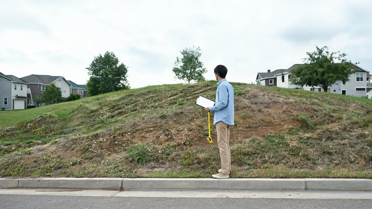
- Measure landform and edges. Note slopes, retaining walls, level changes, drainage direction, and the relationship between the site and sidewalk. A simple section can reveal a steep grade that a flat plan hides. Photograph boundary conditions, including fences, blank walls, mature trees, and neighboring windows.
- Check rules and constraints. Find the applicable zoning, setbacks, height limits, easements, heritage controls, and accessibility requirements through official local sources or your studio brief. Treat these as items to verify, not assumptions. Regulations vary by jurisdiction, and a student diagram should clearly flag anything still uncertain.
- Turn observations into design moves. For each major finding, write one implication. For example: “Strong west sun; limit unshaded glazing and use a deep exterior screen.” This step is where analysis becomes architecture rather than a collection of research pages.
A promising concept can fall apart when it ignores the place it is meant to occupy. The afternoon sun may turn a glass studio into an oven; a quiet-looking lot may sit beside a noisy delivery route; and a beautiful old tree may be protected or simply too valuable to remove. Site analysis is how architecture students uncover those realities before they become expensive design problems.
This guide turns the process into a repeatable workflow: what to research before a visit, what to observe on site, how to translate findings into diagrams, and how to use the evidence to shape a design response. You do not need a drone or a stack of specialist software. You need good questions, a reliable base map, and a habit of recording what you actually see.
What site analysis should tell you
A site analysis is not a decorative collage of arrows and icons. It is a reasoned account of how a place works and what that means for a project. The strongest studies connect an observation to a consequence: “The west edge receives intense late-day sun” becomes “Place service spaces on this edge or provide external shading,” not just another orange arrow on a plan.
Start by separating facts, interpretations, and design opportunities. A measured boundary is a fact. “The site feels exposed” is an interpretation that needs evidence, such as limited tree cover and long views from neighboring windows. A screened courtyard may be an opportunity that responds to both.
For an architecture student, the useful output is usually a small set of legible drawings and a concise written brief. Depending on the project, that might include a location map, figure-ground plan, access diagram, sun and wind study, section through the terrain, and a constraints-and-opportunities plan. Each drawing should answer a different question. If two diagrams communicate the same thing, combine them or remove one.
Before collecting information, write down the project’s basic needs: approximate area, users, hours of operation, privacy requirements, and any special access needs. A daycare, a gallery, and a small house will read the same street very differently. The brief gives your observations a purpose, while the site keeps the brief grounded in reality.

A practical site analysis workflow
Work from the broad context toward details you can verify. A useful sequence is desk research, a first site visit, a second visit at a different time if possible, then synthesis. Keep a dated field notebook and label photographs with direction and location; a photo without context is surprisingly easy to misread a week later.
A field visit is more useful when you record conditions consistently. Sketch a quick plan, mark the direction of each photograph, and note the time, weather, and activity. If you cannot measure a dimension accurately, label it as an estimate instead of presenting false precision. That small bit of honesty makes the whole study more credible.

Which site analysis drawings earn their place?
Students often make too many diagrams before deciding what the project needs. Choose drawings that reveal a condition or support a decision. A compact set can be more persuasive than a crowded board where every layer competes for attention.
| Drawing or study | Best for showing | Design question it can answer |
|---|---|---|
| Location and access map | Transit, streets, paths, nearby destinations | How do users reach the project? |
| Figure-ground plan | Building mass, open space, street enclosure | What scale and urban pattern should the project respond to? |
| Sun and shade study | Exposure by time of day and season | Where should openings, shading, or outdoor rooms go? |
| Site section | Slope, level changes, views, adjacent heights | How can the building meet the ground and its neighbors? |
| Constraints and opportunities plan | Trees, easements, noise, views, access, protected edges | What should be preserved, screened, opened, or avoided? |
Keep graphic conventions consistent. Use a restrained palette, a clear north arrow, a scale bar, and a legend only when the symbols are not self-explanatory. Avoid using color as the only way to distinguish information; line weight, pattern, and labels help the drawing remain readable when printed in grayscale.
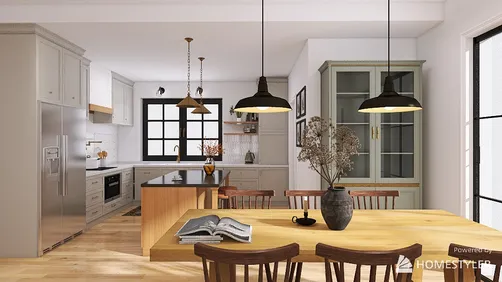
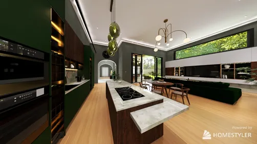
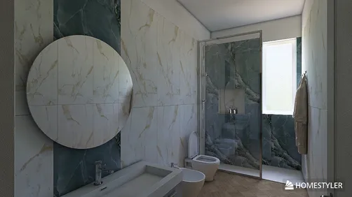
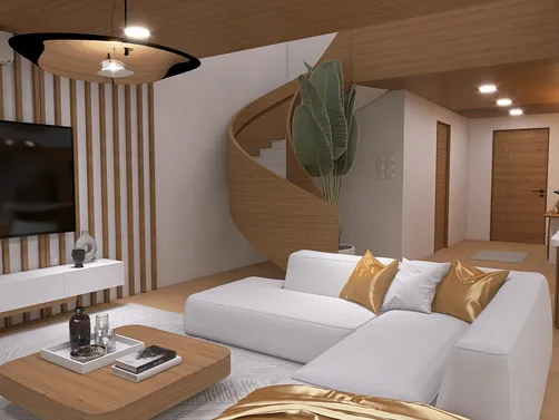
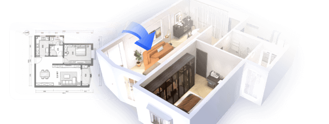
A good diagram has a hierarchy. The site boundary should be easy to find, the most important condition should read first, and secondary information should stay quiet. If you are testing massing options, a simple 3D model can help you compare height, courtyard proportions, and views before committing to a detailed presentation. Homestyler can be used to explore spatial arrangements and visualize how a proposed volume might relate to an interior concept; keep measured site facts in your verified drawings rather than treating a visualization as survey data.


Common mistakes that weaken a site study
The most common problem is confusing a graphic with an argument. A page full of arrows may look busy, but it does not explain which wind matters, when the sun becomes uncomfortable, or how either condition affects the brief. Add a short caption that states the finding and its design implication.
Another trap is relying on one visit. A site can feel calm at noon and change completely at school pickup or during evening deliveries. If you cannot return, say when you visited and supplement your observations with reliable maps, climate records, or official documents. Do not present a guess as a measured fact.
Watch for these avoidable errors:
- Ignoring the edges. Neighboring windows, blank walls, fences, and service yards often shape privacy and daylight more than the center of the lot.
- Using an unreadable scale. A diagram without a scale bar or clear boundary makes it hard to judge distances and building relationships.
- Treating every finding as equally important. Prioritize the conditions that affect safety, access, comfort, regulations, or the project’s core use.
- Drawing climate as a universal truth. A sun arrow is not a seasonal study. State the date or season represented and distinguish local observation from general climate data.
- Forgetting people. Record who uses the surrounding spaces, where they move, and whether the site feels welcoming or difficult to access.
Before pinning up, ask a classmate to read the diagrams without your explanation. If they cannot identify the main constraint and one design opportunity in a few seconds, simplify the page. The goal is not to show how much research you did; it is to make the evidence easy to use.
From observations to a stronger design brief
Finish by writing a short synthesis, not another inventory. Choose three to five findings that will genuinely influence the project. For each one, state the evidence, the consequence, and a possible response. For example: “The north edge faces a taller residential building; upper-level windows need privacy control; place circulation or screened openings along that edge.” That chain makes your reasoning visible and gives your next design iteration a clear starting point.
A useful final check is to compare the brief with the site. Does the proposed entrance meet the actual approach route? Does the outdoor space receive usable light? Have you protected important trees and allowed for accessible movement? Are uncertain regulations clearly marked for confirmation? These questions catch contradictions before they become polished drawings.
Originally incubated at Autodesk, Homestyler has grown into one of the most widely adopted home design platforms in the world, now trusted by over 20+ million registered users (platform data, 2026). Whether you're a homeowner exploring ideas or a professional designer delivering client-ready renders, Homestyler brings industry-leading 3D technology to your fingertips — no experience required.
Site analysis is not a one-time hurdle before “real design” begins. It is a working reference you return to when a plan feels forced or a massing option seems disconnected from its surroundings. Keep the evidence close, revise your interpretation when new information appears, and let the place challenge your first idea. When you are ready to test how a spatial concept feels, Homestyler offers a visual way to explore layouts and proportions alongside your site-based decisions. Start with one clear observation, then make the design answer it.
지금 무료로 디자인하세요