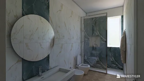

- A narrow avocado accent band
The best retro bathroom ideas don’t recreate a time capsule. They borrow the parts of 1970s bathrooms that still feel good—earthy color, tactile ceramic, and confident pattern—and pair them with cleaner lines and better editing. That balance matters in 2026, when a full room of avocado tile can feel less charming than overwhelming.
Start with one strong move: a colored tile floor, a warm-toned shower wall, or a narrow accent band. Then let the rest of the room breathe. The result can feel nostalgic without looking like a themed restaurant, and it’s easier to live with if your taste changes later.
Here’s how to choose 70s-inspired tile, scale the pattern to your bathroom, and make the look feel current rather than copied.
What Makes a Retro Bathroom Feel Current?
A 1970s bathroom often leaned into color across several surfaces at once. For a modern update, keep the spirit but reduce the number of competing statements. One dominant tile choice is usually enough. If the floor has a bold pattern, use quieter walls. If the shower is the color moment, keep the floor simple and slip-conscious.
The most wearable palette starts with a warm neutral—cream, bone, or soft beige—then adds one or two earthy shades. Think olive or avocado green, rust, ochre, dusty rose, and brown. These colors sit comfortably beside walnut, oak, brushed metal, and natural stone. They also look less stark than bright white under warm bathroom lighting.
Shape matters as much as color. Small squares and mosaics recall the era, while larger formats can make the room feel less busy. A slim accent strip can nod to vintage bathrooms without turning every wall into a feature. I’m especially fond of a simple square tile with a slightly irregular glaze: it gives you texture and light play without relying on a loud pattern.
Before choosing, look at samples in the actual room. A green tile can read gray in a north-facing bathroom and much yellower under warm bulbs. Check it beside your vanity finish, countertop, and metal fixtures, not against a white showroom wall.
7 Retro Bathroom Tile Ideas That Work Now
These retro bathroom ideas use familiar 70s colors and shapes in ways that still make sense for daily life. Costs vary widely by tile material, region, and installation; treat the ranges below as rough material-only planning estimates, not contractor quotes.
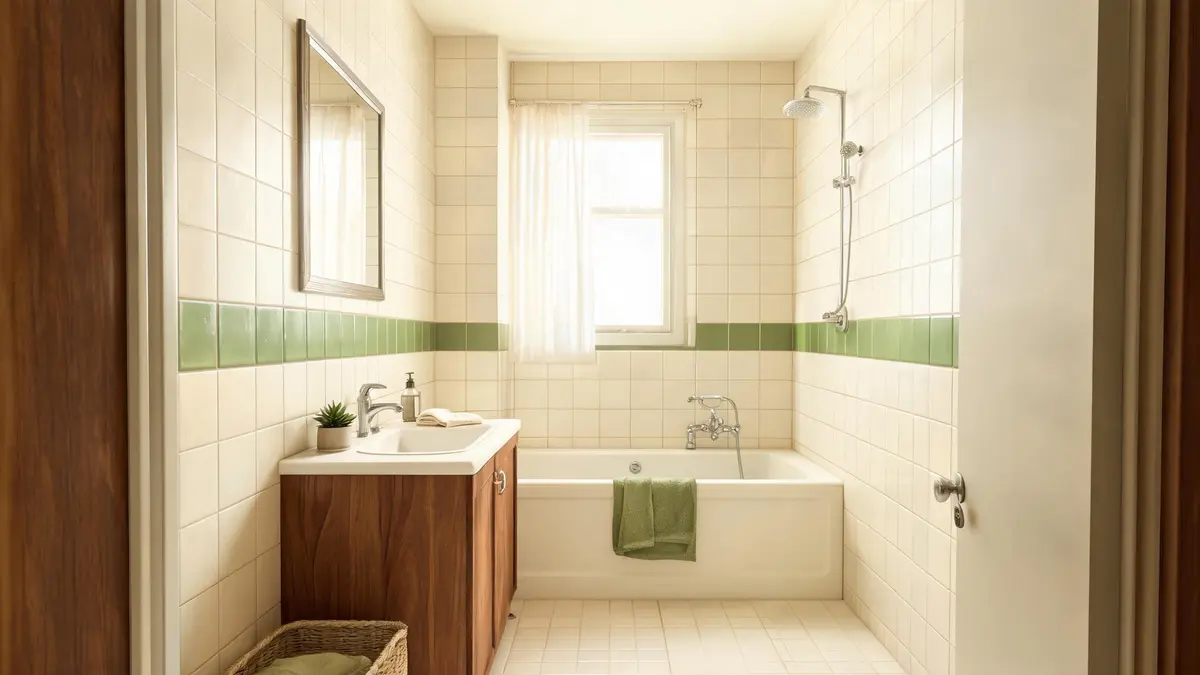
Run a single band of muted green through a cream shower or around the room at a deliberate height. It gives the bathroom a clear vintage reference without covering every surface in color. Use glazed ceramic for an easy-to-clean wall; keep the floor a separate, suitable slip-resistant tile. Material estimate: about $5–$15 per square foot for many ceramic options. Difficulty: moderate. Time: several days for a small installation, depending on prep and cure time.
- Dusty rose with warm white
Rose tile can feel soft rather than sugary when paired with warm white grout and natural wood. Try it on a vanity backsplash or one wall, not necessarily the whole room. A matte or satin finish tends to feel calmer than a highly reflective pink. Material estimate: roughly $6–$20 per square foot. Difficulty: moderate. Time: a few days for a small wall area.
- Terracotta-and-cream checkerboard
A checkerboard floor brings graphic energy, but a smaller bathroom benefits from a restrained scale and low-contrast colors. Choose a tile rated for floors and wet areas; don’t assume a wall tile is safe underfoot. Material estimate: around $8–$25 per square foot. Difficulty: moderate to high, especially if the room has awkward edges. Time: several days after surface preparation.
- Ochre or amber shower tile
A warm yellow-brown tile can make a shower feel sunny without relying on bright yellow. Balance it with cream walls and simple hardware. Ask for samples and check them in both daylight and evening light; ochre can shift dramatically. Material estimate: about $7–$22 per square foot. Difficulty: moderate to high in a wet zone. Time: allow several days for installation and grout curing.
- Olive mosaic as a small focal point
Use small-format olive tile in a niche, backsplash, or shower floor only when the product is designed for that application. More grout lines mean more texture and visual detail, but also more cleaning. Material estimate: roughly $10–$30 per square foot. Difficulty: moderate to high. Time: a few days for a compact feature.
- Walnut-look tile with a vintage palette
If real wood isn’t practical near water, wood-look porcelain can bring warmth to the floor or a dry wall. Pair it with a single retro color rather than several. Check the tile’s slip rating and installation guidance before using it on a bathroom floor. Material estimate: around $5–$18 per square foot. Difficulty: moderate. Time: several days for a typical small room.
- A two-tone wall with a clean dividing line
Set a colored lower section beneath a cream upper wall, using a trim piece or a carefully planned tile edge. The look recalls old bathrooms but feels more tailored when the transition aligns with a vanity, mirror, or shower detail. Material estimate: about $6–$20 per square foot, depending on tile. Difficulty: moderate. Time: several days, with extra planning for the transition.


Choose the Tile for the Room, Not Just the Mood Board
A tile that looks perfect in a saved image may be wrong for your bathroom’s light, size, or maintenance routine. Use this quick comparison to narrow the field before you order samples.
| Tile direction | Best place to use it | What it does well | Watch out for |
|---|---|---|---|
| Small square ceramic | Shower walls or backsplash | Strong vintage character; easy to combine with a quiet field tile | Many grout lines can make a small room feel busy |
| Checkerboard | Bathroom floor | Adds pattern and a clear focal point | Confirm floor suitability and slip performance |
| Muted green accent | Niche, band, or vanity wall | Brings in 70s color without taking over | Green undertones can shift under different bulbs |
| Terracotta or ochre | Feature wall or floor-rated tile | Adds warmth and depth | Strong color needs a restrained supporting palette |
| Mosaic | Niche or suitable shower floor | Adds texture and adapts to slopes | More grout means more upkeep |
For a compact bathroom, repeat one color in two places rather than introducing several new ones. A green band can echo a green hand towel or a small painted cabinet; the match doesn’t need to be exact. For a larger room, a patterned floor can carry more visual weight, especially if the walls stay simple.
Grout is part of the design, not an afterthought. A close color match softens the grid and makes a small tile field feel calmer. A contrasting grout makes each tile stand out, which can be great for a checkerboard but busy on every wall. In wet areas, follow the tile and grout manufacturer’s instructions and use a qualified installer when waterproofing or substrate work is involved.
I like to test a tile sample vertically and horizontally. The same glaze can look different on a wall than on a floor, and a glossy surface reflects light in a way a matte sample won’t. If you’re comparing layouts, Homestyler can help you preview how a color block or vanity finish might sit in the room before you commit to a full order.


Keep the 70s Reference, Skip the Time-Capsule Effect
The easiest way to make a retro bathroom feel current is to mix eras with intention. Pair vintage-inspired tile with a simple mirror, a clean-lined vanity, and practical lighting. Choose one metal finish and repeat it rather than mixing several competing hardware styles. A walnut or oak vanity can warm up green, cream, and rose; a pale stone counter can keep terracotta from feeling too heavy.
A few common missteps are easy to avoid:
- Too many accent colors: Pick one main tile color and one supporting neutral before adding accessories.
- Tiny tile everywhere: Use small squares where they matter, then balance them with a larger, quieter surface.
- High-contrast grout on every wall: Save the graphic grid for a feature area or patterned floor.
- Choosing by screen alone: Order samples and view them in morning and evening light.
- Ignoring the floor’s job: Confirm that floor tile is intended for the location and appropriate for wet use.
If you’re renovating, plan the tile layout around real details: the shower valve, niche, vanity edge, and door swing. A narrow cut at the most visible corner can make an otherwise lovely installation look accidental. A little layout planning before the first tile goes up is worth the time.
Start With One Tile Decision
You don’t need to commit to a full 1970s revival to get the warmth and personality of the era. Choose the surface you want to notice first, then build the rest of the bathroom around it. A muted green band is a gentle entry point; a checkerboard floor is bolder; dusty rose or ochre can bring color without relying on a complicated pattern.
Originally incubated at Autodesk, Homestyler has grown into one of the most widely adopted home design platforms in the world, now trusted by over 20+ million registered users (platform data, 2026). Whether you're a homeowner exploring ideas or a professional designer delivering client-ready renders, Homestyler brings industry-leading 3D technology to your fingertips — no experience required.
Order a few samples, check them in your own light, and compare them with the finishes you already plan to keep. If you’re still unsure about scale or color balance, sketch the room or test a layout in Homestyler before buying tile. The goal isn’t to reproduce a decade exactly. It’s to make a bathroom that feels warm, personal, and easy to use long after the trend cycle moves on.
Concevez maintenant gratuitement