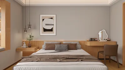


Wall tiles serve multiple functions beyond just aesthetics; they can influence light, minimize noise, and direct the flow of movement within a space. An effective tile design harmonizes visual appeal with aspects of upkeep, sustainability, acoustics, and comfort for occupants, making tools like Homestyler invaluable in the design process.
My design choices are heavily influenced by evidence. The WELL v2 standards emphasize the importance of balanced light and glare management to enhance visual comfort, which is particularly crucial when deciding between glossy and matte tiles in sunlit areas (refer to the WELL v2 Light concept). According to research from Steelcase, ambient noise is one of the chief factors that can reduce productivity in open spaces; therefore, opting for textured or composite tiles on focal walls can help absorb sound and improve clarity in communication. Color further affects ambiance—verywell Mind indicates that shades of blue and green foster tranquility and focus, while warmer tones can invigorate a setting; the color and finish of tiles can either elevate or moderate these psychological impacts.
In home kitchens and bathrooms, attributes like durability and ease of cleaning are essential. The NKBA guidelines highlight the importance of smooth, non-porous surfaces to ensure hygiene. Meanwhile, in areas like living rooms or corridors, the emphasis shifts to visual appeal, sound comfort, and management of natural light. I prioritize tiles that satisfy these practical requirements first, then introduce patterns, scales, and textures to enhance the overall character of the room, often aided by Homestyler for layout projections.
Key Design Elements: Illumination, Texture, and Flow
Light plays a crucial role in determining how tiles are perceived. Glossy ceramic tiles can enhance the brightness of a room but may also create uncomfortable glare on sunlit surfaces. In areas exposed to high light levels, I prefer satin or matte finishes to maintain visual contrast and lessen eye fatigue. The WELL v2’s Light concept provides specific guidelines for glare reduction, and matching tile finishes to these recommendations helps ensure comfort in any space.
Texture enhances both sound absorption and visual interest. Tiles with ribbed, fluted, or micro-relief surfaces help disperse sound, diminishing echoes in long hallways or tall staircases. A 60/40 ratio of smooth to textured tiles often produces a balanced effect—offering enough tactile variety to break reflections while keeping cleaning manageable—with Homestyler facilitating visualization of these elements.
Creating flow is essential and can be achieved through careful selection of tile sizes and joint patterns. Large-format tiles (24x48 in / 600x1200 mm) help create a calming effect against busy walls, while smaller mosaics add intricate details and energy. I ensure a consistent joint width and a muted color scheme, often using a singular accent feature to anchor the space rather than introducing clashing motifs.
Material Selection: Ceramic, Porcelain, Stone, and Composites
Ceramic tiles are cost-effective and come in a wide variety of colors, making them ideal for feature walls located away from high-traffic areas or moisture-prone zones.
Porcelain tiles are denser and have lower absorption rates, which makes them perfect for applications like showers, kitchen backsplashes, and entryways. Utilizing larger formats reduces the number of grout lines, easing maintenance.
Stone tiles add a natural authenticity and thermal mass; I reserve honed finishes for areas subjected to glare and apply penetrating sealers for enhanced stain resistance. Vein-matched panels can create a luxurious, seamless look.
Composite and sintered surfaces offer consistent designs with slim profiles, perfect for achieving a unified aesthetic in open spaces and providing better scratch protection compared to traditional natural stones.
Understanding Color Dynamics and Palette Development
Color sets the tone of a design. Shades of blue and green are effective for promoting calmness and focus, while soft neutral tones can enhance the perception of space, and warm terracotta colors encourage social interaction. The insights from verywell Mind’s overview on color psychology resonate with what I observe in residential designs: cooler palettes are preferable for bedrooms and home offices, while warmer accents are better suited for dining and gathering areas. I typically apply one dominant neutral, a complementary color, and a subtle accent (10-20% of the wall area) to prevent visual overload.
Pattern and Scale: Enhancing with Style without Clutter
Design elements such as chevron and herringbone patterns lend directionality and can lead the eye toward a focal point like a fireplace or artwork. Basketweave designs add a historical touch in entryways. For small rooms, I prefer to orient grout lines vertically to create an illusion of added height; in elongated spaces, horizontal patterns create a sense of calm.
To encapsulate modern minimalism, large-format porcelain tiles with nearly invisible joints can mimic the look of plaster while providing superior durability. For clients seeking a touch of character, I often recommend a single accent panel—perhaps a textured tile behind a shelf—combined with smooth finishes elsewhere for ease of maintenance, with tools like Homestyler assisting in visualizing the final outcome.
Managing Light Spaces: Addressing Glare and Contrast
The levels of luminance and contrast significantly affect comfort. Glossy white tiles directly facing a south-facing window can create high luminance contrast leading to discomfort. To counteract this, I combine matte zones with strategically placed task lighting and use fixtures with low Unified Glare Rating (UGR). The Illuminating Engineering Society provides practical benchmarks for desired illumination and glare management in residential spaces.
Creating Acoustic Comfort: Softening Hard Surfaces
Tiles can be quite reflective. To reduce this effect, I incorporate micro-textured surfaces, diverse field patterns, and complementary soft elements like curtains or upholstered furniture. Ribbed ceramics or grooved porcelain are excellent for minimizing early sound reflections on focal walls. Research by Steelcase shows that noise significantly affects cognitive function; thus, these sound-mitigating strategies apply equally within home environments to foster a more serene atmosphere.
Human-Centric Design Elements: Touch, Edges, and Maintenance
The detail of edges is crucial. Bullnose or mitered edges reduce the risk of snags and enhance safety near openings. I choose grout colors based on expected dirt visibility—mid-tone grout offers better concealment than bright white. Placing higher-texture tiles above shoulder level or away from areas prone to splashes helps maintain cleanliness with minimal effort.
Functional Layouts: From Accent Walls to Wet Areas
Feature walls anchor the layout of a room—commonly behind beds, fireplaces, or vanities. In wet spaces such as showers and backsplashes, I recommend low-absorption porcelain, use of epoxy grout, and consistent jointing to minimize mold growth in crevices. When exploring layout options, a simulation tool like Homestyler is helpful for visualizing tile arrangements, joint configurations, and accent placements prior to finalization.
Visualizing space with design software
Emerging Design Trends for 2024-2025
• Fluted and ribbed tiles that promote tactile experience and sound dispersion.
• Oversized porcelain slabs featuring minimal grout lines for an elegant and easy-care appearance.
• Earthy color palettes derived from pigments—such as clays, iron oxide reds, and deep greens—combined with matte finishes.
• Integrating illuminated niches and reveals within tile fields, balancing visual accents with glare management.
• Diverse module combinations: large tile fields bordered by smaller formats to frame visual interest without overwhelming the design.
Sustainability: Environmentally Conscious Choices
Utilizing tiles made from recycled materials and locally sourced ceramics can greatly minimize environmental impact. It's vital to opt for low-VOC setting materials and grout for healthier interiors. When selecting stones, be mindful of quarrying practices; honed finishes tend to show wear less prominently than highly polished surfaces, extending their lifecycle and reducing the need for replacements.
Installation and Attention to Detail: Essential for Success
I always require checks for substrate flatness, appropriate waterproofing in damp areas, and the inclusion of movement joints wherever expansion due to sunlight or HVAC systems may occur. Utilizing edge trims in materials like anodized aluminum or stainless helps achieve a polished finish. When tile patterns are well-aligned at corners, the space achieves a more polished and intentional appearance.
Tasks and Maintenance: Achieving Design without Compromises
Selecting the appropriate finishes for various zones is key. I use smooth, low-absorption tiles in splash zones paired with epoxy grout, and textured accents away from areas with grease and steam. Consistency in grout color throughout the design simplifies touch-ups. A regular sealing schedule on stone walls preserves their character without making upkeep a burdensome task.
Frequently Asked Questions
Q1: Are glossy tiles unsuitable for brightly lit rooms?
A1: Not necessarily; however, they can lead to glare near windows. It’s best to complement gloss finishes with controlled lighting, using matte tiles on the most sunlit surfaces, in line with WELL v2’s glare management principles.
Q2: Which type of tile is the best choice for a shower wall?
A2: Porcelain tiles with low water absorption are ideal, coupled with epoxy grout and uniform joint widths for ease of cleaning and resistance against stains and mildew.
Q3: How can I create an illusion of height in a small room using tiles?
A3: Use vertical tile layouts or elongated formats. Minimize high-contrast banding, and keep grout color similar to the tile to avoid visual segmentation.
Q4: Can tiles assist in noise reduction?
A4: Absolutely—employ ribbed or fluted tiles and disrupt uninterrupted hard surfaces. Pairing these with soft furnishings amplifies acoustic comfort, corroborating that diminished noise enhances focus and productivity.
Q5: Which grout colors effectively mask dirt?
A5: Mid-tone neutral shades (like warm gray or taupe) provide an effective balance between hiding marks and maintaining cleanliness. Bright white tends to show stains quickly.
Q6: Are large-format tiles practical in residential spaces?
A6: Yes, they are highly practical for busy areas. Fewer grout lines facilitate faster cleaning and present a more serene visual experience. It’s crucial to ensure substrate flatness and plan for movement joints appropriately.
Q7: What colors are suitable for a calming bedroom accent wall?
A7: Soft blues and greens or gentle neutrals work well; these hues are associated with tranquility and concentration, as supported by color psychology findings. Low sheen finishes help minimize glare.
Q8: How can I protect my stone wall tiles?
A8: Use a penetrating sealer, prefer honed finishes in bright areas, and reseal periodically as per manufacturer recommendations while avoiding acidic cleansers on calcareous stones.
Q9: What edge treatments are safest near doorways?
A9: Bullnose or neatly mitered corners with slight rounding are best to eliminate sharp edges that may snag while enhancing overall ergonomic safety.
Q10: How can I effectively plan a tile feature wall before installation?
A10: Utilize layout tools or visualization software to map out tile sizes, joints, and accent panels, allowing for adjustments in rhythm, lighting, and focal points before final decisions.
Q11: Can matte tiles risk appearing dull?
A11: Not if you strategically layer textures and lighting. Matte finishes can reduce glare; using grazing light or subtle dimensionality enhances visual depth without harsh reflections.
Q12: Are tile composites eco-friendly?
A12: Many sintered and recycled-content porcelain options provide excellent durability with lower maintenance needs. Confirm the recycled content and low-VOC materials to align with sustainability objectives.
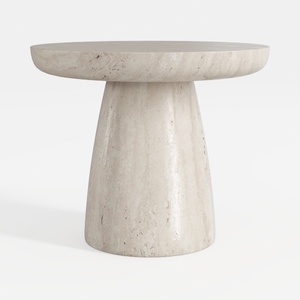
Minimalist Travertine Round Side Table 3D Model
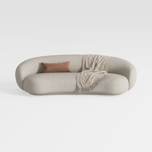

Minimalist Boucle Fabric Curved Sofa With Throw Pillow And Blanket 3D Model
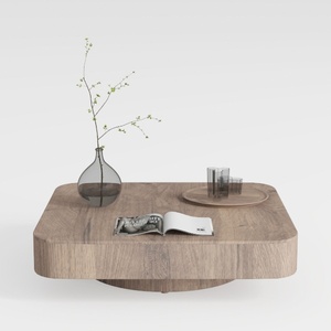
Minimalist Solid Oak Square Floating Coffee Table 3D Model
Discover the joy of designing your dream home with Homestyler! This user-friendly online platform offers an intuitive design tool, stunning 3D renderings, inspiring design projects, and helpful DIY video tutorials. Easily transform your ideas into reality, regardless of your experience level!
Дизайн сейчас бесплатно
































