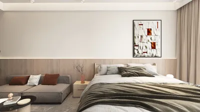


I am particularly drawn to wall texture due to its ability to transform the perception and functionality of a living room almost instantaneously. Texture influences the way light interacts with the space, enhances sound insulation, and sets an inviting mood. When thoughtfully implemented, textured walls can create a more intimate seating environment, accentuate architectural features, and infuse depth without creating clutter, making DIY design applications like Homestyler incredibly useful.
Evaluate How Texture Affects Light and Atmosphere
In the context of living rooms, textured surfaces interact with light in a distinctive way compared to flat paint finishes. The Illuminating Engineering Society (IES) recommends maintaining typical ambient lighting in living rooms around 100–300 lux, while task lighting for activities like reading should range from 300–500 lux; textures that offer medium reflectance are effective in diffusing light, reducing glare rather than merely reflecting it. Color psychology also plays a role—warm colors such as beige and terracotta foster a cozy and social vibe, while cooler shades like gentle greens and soft blues promote tranquility, both of which are augmented by the depth of shadows created by texture.
In addition to light and color considerations, the WELL v2 framework highlights the importance of visual comfort and acoustics in promoting overall well-being. Textured walls constructed with natural fibers or finely ribbed designs help diminish harsh reflections, creating a more pleasant sound environment for conversation and entertainment. For further insights on quality of lighting and comfort norms, the IES Standards resource is invaluable, and WELL v2 serves as an authoritative guideline for enhancing visual and acoustic experiences.
Strategize Your Texture for Functional Areas
The effectiveness of texture is heightened when aligned with the functional use of the space. In a living room featuring a primary seating arrangement and an additional reading nook, assigning a more robust texture behind the sofa enhances the focal wall while opting for a lighter, tactile surface near the reading area helps in maximizing light distribution. For those reconsidering furniture layout alongside textured elements, employing an interior layout planner like Homestyler can provide insights into sightlines and light interaction.
Trendy Wall Texture Options with Timeless Appeal
• Limewash and mineral paints: These provide a soft, cloud-like visual with a chalky depth that minimizes glare, ideal for spaces with varying lighting conditions.
• Venetian or marmorino plaster: This method offers a silky finish that subtly reflects light; it works well with warm LED lighting to enhance comfort.
• Textured wallpapers like grasscloth and linen: These natural materials soften sound, making lively spaces more inviting. It's advisable to use neutral tones to ensure flexibility as decor evolves.
• Micro-ribbed or fluted panels: These vertical designs create a feeling of height and manage shadows effectively. In smaller spaces, narrower ribs reduce visual bulk while promoting the soft diffusion of light.
• Slaked clay finishes: These matte, breathable options help regulate humidity and provide a rich texture ideal for biophilic design choices.
• Subtle comb or skip trowel textures: Low-relief designs exude calmness and should be kept understated to avoid appearing dated.
Managing Light Temperature, Lux, and Glare
I prioritize lighting design that complements texture rather than clashes with it. Using ambient LEDs between 2700K–3000K casts warmth, while accent lighting at 3000K–3500K highlights artworks or textured elements without making the room feel sterile. For relaxed evenings, I recommend ambient light levels around 150–250 lux, increasing to 300–400 lux for gatherings. Installing wall washers at a distance of 12–18 inches from textured surfaces helps prevent excessive brightness and reflections.
Understanding Color Psychology in Relation to Material Texture
The perception of color is influenced significantly by texture. For instance, warm neutrals on a limewash finish appear richer and cozier due to micro-variations, while cooler shades on ribbed surfaces feel soothing and crisp. According to insights from Verywell Mind, warm colors evoke liveliness, whereas cool tones induce calmness; these reactions are amplified in textured spaces where shadows and highlights play a crucial role. I typically favor moderate saturation and emphasis on value contrasts to allow texture to take center stage.
Achieving Acoustic Comfort Without Bulky Solutions
Many living rooms contend with echoes stemming from flat surfaces and hard flooring. Materials such as natural fiber wallpapers and micro-textured plasters can subtly disperse and absorb sound. Pairing textured walls with soft rugs and curtains helps regulate reverberation time effectively without resorting to overt acoustic adjustments. It’s advisable to steer clear of glossy finishes on main walls, as they tend to reflect sound and light more aggressively.
Harmony in Proportions, Rhythm, and Focal Points
Texture serves as a vital compositional aspect. I designate a primary focal wall (often positioned behind the main seating arrangement) and maintain a more subdued finish on adjacent walls to preserve spatial harmony. Vertical textures, such as flutes or narrow battens, enhance perceived height, while horizontal textures can make compact areas feel wider. In spaces with low ceilings, capping ribbed panels at two-thirds of the wall height avoids a top-heavy appearance. Repeating texture elements, such as ribbed consoles or woven ottomans, helps unify the space.
Choosing Sustainable Materials
Opt for low-VOC mineral paints, lime-based plasters, and eco-friendly wallpapers that use responsibly sourced materials. Natural textural options are more versatile under varying light and tend to age beautifully. When possible, choose finishes with published data on emissions and recyclability to bolster indoor air quality and durability in the long term.
Key Installation and Maintenance Insights
Hand-applied finishes like limewash and plaster require skilled application; testing samples in situ is crucial as lighting angles vary. Ensure textured wallpapers are installed on clean, even surfaces, and consider lining papers to avoid visible seams. For micro-ribbed panels, precise alignment is vital for a cohesive look with furniture and decor. Maintenance usually involves light dusting; harsh cleaning could damage the delicate micro-relief.
Optimizing Small Living Areas: Texture Without Clutter
For smaller rooms, it's best to stick with low-relief textural patterns and designate a single accent wall. Keeping a harmonious color palette—two adjacent shades in a similar range—promotes tranquility. Utilize fine grasscloth, narrow ribs, or soft mineral washes to create depth while maintaining openness. Position lighting to softly graze rather than harshly spotlight, and experiment with dimming to ensure even brightness across seating areas.
My Approach to Crafting a Textural Scheme
I start with swatch comparisons under various lighting scenarios throughout the day. Next involves mapping out focal points and secondary areas, then analyzing the beam angles for wall washers and accent lights. If the layout remains uncertain, I often utilize a room design visualization tool such as Homestyler to assess how seating, artwork, and lighting interplay prior to finalizing a finish.
Frequently Asked Questions
Ambient lighting should hover around 100–300 lux, with 300–500 lux designated for reading or hobbies, following IES recommendations. Textured walls respond best to soft wall washing rather than concentrated spotlights.
For ambient lighting, opt for warm-white LEDs at 2700K–3000K and accent lights at 3000K–3500K to maintain a cozy atmosphere while ensuring that textured details are clearly visible.
Definitely. Natural fiber walls and textured options like grasscloth help minimize reflections and enhance speech clarity without the need for bulky acoustic treatments.
That shouldn’t be an issue if you keep the texture subtle and limit richer designs to one focal wall. Vertical elements can even enhance the perception of height in a room.
Use adjustable wall washers positioned 12–18 inches from surfaces; avoid high-gloss finishes on focal walls and instead, choose matte or eggshell options.
Look for mineral paints and fine plaster with matte sealants as well as durable woven wallpapers. Gentle dusting and soft cloth spot cleaning are preferred to maintain these surfaces.
Yes—limit to two primary textures with one accent to prevent overwhelming the space visually. Stick to a cohesive color scheme for best results.
Select low-sheen finishes and mid-range colors to minimize glare. Testing samples throughout the day can illustrate how shadows and highlights affect the overall look.
These materials work effectively; opt for micro-ribbed or fabric-backed options to mitigate reflections. Ensure to plan for cable access and panel seams keeping the screen size in mind.
Yes, particularly with a breathable sealant. Expect a lovely patina as time passes; this aging process adds to the character of the material and enhances its appeal over time.
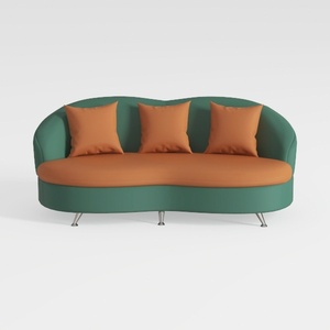

Modern Two Tone Fabric Curved Sofa With Throw Pillows 3D Model

Minimalist Fluted Solid Wood 6 Drawer Dresser 3D Model
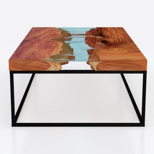
Modern Solid Wood Epoxy Resin Square Coffee Table 3D Model
Transform your home with Homestyler! This user-friendly online design platform offers a powerful design tool, stunning 3D renderings, and a vast array of DIY video tutorials. Whether you’re a beginner or an experienced decorator, Homestyler makes it easy to bring your visions to life.
今すぐ无料でデザイン
































