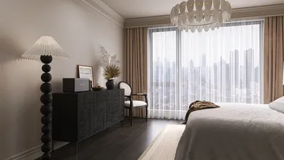


Transforming your living room with glass shelves can significantly enhance the space by opening up sightlines, increasing natural light penetration, and providing a sleek platform for books, decorative objects, and art pieces. I often prefer glass in spaces that require visual lightness coupled with a touch of sophistication, eliminating the bulkiness associated with traditional wood cabinetry. When utilized correctly, glass shelving effectively combines the functions of display and storage, ensuring daily usability while maintaining a serene atmosphere, which can be readily designed using tools like Homestyler.
When it comes to interior design, performance is just as crucial as aesthetics. As per the recommendations by the IES, living spaces should incorporate layered lighting with task areas illuminated to about 300–500 lux. Accent lighting typically falls within the range of 150–300 lux, creating a spotlight effect on items without causing glare (according to IES standards). Workplace research highlights that a well-organized visual environment boosts productivity at home, with studies from Steelcase indicating that balanced lighting and controlled visual clutter contribute to better focus—conditions that glass shelves facilitate by distributing light evenly and organizing displays. Furthermore, the WELL v2 standards advocate for glare reduction and balanced ambient-to-task lighting ratios; these are essential considerations when illuminating glass installations to prevent reflections and hotspots (WELL v2).
Design Intent: Lightness, Rhythm, and Visual Clarity
Glass provides a lighter aesthetic compared to wood, facilitating a floating appearance that stretches sightlines—this is ideal for smaller living rooms. I maintain consistent spacing between shelves to create a rhythm—a standard spacing of 9–12 inches for mixed décor and 12–15 inches for taller items like vases or books works well. The transparent edges of glass help soften the visual weight, while either a symmetrical grid or an asymmetrical stack can serve as a focal point on walls. To minimize visual clutter, I limit display categories—such as books, art pieces, and a single type of plant—and apply a tonal harmony that allows the eye to rest rather than becoming overwhelmed by chaos.
Material Choices: Tempered, Laminated, and Low-Iron Glass
For my living room designs, tempered glass serves as the safety standard; it undergoes heat treatment to enhance its strength and, in the event of breakage, shatters into smaller, less dangerous pieces. When shelves need to span wider spaces or bear heavier items, I opt for laminated glass—this type consists of two pieces fused with an interlayer, ensuring the pieces stay intact even if one side cracks. Low-iron glass is a fantastic option as it eliminates the green tint associated with thicker glass, ensuring that colors in art prints and ceramics appear accurate. Additionally, for reducing fingerprints, I recommend matte or acid-etched finishes that diffuse reflections and minimize glare under accent lighting.
Thickness, Load, and Bracket Strategy
The thickness of glass should correlate with its span and expected load. For instance, an 8 mm (5/16 in) thickness is adequate for small display shelves with short spans, while 10 mm (3/8 in) is better for medium spans that accommodate a mix of items. A preference for 12 mm (1/2 in) thickness is advisable for long spans or heavier book displays. I recommend pairing these shelves with hidden steel brackets or continuous wall channels to ensure even load support. Proper stud mapping is essential; fasteners must be secured onto structural supports. For masonry walls, I've found that rated anchors work best, and adding vertical supports can avert twisting in extended shelf runs.
Lighting the Display: Avoiding Glare and Hotspots
Bringing together lighting and glass requires careful consideration. I recommend angling directional fixtures by 15–30 degrees to avert direct reflections across the shelves, adjusting beam spreads to create a subtle wash rather than overpowering bursts of light across displays. Integrating high-CRI LED strips below the shelves provides a gentle brightness gradient, while small downlights can highlight standout pieces. It’s essential to maintain accent illumination at levels of 200–300 lux for display items and to ensure that ambient lighting doesn't overshadow it; these ratios align with IES guidelines and WELL v2 glare management criteria. Employing dimmers can help control excessive brightness during evening hours and adjust the ambiance to match the room’s usage.
Color Psychology: Curating Calm with Transparent Surfaces
Using transparent shelving allows wall colors to influence the overall mood of the space. Lighter cooler palettes like soft greys or muted blues create a crisp, gallery-like feel with glass. In contrast, warmer tones such as taupe or soft terracotta foster a cozy and collected atmosphere. Research on color psychology indicates that blue tones promote calmness and focus, while greens inspire feelings of rejuvenation; I often use these colors strategically as backgrounds in living spaces that double as reading areas. A carefully selected color palette for displayed objects—grouped by either hue or material—helps to lessen cognitive load and ensures a more serene ambiance, which can be enhanced through design tools like Homestyler.
Ergonomics and Everyday Use
For optimal usability, I set the main reach zone of shelves between 28–60 inches from the floor, designating higher shelves for seasonal decorations. All edges of the glass should be polished or beveled to diminish snag risks and glare. If the shelves have doors, I ensure that they come with soft-close hinges to eliminate the risk of slamming. For households with children, laminated glass is preferable at lower levels for added safety. When shelves are positioned around media equipment, I like to organize cable management behind discrete channels to maintain clean sightlines and uphold the overall aesthetic.
Acoustic Comfort and Material Pairing
Since glass surfaces reflect sound more than porous materials do, it’s important to balance the design with softer elements such as rugs, upholstered seating, and textured wall treatments to promote acoustic comfort. Incorporating books and artwork backed with fabric on glass shelves can act as passive sound absorbers, helping to reduce echo while enhancing the visual depth of the room.
Layout Strategy: Anchoring Focal Walls
Strategic placement can dramatically impact a room's aesthetics. For instance, positioning two to three long glass shelves above a low console can create the illusion of space within the room. Anchoring vertical glass stacks on either side of a fireplace provides a symmetrically pleasing look that offers lightness over bulky traditional built-ins. For corner setups, an overlapping or stepped arrangement can help minimize shadow accumulation. To experiment with locations before committing to installation, consider using a room layout tool to simulate shelf heights, spacing, and sightlines in conjunction with seating arrangements and lighting.
Safety and Maintenance
In homes with children or pets, selecting tempered or laminated glass is vital for safety. I always caution against overloading shelves, ensuring that heavier items are placed closer to the brackets for stability. For upkeep, I suggest using a non-ammonia glass cleaner along with a microfiber cloth to safeguard any coatings and prevent streaking. Utilizing felt pads beneath decorative items can further protect the surfaces from micro-scratches. If accent lighting is incorporated, it’s crucial to verify that LED strips are low-heat and adequately diffused to prevent overheating.
2024–2025 Design Trends to Leverage
Today's living room trends favor lighter visual appearances, seamless technology integration, and eco-friendly materials. Low-iron glass—especially with recycled content—coupled with warm metallic accents achieves a modern yet classic balance. Matte finishes are becoming increasingly popular for their ability to mitigate glare. Additionally, the focus of display curation has shifted towards intentional storytelling—fewer items with richer textures and more negative space—allowing glass shelves to serve as a backdrop rather than a cluttered storage area.
Pro Tips: Composing a Cohesive Display
- Arrange displayed objects in odd numbers to create a sense of rhythm.
- Combine vertical items (like vases) with horizontal ones (like stacked books) for a balanced shelf appearance.
- Ensure there's 1–1.5 inches of space around each object to avoid crowding.
- Align the front edges of objects for a tidy visual presentation from across the room.
- Use a variety of materials—ceramics, wood, metals—to add tactile interest against the glass backdrop.
FAQ
Tempered glass offers standard protection against impact; laminated glass includes an interlayer that keeps fragments together if broken, making it particularly suitable for lower shelves or heavier loads.
Generally, 8 mm thickness is ideal for lighter décor with shorter spans, 10 mm works for mixed loads, and 12 mm is recommended for longer spans or collections dominated by books. It's important to match the thickness to the bracket ratings and the wall’s structural capacity.
Absolutely! Glass multiplies light and minimizes visual bulk, thereby promoting a balanced distribution of ambient and accent lighting. In line with IES guidelines, I suggest maintaining accent levels of around 200–300 lux to illuminate objects without creating glare.
To avoid glare issues, angle spotlight fixtures, utilize diffusers, and select matte or acid-etched glass for your shelves. Additionally, position lights at 15–30 degrees off-axis and incorporate high-CRI LED strips for an even, soft light wash.
Yes, provided appropriate thickness and brackets support them. For book displays, use glass measuring 10–12 mm in thickness, store heavier volumes near brackets, and avoid long spans without support.
Using concealed steel brackets or continuous wall channels can help evenly distribute weight while keeping the aesthetic sleek and minimalistic. Ensure fasteners are anchored into studs or rated masonry to secure them properly.
Clean your glass shelves with a non-ammonia glass cleaner and a microfiber cloth. Consider adding felt pads beneath decorative pieces to prevent scratches. Regularly check brackets for stability and ensure integrated LED strips operate cool and diffuse light properly.
Since glass reflects sound rather than absorbing it, balance this with soft furnishings, such as rugs, upholstered chairs, curtains, and strategic placements of books to enhance acoustic comfort within your space.
Cool neutural colors like soft greys and desaturated blues can create a gallery ambiance, while warmer shades like taupe and muted terracotta add a sense of coziness. Curate your objects by color to maintain visual simplicity and reduce clutter.
If you're displaying color-sensitive items or using thicker shelves, low-iron glass is highly recommended as it preserves accurate color representation by minimizing the green tint common in standard glass.
Testing spacing with 9–12 inches for mixed items and 12–15 inches for taller objects can optimize your display. You can utilize painter’s tape or a room layout tool to visualize how the shelves will interact with existing furniture and sightlines.
Selecting matte finishes for glare reduction, low-iron glass for transparency, and a minimalist approach to curation—focusing on fewer, well-chosen pieces—will lead the current trends in modern display ideas.


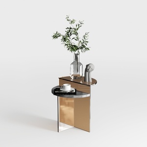
Modern Minimalist Brass Metal Side Table Unique Hourglass Shape 3D Model
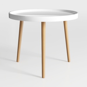
danpinera Round Side Table, Metal Legged Accent
Homestyler is your go-to online home design platform, perfect for both novices and pros. It offers an intuitive design tool, stunning 3D renderings, a plethora of design projects, and helpful video tutorials. Unleash your creativity and transform your space effortlessly!
Desain sekarang Gratis
































