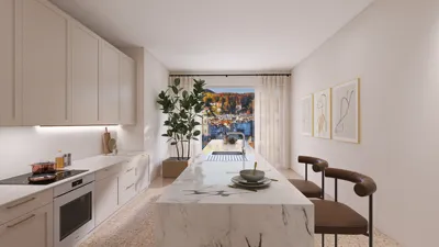


Transforming a living room can be as simple as adding a white rug, which instantly enhances the room's aesthetic by brightening its color scheme, defining proportions, and providing a serene backdrop for furniture and artwork. My experience with white rugs across various settings, from modern lofts to cozy family homes, shows that they thrive when their texture, scale, and material are thoughtfully coordinated to everyday life. The perfect balance of light, texture, and upkeep makes the space inviting rather than overly delicate. According to the WELL v2 Lighting principles, a well-regulated balance of light and minimized glare promotes visual comfort and a clean appearance—attributes that keep a white rug looking fresh rather than sterile (WELL v2, L03–L06). Supporting this, Steelcase’s research highlights that environments designed for visual comfort and lower eye strain contribute to greater satisfaction—proving that a well-lit living area can make utilizing a white rug feel seamless day in and day out (Steelcase Research).
The importance of daylight and task lighting levels is more significant than we might realize. The Illuminating Engineering Society suggests maintaining 150–300 lux in living rooms, with higher levels in areas designated for reading (IES guidelines). In my designs, I often use a layered lighting strategy—ambient lighting around 200 lux, task lighting between 300-500 lux, and accent lights for artistic features—to keep a white rug glowing without creating bright spots. Utilizing a color temperature of 2700–3000K fosters warmth against white fibers, while a Color Rendering Index (CRI) of 90+ helps preserve delicate textures. Behavioral insights from Gensler indicate that people are drawn to brighter, finely-tuned areas; at home, this translates to heightened usage of seating areas with well-balanced lighting and minimized glare (Gensler Research).
Understanding Scale, Proportion, and Placement
Begin with the appropriate scale. In most living rooms, a rug that allows the front legs of sofas and chairs to rest fully on it creates a cohesive visual unit. Recommended sizes include 8×10 ft for smaller lounges, 9×12 ft for average living rooms, and 10×14 ft for open-concept spaces. Ensure there is a consistent border of 8–18 inches from the walls for a sense of space; narrower gaps can make the rug appear misplaced. If you're exploring layout options, tools like Homestyler can effectively simulate furniture orientation and movement flow before making final decisions.
Selecting the Ideal Shade: Tone, Warmth, and Texture
Not all white tones behave identically. Cool whites, with hints of blue or gray, complement elements like concrete, dark metals, and northern light. Conversely, warm whites—such as cream and ivory—harmonize well with oak flooring, brass accents, or southern light. The texture of the rug often outweighs the tone: a flat, low-pile design appears refined and modern, while a micro-shag or high-low weave introduces depth and helps conceal minor dirt. For households with pets or children, an off-white that features subtle flecks may be more practical than a stark, solid white.
Choosing the Right Fiber: Performance Above All
The material you select significantly affects maintenance requirements. My guidelines include: wool for durability and natural stain resistance; solution-dyed polypropylene for spill-prone areas; nylon blends for longevity combined with softness; cotton flatweaves for low-profile needs; and TENCEL or viscose should be used judiciously as they can show marks easily. For eco-friendliness, seek undyed New Zealand wool or recycled synthetics accredited by third-party standards. A simple hand-feel test—pinching and twisting—can indicate whether the fibers will withstand the wear from a coffee table or foot traffic.
Enhancing Depth and Functionality Through Layering
Layering a basic flatweave white rug with a smaller patterned wool on top adds richness and anchors furniture like coffee tables. This dual-layer approach not only designates the area but also protects the base rug from wear. In acoustically lively spaces with hard flooring, a dense wool pile can significantly diminish sound reflection, resulting in improved clarity during conversations. The outcome is a living environment that is not only aesthetically pleasing but also quieter and more comfortable.
The Psychology of Color and Creating Calm Spaces
White is often synonymous with openness and mental clarity. To combat feelings of emptiness in living rooms that might feel too stark, incorporate softer hues and natural materials for added warmth. Research from Verywell Mind on color psychology suggests that muted colors and warm accents can lower perceived stress and enhance comfort, especially when paired with tactile elements. I find that white rugs look splendid with camel leather, oak, ecru linen, and a strategic touch of color, such as forest green or indigo, to maintain grounding in the room.
Effective Light Management: Steering Clear of Glare and Patchiness
White fibers enhance brightness. To avoid glare or uneven lighting, consider using dimmable ambient lights around 2700–3000K, placing a floor lamp near reading areas, and including wall washers to create uniformity on vertical surfaces. In areas where direct sunlight intensively hits the rug, sheer drapery can diffuse the brightness, protecting the fibers and ensuring color consistency throughout the day.
Understanding Traffic Patterns and Ergonomics
Take note of circulation paths between entrances, sofas, and the media area. A rug should not disrupt natural walking routes nor create potential tripping hazards. I recommend maintaining at least 36 inches of clear space and using low-profile rug pads to prevent corners from curling. Considering human factors is crucial: chairs should rest securely on the rug without wobbling, and there should be 16–18 inches of clearance for comfortable movement around coffee tables from the front of sofas.
Coffee Table Compatibility and Visual Harmony
White rugs pair best with tables that provide visual contrast and clarity, such as walnut, travertine, or blackened steel. It's essential to maintain a harmonious proportion: the width of the rug should roughly match the seating width, and the coffee table should measure between half to two-thirds the length of the sofa. When using a floating sofa arrangement, extend the rug at least 6–8 inches behind the back legs to avoid a jarring visual cutoff.
Integrating Patterns, Borders, and Stain Concealment
Micro-patterns such as herringbone, speckles, or high-low textures help to disguise footprints and accumulated dust. Implementing a subtle border or tone-on-tone banding can frame the area, giving the rug a tailored appearance instead of looking plain. In family spaces, I often recommend an ivory base embellished with a 5–10% darker speck—this design appears white in photographs while being more forgiving to daily use.
Practical Maintenance: Keep It Usable, Not Fussy
Opt for a felt or natural rubber pad beneath the rug to minimize fiber wear and enhance comfort. Regular vacuuming—using a suction-only attachment for high-pile rugs, and avoiding aggressive brush bars for loop piles—is essential. Always address spills immediately by blotting rather than rubbing. For wool rugs, a pH-neutral cleaner is advisable, while most synthetic food stains can be removed using mild dish soap and lukewarm water. Plan for professional cleaning every 12–18 months in heavily trafficked areas. Rotating the rug every six months can help balance sun exposure and wear.
Strategies for Open-Plan Spaces
In larger areas, use a white rug to delineate the lounge section while keeping adjacent dining zones in darker tones to create contrast and practicality. If size is a concern, quickly visualize the layout using tools like Homestyler to ensure the right balance of seating density, clearances, and visual appeal before making any purchases.
Frequently Asked Questions
Ensure the front legs of all seating pieces rest on the rug while maintaining an 8–18 inch gap from walls. Commonly, living rooms do well with 8×10 or 9×12 ft rugs; larger open spaces may call for 10×14 ft sizes.
Absolutely. The reflective nature of white enhances perceived brightness, and a large, continuous area visually expands the floor space—especially under ambient lighting of 200–300 lux as recommended by IES.
Opt for wool or solution-dyed polypropylene. Wool is naturally soil-resistant and maintains its pile, while solution-dyed synthetics effectively release stains and manage moisture.
Incorporate warm materials like oak and brass, along with tactile textiles such as bouclé and linen, and utilize a soft color palette. Maintain lighting conditions of 2700–3000K and employ dimming to reduce glare.
Certainly, utilizing sheer drapery or UV-filter shades can soften intense sunlight. It's advisable to rotate the rug every six months to combat sun fading, and choosing wool or solution-dyed materials enhances resistance to fading from sunlight exposure.
Materials like walnut, travertine, smoked glass, or blackened steel can offer clarity and prevent the table from blending into a bright background.
Consider a felt or felt-rubber combination of about 1/4–3/8 inch. This setup cushions feet, enhances acoustics, and helps keep rug edges flush to minimize tripping hazards in passageways.
Immediately blot spills with a white cloth. Use a pH-neutral cleaner for wool fabric, and a mild dish soap for synthetic materials. Lightly rinse, blot dry, and ensure airflow for drying. Avoid scrubbing to prevent damaging the fibers.
Slight heathering, speckles, or high-low textures are effective at disguising daily dirt and footprints, more so than a flat, pure white surface.
While fully covering the area can work in spacious rooms, adhering to the front-leg guideline remains a reliable approach. Always maintain 16–18 inches of space between the sofa and coffee table for ease of access and movement.
Indeed, it introduces striking contrast and uplifts the space. Balance it out with medium-toned furniture or décor to unify the room's aesthetic.
Utilize warm-dimming lighting set to 2700K with a CRI of 90+, along with layered sources like overhead ambient lights, floor lamps, and accent lighting to prevent flatness and eliminate glare.
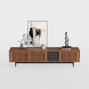

Modern Minimalist Walnut Fluted Door TV Cabinet 3D Model
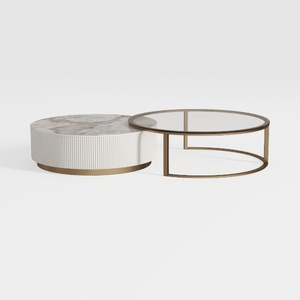
Modern Marble Gold Metal Glass Round Nesting Coffee Table 3D Model
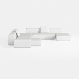
Minimalist Modern White Fabric Modular Sectional Sofa 3D Model
Looking to transform your home? Homestyler is your go-to online design platform! With its user-friendly design tool, stunning 3D renderings, and a wealth of design projects and DIY video tutorials, you’ll effortlessly create and visualize your dream spaces. Start designing today!
Desain sekarang Gratis
































