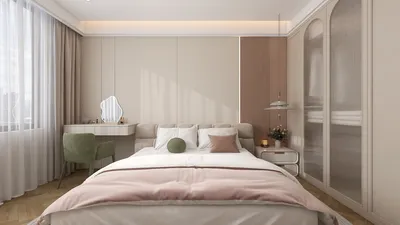


In my decade-long journey as an interior designer, I’ve witnessed a remarkable evolution in living room wall paint ideas. The trends are leaning increasingly towards warm neutrals, striking color accents, and textured finishes. Compact areas can ignite remarkable creativity—selecting the right wall hue can transform a small living room into an expansive space brimming with charm. In this article, I’ll present 10 paint inspirations derived from my experiences along with insights grounded in expert opinion, incorporating the powerful tool, Homestyler, into the process.
1. Soft Beige with Warm Undertones
My Perspective: I once revitalized a narrow apartment with warm beige walls; the way light reflected off the surfaces created a welcoming ambiance. This palette harmonized beautifully with natural textiles.
Benefits: Offers a timeless and adaptable background; seamlessly integrates with both contemporary and traditional décor; enhances light in smaller settings, according to Houzz (2023).
Drawbacks: May appear flat without a variety of textures; could be perceived as overly conventional for those who desire more audacious designs.
2. Deep Navy Accent Wall
My Perspective: A singular navy wall positioned behind the sofa introduces drama while maintaining a balanced atmosphere. I appreciate how it showcases artwork beautifully.
Benefits: Contributes depth and creates a striking focal point; makes metallic details pop and is frequently featured in mood boards generated by AI, like Homestyler.
Drawbacks: Overuse can make the space feel cramped; may necessitate additional coats for uniform coverage.
3. Sage Green for a Calming Vibe
My Perspective: In my own residence, sage green walls transform the living area into a serene retreat. It is refined yet exudes warmth.
Benefits: Brings a touch of nature inside; complements wooden tones; in line with biophilic design trends, as noted by Architectural Digest (2022).
Drawbacks: Might clash with vivid upholstery; under artificial lighting, some variations may appear grayish.
4. Soft Gray with White Trim
My Perspective: This combination has been effective in open-plan spaces, allowing for subtle distinctions between living areas without disrupting openness.
Benefits: Neutral yet fashionable; accentuates architectural features and integrates effortlessly with various accent shades.
Drawbacks: Excessive gray might evoke a cold feel; requires warm lighting to prevent sterility.
5. Warm Terracotta
My Perspective: A client envisioned a cozy Mediterranean vibe, and terracotta walls added instant charm and a sun-kissed glow, even during winter.
Benefits: Brings warmth; effectively conceals marks and scuffs; imparts a rustic appeal.
Drawbacks: Could dominate small spaces if all walls are painted; challenging to pair with cooler-toned furniture.
6. Muted Mustard Accent
My Perspective: This color works wonders in eclectic settings. I once used it behind a mid-century sofa to unify cushions and artwork.
Benefits: Introduces cheer without being overly loud; complements both bohemian and retro styles; clients often find it serves as an excellent Zoom backdrop.
Drawbacks: Can become dated quickly if excessively used; not ideal alongside specific cool blues.
7. Crisp White for Minimalism
My Perspective: For a Scandinavian-styled loft, matte white walls combined with oak accents maintained an airy feel reminiscent of a gallery.
Benefits: Emphasizes light; easy to layer decorations upon; a timeless choice; ideal base for minimalist furniture setups.
Drawbacks: Easily shows dirt; can appear stark without texture or layered decorations.
8. Two-Tone Walls
My Perspective: I enjoy applying a darker shade on the lower wall to provide depth and practicality. In family homes, it effectively conceals fingerprints.
Benefits: Enhances visual intrigue; permits bold color use without overwhelming the space; functional for areas with heavy foot traffic.
Drawbacks: Requires meticulous tape work; can appear chaotic if not balanced with decor.
9. Textured Paint Effects
My Perspective: Techniques like limewash and brushed finishes can infuse layers of visual richness. I incorporated limewash in a loft to soften industrial aesthetics.
Benefits: Produces a unique appearance; adds depth and movement to otherwise flat surfaces.
Drawbacks: Application can be labor-intensive; touch-ups may be visible; trends can shift rapidly.
Tip: Different techniques may vary in cost, but anticipate higher labor rates for methods like sponge or rag rolling.
10. Soft Blush Pink
My Perspective: This color is stunning in art-rich environments. I coordinated blush walls with brass fixtures and plush chairs, resulting in instant sophistication.
Benefits: Imparts warmth and gentleness; enhances skin tones; pairs effectively with both modern and vintage styles.
Drawbacks: May feel overly sweet if not counterbalanced; could limit future design options without repainting.
In one particular project, the soft hue elegantly bridged the dining and living spaces, especially with 3D visualizations facilitated by tools like Homestyler guiding the color mix.
Conclusion
Ultimately, optimizing small living rooms requires intelligent design choices rather than fewer ones. The right wall paint can significantly alter perceptions of space and aesthetics—a concept endorsed by color psychology research from the University of British Columbia. Which of these 10 wall paint ideas will you experiment with first?
Frequently Asked Questions
Q1: What is the top wall color trend for living rooms in 2024?
A1: Warm neutrals like beige and taupe dominate, offering both versatility and timeless appeal, according to the Sherwin-Williams Color Forecast.
Q2: Do dark colors diminish the perceived size of my living room?
A2: Not necessarily; a dark accent wall can add depth and character without compressing the space, provided it’s balanced with lighter décor.
Q3: Are two-tone walls currently in style?
A3: Yes, particularly in modern and eclectic homes; they are both practical and chic.
Q4: What paint finish is ideal for a living room?
A4: Eggshell or satin finishes are ideal as they offer durability and ease of cleaning while ensuring an aesthetically pleasing appearance.
Q5: How can I select a wall paint color that pairs well with my furniture?
A5: Begin with undertones—choose warm paint tones for warmer furniture and consider grays, blues, or greens for cooler furnishings.
Q6: Is blush pink suitable for modern living rooms?
A6: Certainly; when paired with sleek lines and neutral accents, it can avoid an overly sweet appearance.
Q7: Is investing in textured paint worthwhile?
A7: If you appreciate a unique, tactile finish, then yes—but be prepared for higher application costs, as noted by Benjamin Moore (2023).
Q8: What are some cost-effective methods to test paint colors?
A8: Use sample pots or peel-and-stick swatches; digital tools like Homestyler also offer helpful previews of your envisioned look.
Looking to transform your space? Try Homestyler! This user-friendly online design platform offers powerful design tools, stunning 3D renderings, and a wealth of inspiring DIY video tutorials. Whether you're a beginner or a pro, it's your go-to resource for creating beautiful home interiors effortlessly!
Zaprojektuj teraz za darmo
































