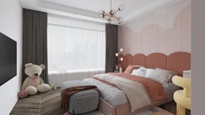


The choice of color fundamentally impacts the atmosphere, functionality, and evolution of a room. In spaces designed for girls, paint emerges as the most effective tool to influence mood, facilitate daily activities, and reflect individual style, avoiding the trap of clichéd designs. I particularly focus on versatile color palettes that transition gracefully from early childhood through the tween and teenage stages, all while considering aspects such as natural light, ergonomics, and acoustic comfort. Incorporating the design software Homestyler can be beneficial in visualizing these transitions.
Lighting combined with color plays a crucial role in creating the right environment. According to WELL v2 guidelines, ensuring adequate illuminance for various tasks is essential, with a target of 300 to 500 lux for homework areas. This is complemented by using warm-neutral lighting at around 3000 to 3500K to maintain true color integrity and alleviate eye strain (source: v2.wellcertified.com). Research by Steelcase indicates that factors such as light, color, and temperature significantly correlate with perceptions of wellbeing and productivity, emphasizing the behavioral repercussions of our paint choices. These standards assist me in balancing vibrant hues with visual comfort throughout the day and night.
Understanding color psychology offers valuable insights. As noted by Verywell Mind, colors like blue evoke calmness, green promotes restoration, and yellow brings energy when applied thoughtfully (verywellmind.com/color-psychology). In practical applications, using intense reds in study areas may lead to increased arousal and distraction, whereas softer shades like blush, sage, or powder blue can enhance focus and tranquility. I begin with an analysis of the room's orientation, the quality of daylight, and its intended activities, allowing color to naturally support these dynamics.
Layered Neutrals with Soft Accents
Choosing a timeless base color prevents the room from feeling dated too soon. I often opt for warm greige or soft oatmeal on the walls, then instill personality through the addition of powdery accents, such as blush, lilac haze, or seafoam. This neutral backdrop soothes visual perception, while an accent wall—ideally opposite the bed—serves as a focal point for artwork or shelves. To minimize glare, I prefer matte or eggshell finishes for walls and utilize satin on trims for added durability.
Soothing Blues and Restorative Greens
For bedrooms focused on relaxation, it's beneficial to use a desaturated color scheme. Light blue-grey or muted eucalyptus green enhances winding down routines, especially when paired with warm, dimmable lighting. Keeping the saturation low (with L* values above 70 in CIELAB terminology) ensures the room remains calm during the night. Small touches of navy in bedding and forest-green storage can ground the color scope without overwhelming the visual field.
Joyful Pastels that Exude Sophistication
Pastel colors can appear sophisticated when blended with mature finishes. Consider lavender walls paired with natural oak and woven textures. Alternatively, buttercream can be teamed with brushed brass accents and crisp white trim. My guideline for this approach is to include one soft hue, one natural texture, and one refined metallic, which keeps the color scheme cohesive and allows the room to age gracefully.
Modern Monochrome with a Unique Twist
Monochrome design doesn't have to come off as stark or bland. Select one color family—like pink—and transition it from a whisper-soft shade on three walls to a medium rose on the headboard wall, incorporating deeper berry tones through textiles. This tonal flow adds depth without causing visual clutter. To introduce variety, contrast the scheme with elements like sage plant pots or indigo artwork, ensuring a harmonious balance.
Color Blocking to Define Spaces
When a room serves multiple purposes such as study, sleep, and play, utilizing color can communicate these different areas. I typically apply a calm, low-saturation hue around the desk (like cloud blue), a cozy tone near the bed (such as mushroom or taupe), and a lively yet contained area in the play corner (like sunny ochre at picture rail height). Utilizing painter's tape allows for clean transitions, aligning block edges with architectural lines to create a clear visual hierarchy. If reevaluating furniture layout and flow, utilizing a room design tool like Homestyler can help envision how these color zones interact with storage and pathways.
Perfecting Accent Walls and Ceilings
Accent walls remain relevant when framing significant areas like beds or desks. I steer clear of placing accent colors behind screens, as bright hues can lead to visual fatigue at night. Ceilings also serve as an often-overlooked canvas—painting them 10 to 20% darker than the walls can create a cocooning effect, or choosing a slightly lighter hue can enhance the perception of height. In smaller spaces, carrying the wall color onto the ceiling while opting for a matte finish helps avoid glare from fixtures.
The Importance of Finish: Sheen, Durability, and Glare
The choice of paint sheen should be influenced by the room's usage and available lighting. Matte or eggshell finishes minimize reflections and encourage focus in study areas, while satin or semi-gloss provides durability for trims, doors, and high-contact cabinetry. In areas near windows, high-gloss paint can amplify glare and distort color perception, particularly with deeper tones, so I choose to limit its use.
Considering Ergonomics and Human Factors
Color design should never detract from functionality. A high-contrast desk surface (light desk, darker wall) aids in visual tracking during tasks like note-taking. It's advisable to keep highly saturated accents out of the peripheral views from the bed to minimize nighttime stimulation. For spaces catering to diverse needs, it’s best to reduce busy patterns and adhere to a limited palette (2-3 colors) with predictable transitions.
Addressing Noise, Texture, and Acoustic Comfort
While paint cannot absorb sound, your color choices can influence material decisions that do. Combine calm colors with soft finishes—like cork boards, wool throws, and fabric shades—to help reduce echoes. This approach promotes a serene homework corner and smoother bedtime routines, especially in rooms with hard surfaces.
Optimizing Sunlight Direction and Color Temperature
North-facing rooms tend to benefit from warmer paints (like almond or warm blush) to balance cool daylight. Conversely, south-facing spaces can accommodate cooler shades (such as breeze blue or mint) since they are naturally warmed by sunlight. For LED lighting, it's important to keep a consistent temperature around 3000 to 3500K to prevent color shifts between day and night; task lamps may reach up to 4000K for clarity without feeling overly harsh.
Adapting as Preferences Change
Plan for change by applying a soothing base on 70-80% of surfaces while reserving 20-30% for accents that can easily be updated, like on walls where headboards or closet interiors reside. As interests evolve, consider swapping out accent colors rather than repainting entire spaces. Artwork and bedding offer the quickest updates to a room's personality.
Sample Palettes That Inspire
- Soft Blush + Oatmeal + Brushed Brass + Natural Oak
- Misty Sage + Chalk White + Terracotta Accents + Linen
- Powder Blue + Warm Greige + Navy Textiles + Cane
- Buttercream + Mushroom + Cherry Red Micro-Accents + Rattan
- Lavender Grey + Ink Blue + Pale Maple + Matte Black Hardware
Practical Painting Tips for Efficiency
- Test color swatches on all cardinal walls; evaluate them in both morning and evening under varied lighting conditions.
- Always prime when transitioning between dark and light color schemes to prevent undertones from bleeding through.
- Employ clean cutting techniques and utilize a 3/8"–1/2" nap roller for smooth application on residential drywall.
- Ensure accent walls are positioned away from direct glare, aligning with natural focal points in the room.
- Batch repainting projects: tackle accent walls and closet interiors together for cohesive results.
FAQ
Q1: What colors are most conducive to sleep?
A1: Soft blues, gentle greens, and warm neutrals help facilitate relaxation before sleep. Keeping colors less saturated and combining them with 3000–3500K light prevents overstimulation as advised by WELL v2.
Q2: How can I select a color for study zones?
A2: Aim for soothing, low-chroma colors like cloud blue or pale sage. Ensure the desk receives 300–500 lux of light, fostering comfortable reading conditions and minimizing eye fatigue, in alignment with performance-enhancing lighting standards.
Q3: Is it acceptable to use bright pinks or reds?
A3: Yes, in moderation—such as pillows or art—they can invigorate a space. However, on large walls near study or rest areas, they can elevate arousal levels and disrupt focus. Striking a balance with neutral shades ensures the room remains tranquil.
Q4: What sheen is advisable for paint choices?
A4: For walls, matte or eggshell finishes help reduce glare, while satin or semi-gloss is preferable for trims and doors where durability is key. Avoiding high-gloss in window areas prevents problematic visual hotspots.
Q5: How do I treat a north-facing room?
A5: Opt for warmer hues—like almond or blush—to offset the cool daylight. Layering in textiles and warm-toned wood can offer additional visual warmth without overwhelming saturation.
Q6: Can color assist in organizing different zones?
A6: Absolutely. Implement color blocking to distinguish between sleep, study, and play spaces. Keep transitions refined and aligned with architectural outlines, and utilize a design visualization tool to ensure natural circulation flow.
Q7: How can I prevent pastels from looking too childish?
A7: Combine pastels with sophisticated textures and finishes—such as linen, woven cane, oak, and muted brass accents. Limiting the palette to two primary colors plus a neutral base maintains an elegant appearance.
Q8: What's the best approach for ceiling colors?
A8: Painting ceilings 10-20% darker can create a cozy atmosphere, while a slightly lighter shade elevates the perceived height of the room. I recommend opting for a matte finish to avoid any glare coming from fixtures.
Q9: How often should I update accent colors?
A9: Refreshing every 2-3 years is ideal as personal tastes evolve. Keeping the main walls in a neutral tone allows for simple updates to just the accent areas and accessories that shape the room's character.
Q10: Do LED lights affect paint appearance?
A10: Yes, they can influence the appearance of paint. Aim for a consistent 3000–3500K for general illumination, using task lights that can reach up to 4000K for clear visibility while preventing nighttime harshness.
Q11: Can color choices impact noise perception?
A11: Indirectly, yes—calm color schemes can inspire the use of softer materials, such as rugs, fabric shades, and cork elements, which enhance acoustic comfort in spaces with hard surfaces.
Q12: What is a safe starting palette for decor?
A12: A combination of warm greige walls, a blush or sage accent color, crisp white trim, and elements of natural oak provides flexibility, tranquility, and a style that evolves as the room ages.
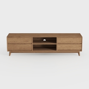
OKD TV Stand for 75+ Inch TV, Mid Century Modern


Modern Amber Glass Oval Coffee Table 3D Model

Minimalist Solid Wood Linen Fabric Extra Long Sofa 3D Model
Looking to transform your home effortlessly? Homestyler is your go-to online design platform! With its user-friendly design tool, stunning 3D renderings, and a wealth of design projects and video tutorials, you can easily unleash your creativity and visualize your dream spaces. Give it a try!
Design Now for FREE
































