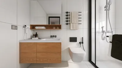


Light grey stands out as a subtle champion in modern interior design. It not only softens contrasts but also enhances the feel of space, providing a tranquil foundation that allows textures, lighting, and strategically placed accents to take center stage. Recent projects in both workplaces and residences have shown that light grey consistently boosts visual clarity and lessens sensory strain—a finding supported by research. Steelcase highlights that carefully planned environments enhance focus and well-being, with 70% of employees recognizing their workspace as vital to their performance. Low-contrast color schemes, such as those using light grey, are effective in minimizing cognitive overload in different settings. Furthermore, the WELL v2 standard emphasizes the importance of light quality and color accuracy for comfort and circadian health—factors that harmonize beautifully with light grey’s reflective quality.
As a practical cornerstone, light grey finishes usually exhibit reflectance values ranging from 50% to 70%. This characteristic allows for a gentle light reflection that enhances uniformity without causing glare, especially when combined with lighting setups that conform to IES recommendations, such as 300–500 lux for task areas and 100–200 lux for circulation zones. Research conducted by Herman Miller reveals that varying posture settings and specialized areas for collaboration versus concentration can boost perceived productivity and comfort, which is why I incorporate light grey to visually connect these areas while allowing elements like acoustics, lighting, and furniture to shape behavior. For combined living-dining spaces, a similar method helps minimize visual clutter, creating a serene and cohesive atmosphere.
Design Principles: Bringing Light Grey to Life
I view light grey not merely as a color choice but as a foundational material for the space. To prevent any sense of blandness, I introduce three key elements: texture, temperature, and proportion.
Living Rooms: Gentle Contrast and Subtle Focal Points
Begin with a light grey base (LRV 55–65) in a matte or eggshell finish to eliminate harsh glare. Enhance the room with a textured rug featuring stone or charcoal flecks, complemented by a sofa in a slightly warmer shade of grey to maintain visual depth. Adding a singular sculptural element—a sleek oak coffee table or a matte black linear reading lamp—provides a resting point for the eye. If the arrangement requires adjustments for sightlines and proximity, employing an interior layout planner like the Homestyler tool can streamline iterations while ensuring a modern aesthetic.
Bedrooms: Soothing Neutrals and Circadian-Friendly Lighting
In bedroom designs, I keep illumination soft and layered, aiming for 50–150 lux for general ambiance during winding down, while utilizing 300–500 lux for task lighting when necessary. The use of warm LED lights in the 2700–3000K spectrum is essential. Light grey linens with deeper charcoal trim offer a hint of definition, and a headboard made from bouclé or felt provides acoustic comfort. For smaller spaces, a light grey ceiling visually enhances the height and soothes transitions between walls and trims.
Kitchens: Sleek Lines and Long-lasting Finishes
Light grey cabinetry presents a modern yet forgiving look, favoring low-sheen, fingerprint-resistant laminates or durable MDF with a strong topcoat. Pair it with honed quartz in off-white or light terrazzo to add movement. Introduce tonal diversity at the backsplash with vertical stacked tiles in mist grey or use micro-cement for an unbroken, minimal surface. Under-cabinet task lighting calibrated at 3000–3500K ensures high color rendering for food preparation while maintaining a warm environment.
Bathrooms: Tranquil Vibes with Smart Reflectance
To manage glare more effectively, balance glossy and matte finishes. Large-format light grey porcelain tiles reduce visible grout lines and can be coupled with matte plaster or ceramic above wet areas. Incorporating warm metallics, like brushed brass or champagne, keeps the design from feeling too sterile. I prefer backlit mirrors with a CRI of over 90 to ensure natural-looking skin tones.
Home Offices: Focused and Low-Glare Work Environments
In a home office setting, I create a low-contrast ambiance using light grey walls paired with a mid-grey desktop, significantly reducing reflections from screens. Aim for 300–500 lux for horizontal task lighting, supplemented with vertical lighting to lessen eye strain. Introducing a single accent hue—such as sage or muted clay—can inject energy while keeping distractions at bay. Additionally, acoustically absorbing elements like felt pinboards or grey-toned wool curtains improve speech privacy during virtual meetings.
Open-Plan Apartments: Effective Zoning with Minimal Visual Disruption
Light grey is particularly effective for subtle zoning. Use variations in flooring—different but complementary grey rugs—to delineate living from dining areas; adjust lighting temperatures across zones (warmer for lounge spaces, neutral for dining or work areas). A slim, light ash slatted screen can add privacy while maintaining a unified palette. Utilize tools like the Homestyler room design visualization tool to verify generous circulation space in arrangements.
Lighting Strategy: Managing Color Temperatures, Dimming, and Glare
Light grey not only improves lighting decisions but also makes errors more apparent. I align the lighting with the space’s purpose and the time of day: opting for 2700–3000K in relaxation areas and 3000–3500K where alertness is key. It's vital to keep the Unified Glare Rating low through the use of diffusers, baffles, or indirect lighting approaches. Accent lighting at 200–300 lux on artworks or textured walls infuses dimension into a restrained color palette.
Color Psychology: A Calming Foundation with Purposeful Accents
From a psychological perspective, low-saturation colors help lower arousal levels and enhance concentration. Light grey offers a neutral base that allows for personal expression through art, books, and seasonal textiles. For clients needing bursts of energy, I incorporate small, high-chroma accents in limited doses—such as throw pillows or a singular chair—ensuring the overall palette remains soothing.
Materials and Sustainability: Authentic Surfaces and Thoughtful Choices
I emphasize materials that provide real texture and have manageable upkeep. Options like wool, recycled polyester blends, FSC-certified woods, and low-VOC paints contribute to clean air quality and practical aesthetics. In high-traffic areas, opt for slip-resistant matte tiles, while in living spaces, oiled wood flooring develops a beautiful patina against light grey walls.
Small Spaces: Considerations for Scale, Finish, and Storage
In petite rooms, it's best to stay toward the lighter side of the grey spectrum and maintain uniform sheen across prominent surfaces to avoid visual clutter. Wall-mounted storage in the same light grey helps create a seamless appearance, making the space seem more expansive. Mirrors should be positioned to reflect indirect light rather than directly facing windows to mitigate glare.
My Preferred Palettes
In terms of lighting quality and human health adherence, I cross-reference the performance guidelines of WELL v2 and IES lighting standards. Insights on workplace comfort and behavior drawn from Steelcase research consistently reinforce that layered lighting and controlled contrasts over a light grey backdrop foster comfort and a perception of spaciousness.
FAQ
North-facing light tends to be cooler, so integrating a warm grey with beige or green undertones can help balance the light and prevent the room from feeling too chilly.
Incorporate varied textures (like bouclé, ribbed wood, and honed stone), slightly differing values across furnishings, and strategic accent lighting to create depth on surfaces.
For living rooms and bedrooms, utilize 2700–3000K lighting to encourage relaxation, while 3000–3500K is preferable for kitchens and home offices where alertness and accurate color rendering are critical.
Indeed. Light grey provides a neutral backdrop that allows vibrant art to shine without clashing with the wall color. Opt for a low-sheen finish to minimize reflections.
Maintain a consistent wall color while defining zones using rugs, pendant arrangements, and the silhouettes of furniture. Slight variations in fabric grey and lighting temperature can signal different functions without adding clutter.
For contrast balance, consider warm woods (like oak or walnut) or lighter terrazzo/concrete for a crisp contemporary vibe. Ensure that flooring is distinctly warm or cool to avoid muddled mid-tones.
Absolutely—select a lighter grey value (LRV around 60–70), keep trimmings in the same grey family, and minimize harsh contrasts. Built-in elements in matching grey can enhance the perception of space.
Utilize matte or eggshell paints, alongside indirect or diffused lighting, as well as mid-grey desktop finishes to reduce reflections on screens and glossy surfaces.
For a warm touch, consider brushed brass or bronze fixtures. For cooler schemes, stainless steel or blackened steel works well. Consistent metal finishes across hardware and lighting help establish cohesion.
Utilizing materials like wool, linen, and textured cotton can enhance depth. For enhanced performance, select recycled blends that offer a soft feel, ensuring the palette remains tactile and enduring.
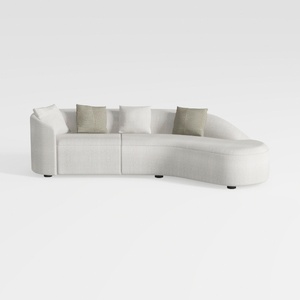

Minimalist Fabric Curved Sectional Sofa With Throw Pillows 3D Model
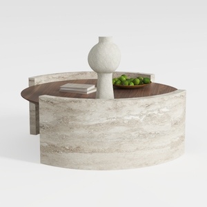
Minimalist Travertine Walnut Round Coffee Table 3D Model

Minimalist Fabric Curved Sofa With Throw Pillow 3D Model
Homestyler is your go-to platform for home design inspiration. With a user-friendly online design tool, stunning 3D renderings, an array of design projects, and helpful DIY video tutorials, transforming your home has never been easier or more fun! Dive in and unleash your creativity today!
Desain sekarang Gratis
































