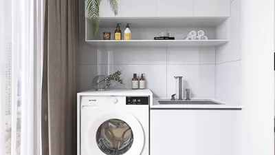


I have always thought that a wall should be more than just a barrier; it should encourage interaction, capture light, and subtly influence the movement and feelings of those within the space. Properly designed textured walls can achieve all of these functions. When executed correctly, they can create visual depth, control brightness, and impact color perception throughout various times of the day. According to the WELL Building Standard (WELL v2), maintaining visual and tactile diversity enhances both cognitive and sensory comfort. In line with this, the Illuminating Engineering Society (IES) suggests maintaining balanced light levels to reduce glare, and textured surfaces can effectively diffuse harsh highlights instead of reflecting them.
Texture plays a significant role in color psychology as well. Using warmer shades on slightly glossy plaster can create a more intimate and restorative environment, while cooler tones on a smooth stipple finish can invigorate a space without overwhelming those within it. As highlighted by Verywell Mind's insights into color psychology, warmer tones often promote a sense of coziness, while cooler tones can enhance alertness. Combining these colors with the appropriate texture elevates the desired ambiance. Research from Steelcase indicates that visual variety in workplaces correlates with reduced stress levels and increased engagement, making the introduction of subtle wall textures an effective way to achieve diverse aesthetics without cluttering the visual experience.
Reading Light and Shadow: Setting a Design Intention
Before I begin mixing materials or grabbing a trowel, I take the time to observe how light interacts with the wall throughout the day. Direct sunlight creates sharp shadows that can exaggerate rough textures, whereas soft light from north-facing windows tends to soften those features. It's crucial to align the scale of textures with the lighting conditions. In cases of intense directional light, opting for finer textures can help avoid stark contrasts; conversely, in more muted ambient light, medium textures provide clarity without appearing overly busy. If you're considering furniture placement or defining pathways, using a layout tool can help you visualize how textured walls will relate to sightlines and daylight.
Subtle Plaster Finishes: Velvet, Limewash, and Burnished Skim
For areas like living rooms and bedrooms, I often choose delicate plaster finishes as my first option. A thin skim coat applied with a steel trowel results in gentle, cloud-like variations—no heavy ridges, only soft movement. Applying limewash over a smooth base creates a matte, chalky depth that remains breathable, which is perfect for soothing color palettes. If I burnish the final coat with light pressure and figure-eight motions, it achieves a satin finish that captures evening light beautifully without becoming too reflective. It's essential to keep the sheen lower than high gloss to adhere to IES luminance guidelines; excessive specular reflection can lead to contrast that’s uncomfortable.
Hand-Troweled Patterns: From Broken-Glass to Drifted Sand
When I'm aiming for a distinctive character, I employ controlled trowel patterns. A broken-glass texture is created using short overlapping strokes with varying pressure; it conveys a modern look that pairs excellently with monochrome color schemes. A drifted sand finish is achieved by pulling the trowel in long, low-pressure strokes, followed by gently cross-brushing with a soft masonry brush to create fine striations. Remember to always create a 2×2 ft sample to test the finish under natural and task lighting, as the perception of texture can seem amplified on larger surfaces.
Roller Techniques: Stipple, Knockdown, and Crosshatch
Using rollers can simplify achieving a consistent texture for DIY enthusiasts. A traditional stipple effect can be created with a medium-nap roller in combination with thinned joint compound; knockdown technique softens stipple by lightly troweling the peaks after the compound has partially set, resulting in an inviting contemporary finish. For a rhythmic visual effect, applying a crosshatch technique (by layering two perpendicular coats) creates a woven appearance that complements linear furniture and millwork beautifully. Always feather the edges to prevent a framed appearance; textured finishes should feel seamlessly integrated rather than outlined.
Dry Brush and Glaze: Quiet Depth Without Bulk
In spaces where acoustic amplification is a concern, I tend to avoid heavy textures and rely instead on dry brushing and glazes. Applying a translucent glaze over a matte base introduces subtle variations that diffuse bright spots. By dragging a dry brush vertically in broken lines, a faint linen effect emerges—light enough to allow for repainting when necessary. This method is particularly suited for hallways and smaller rooms as it adds depth without constricting the sense of space.
Stencil Relief: Crisp Geometry with Minimal Build
For clients who prefer a sense of order, stencil relief provides clear geometric lines. I apply a thin compound using a mylar stencil, gently lifting it, allowing it to set, and then feathering the edges. The design is visible from a distance while appearing nearly smooth up close, which allows for easier maintenance. I generally opt for low-contrast paint so that the pattern emerges through shadows rather than stark color blocks.
Natural Aggregates: Sand, Mica, and Fiber
Incorporating aggregates adds a layer of tactile authenticity. Mixing fine sand into the topcoat gives a subtle texture, adding mica flakes introduces a hint of sparkle in evening lighting, and including cellulose fibers enhances micro-texture while mildly improving sound diffusion. It's important to use conservative ratios to maintain reliability. Natural aggregates pair exceptionally well with earthy color themes and eco-friendly finishes, akin to what you might find in Homestyler's design options.
Acoustic Considerations: Texture That Softens Sound
Shiny, hard walls can create sound reflections. To counteract this, selecting matte finishes alongside micro-relief textures can help absorb soundwaves. In spaces like home offices and media rooms, combining these textured walls with soft furnishings and drapes aids in achieving a harmonious acoustic environment. Light stipple or limewash applied on plaster can enhance sound diffusion without making the room overly absorptive; it’s all about finding that delicate balance that keeps speech clarity intact.
Color + Texture Pairings: Mood Mapping
I align textures with color psychology to create targeted moods. Cozy areas like reading nooks and dining corners thrive on warm mid-tones over soft plaster. In contrast, focus environments like studios or work areas respond well to cooler neutrals layered on crisp stipple, ensuring define edges remain visible. For pathways or circulation spaces, opting for subtle color palettes featuring gentle crosshatch strategies prevents visual fatigue while providing unobtrusive orientation cues.
Sustainability and Materials: Healthy Walls
I prioritize low-VOC primers and paints, along with mineral plasters and limewash formulations for their breathable qualities. Using reusable tools, low-waste masking techniques, and careful mixing processes further diminish the environmental impact of my work. If you're considering materials for a larger renovation, it’s wise to consult WELL v2 guidelines regarding air quality and materials to ensure they meet health-conscious standards.
Ergonomics of DIY: Safe, Calm, Repeatable
Engaging in textured wall applications is as much about proper ergonomics as it is about creative expression. Working at shoulder height when possible, utilizing extension poles to limit the need for ladders, and scheduling breaks can help maintain consistency in application. Additionally, the weight of trowels and rollers is crucial; a well-balanced tool can prevent wrist strain and sustain finish quality from start to finish.
Planning the Wall: Layout, Focal Points, and Transitions
Texture should be part of an overall spatial strategy. Identifying focal walls where natural light enhances the texture, keeping adjoining walls smooth for contrast, and managing corner transitions through feathering instead of abrupt stops are vital for good design. When assessing furniture placements or door swings that could affect textured surfaces, using an interior layout planner can help you anticipate sightlines and shadow dynamics prior to finalizing your decisions.
Execution Steps: A Reliable Workflow
1) Prepare: Fill, sand, and prime. 2) Mockup: Create a sample board. 3) Mix: Small batches, ensuring consistent viscosity. 4) Apply: Work in sections while keeping a wet edge. 5) Evaluate: Assess under multiple light sources. 6) Adjust: Feather edges and correct ridges prior to complete set. 7) Seal: Optional matte topcoat for durability. 8) Photograph: Document techniques for future reference.
Maintenance: Keep the Texture Fresh
Maintain texture by gently dusting with soft brushes and spot-cleaning with dilute mild soap, avoiding vigorous scrubbing on low-sheen finishes. For touch-ups, use the original formula, re-texturing a slightly larger area around the blemish before blending in the paint.
FAQ
Q1: Will textured walls make my room feel smaller?
A: Excessive heavy textures in high contrast can create a constricted feeling. Opt for fine to medium textures with matte finishes while maintaining low color contrast for a more open atmosphere.
Q2: How does lighting affect wall texture?
A: Direct lighting creates pronounced shadows and highlights; softer ambient light can smooth out textures. Strive for balanced luminance to manage glare as recommended by the IES.
Q3: Which textures suit a home office?
A: Employing light stipple or a dry-brushed glaze in cooler neutral tones promotes focus. It's wise to avoid glossy finishes that may reflect monitor light and contribute to visual strain.
Q4: Is limewash a good option for humid areas?
A: Limewash offers breathability and mildew resistance when properly applied over suitable substrates, making it a viable choice for powder rooms with adequate ventilation.
Q5: Can I combine patterns across different walls?
A: Absolutely, but ensure one wall acts as the focal point while adjacent walls remain simpler. Too many textures may compete visually; vary the scale and sheen instead of stacking heavy patterns.
Q6: Does texture help acoustics?
A: Textures with micro-relief and matte finishes can help scatter sound, thus reducing clear reflections. Combining this with soft furnishings can lead to substantial acoustic improvements.
Q7: What’s the easiest DIY technique for beginners?
A: The knockdown technique using thinned joint compound is quite forgiving. Apply stipple with a roller, wait for partial setting before lightly troweling down the peaks.
Q8: How do I select colors that match a texture?
A: Warm medium tones on soft plaster cultivate a cozy environment, whereas cool neutrals on defined textures clarify visual elements. Take note of how daylight alters color temperature throughout the day.
Q9: Should I seal textured walls?
A: A matte sealer helps maintain and clean the texture without introducing unwanted sheen. It’s recommended to trial on a sample to ensure it doesn't darken the finish.
Q10: How do I avoid visible seams?
A: Maintaining a wet edge, working in manageable sections, and feathering edges will help eliminate visible seams. Make sure to revisit edges before they fully set to smooth over lines.
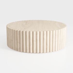
Minimalist Solid Wood Fluted Round Coffee Table 3D Model
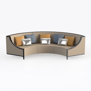
Modern Fabric Curved Sectional Sofa With Decorative Throw Pillows 3D Model
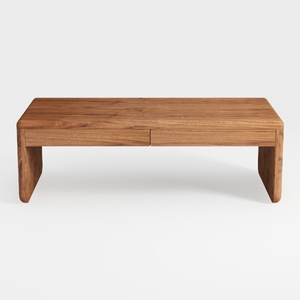
Minimalist Solid Wood Two Drawer Coffee Table 3D Model
Homestyler is an exceptional online platform for home design enthusiasts. Its user-friendly design tool allows you to create stunning layouts, while impressive 3D renderings and a wealth of DIY video tutorials inspire your creativity. Transform your space effortlessly with Homestyler!
今すぐ无料でデザイン
































