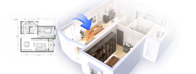
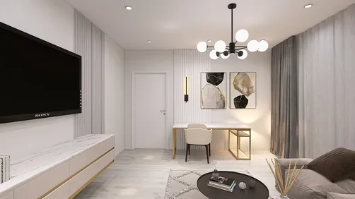
In the last ten years of my career as an interior designer, I’ve observed that open-concept living and dining areas have evolved into the nucleus of family homes. Choosing the right wall color can create a sense of unity, spaciousness, and inviting warmth in these communal spaces. This is especially true for smaller areas where creativity can really shine. In this article, I’ll share ten paint ideas for living and dining rooms that I have personally applied and adored, blending my experience from client projects with the latest design trends, including insights from platforms like Homestyler.
1. Soft Greige Harmony
My Experience: I once transformed a compact living-dining area with a warm greige tone, successfully harmonizing modern furnishings with a cozy atmosphere. This gentle neutral created a connection between both spaces.
Benefits: Greige complements nearly any style of decor and facilitates a smooth transition in an open layout, particularly when enhanced with natural light. It softly reflects daylight, minimizing harsh shadows.
Drawbacks: For those who prefer bold expressions, this shade might feel overly safe, and it can appear dull in dimly lit areas.
Pro Tip: Test at least two shades on your walls to see how light affects the color throughout different times of the day.
2. Deep Navy Accent
My Experience: Utilizing deep navy on a feature wall behind the dining table has been a favorite of mine, as it creates a designated space without physical barriers.
Benefits: This sophisticated color creates a striking focal point and complements wooden accents and brass decor nicely. According to Behr’s 2023 trend guide, navy is a timeless choice for blending formal and casual settings.
Drawbacks: Overusing dark tones can visually shrink a space, especially in the absence of proper lighting.
Pro Tip: Pair the navy with lighter trims or adjacent walls painted in warm white to maintain a sense of balance.
3. Warm Terracotta Glow
My Experience: In a loft project, painting the dining nook terracotta highlighted the transition between living and dining areas, introducing a Mediterranean warmth that encouraged meals to last longer.
Benefits: This shade injects energy and warmth into spaces with abundant natural light — often sought after by users searching for ‘warm dining room paint colors for open floor plans’ on platforms like Homestyler.
Drawbacks: In small rooms, fully painting all walls terracotta can be overwhelming.
Pro Tip: Consider using this color on one wall or as half-height paneling for a more balanced aesthetic.
4. Soft Sage Green
My Experience: This serene color brings to mind the tranquility of the countryside. I utilized sage walls paired with linen curtains, which immediately calmed a bustling open space.
Benefits: Ideal for biophilic designs, this color fosters a connection with nature and helps minimize visual clutter, as indicated by a 2022 Houzz study.
Drawbacks: Its appearance can skew towards grey or minty tones based on the lighting conditions, so always test samples in both natural and artificial settings.
Example: This shade works wonderfully alongside botanical prints or rattan furniture.
5. Bold Charcoal Contrast
My Experience: In a modern loft, I applied charcoal behind the sofa and dining chairs — it allowed the artwork to pop and distinctly defined the seating areas.
Benefits: The strong contrast elevates decorative elements and creates depth, perfectly suited for minimalist interiors.
Drawbacks: Requires thoughtful lighting design to prevent a heavy atmosphere.
Pro Tip: Opt for a satin finish to reflect more light than a flat application.
6. Muted Blush Walls
My Experience: A subtle blush tone in an open living and dining area can lend a welcoming yet romantic ambiance without becoming overly sweet.
Benefits: It warms cool lighting schemes and pairs beautifully with wooden flooring.
Drawbacks: This shade might not harmonize with all furniture colors, and excessive pink can feel juvenile.
Midway Example: I appreciated how muted pastels balanced angular furniture in a small apartment design.
7. Crisp White Canvas
My Experience: White walls serve as a designer’s perfect blank canvas. In an open-plan condo, they allowed my client’s art and textiles to stand out.
Benefits: Maximizes perceived space and enhances light, offering versatility for evolving decor themes.
Drawbacks: Without layered textures, white can appear sterile; dirt accumulation can also be a concern.
Pro Tip: Choose a warm white as opposed to a stark white for a cozier ambiance.
8. Two-Tone Balance
My Experience: I enjoy crafting a horizon effect with two colors — darker tones near the floor and lighter shades above, providing a grounding visual.
Benefits: This method visually elevates wall height and distinguishes spaces without employing physical dividers.
Drawbacks: Precisely measuring and steady hands are required to avoid uneven color lines.
Pro Tip: Select complementary shades for seamless transitions rather than contrasting colors.
9. Dusty Blue Calm
My Experience: A soft dusty blue evokes memories of coastal vacations. Using it with driftwood furniture once transformed a balcony-facing living area.
Benefits: This relaxing hue pairs excellently with neutral upholstery, promoting a calming atmosphere.
Drawbacks: Could appear chilly when combined with grey flooring unless warm accents are included.
Pro Tip: Layer in beige throws or jute rugs to introduce warmth.
10. Dramatic Emerald Green
My Experience: For a striking statement, emerald green proves both bold and elegant. In one dining area, it was paired with velvet chairs, creating pure glamour.
Benefits: Rich and luxurious, this jewel tone is trending for accent walls in multi-function spaces according to Sherwin-Williams.
Drawbacks: Overuse might make a space feel enclosed.
Pro Tip: Balance this bold color with neutral decor pieces and utilize greenery to echo its vibrant tones.
Note: The combination of emerald with wood accents introduces an inviting natural warmth.
Summary
Small or shared areas aren’t limitations — they’re chances to innovate your design approach. Selecting the right paint can elegantly connect your living and dining zones, enhancing their depth, warmth, or energy. As noted by Better Homes & Gardens, color is one of the quickest and most cost-effective methods to refresh open layouts. Which of these ten living room and dining room paint concepts would you experiment with first?
FAQ
1. How should I select paint colors for a combined living-dining area?
Choose hues that harmonize with each other and are suited to your lighting conditions. Neutral and soft tones typically offer safer cohesion.
2. Can different colors be used for living and dining spaces?
Absolutely — just ensure a shared undertone or a consistent accent color links them together.
3. What paint finishes are ideal for high-traffic, open areas?
Eggshell or satin finishes provide durability and are easier to clean in comparison to matte options.
4. Do darker colors really make small spaces feel more cramped?
Not necessarily — a well-placed dark accent wall can add depth without compressing the overall space.
5. How can I prevent white walls from appearing too sterile?
Incorporate textures through rugs, curtains, and cushions, and consider warm lighting.
6. Are two-tone walls considered out of style?
Not at all — with the right subtle complementary shades, they can feel contemporary and chic.
7. What is the most timeless color for interconnected spaces?
Soft neutral palettes like greige or warm white tend to retain their appeal over time, according to Dulux’s color trend analyses.
8. Is it important to test paint colors before commitment?
Definitely. Apply swatches to larger sections of wall and observe the effects under various lighting before finalizing your choice.
Homestyler is your go-to online platform for home design! With its user-friendly design tool, stunning 3D renderings, and a wealth of inspiring DIY video tutorials, you can effortlessly create and visualize your dream spaces. Discover your style and transform your home today!
Design Now for FREE


