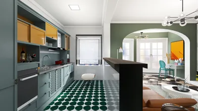


From my experience, the most effective living rooms do more than just look appealing—they seamlessly manage light, sound, daily wear, and individual routines. Utilizing modern wall tiles is an excellent strategy to achieve this equilibrium, particularly when aiming for sleek lines, depth, and a timeless atmosphere. A well-thought-out choice of tiles can minimize glare, enhance acoustic comfort, and subtly affect the mood through texture and color, making it essential for creating a space that feels just right. By incorporating tools like Homestyler, you can visualize these tile choices in your own environment.
Research frequently indicates the importance of designing spaces with human factors in mind, rather than focusing solely on aesthetics. According to the WELL Building Standard, quality lighting and glare control greatly enhance comfort and visual clarity, while circadian-friendly illumination supports better overall well-being. Steelcase's findings also tie visual organization and material clarity to reduced cognitive fatigue and improved concentration, which can be applicable in both workspaces and living areas. It's crucial to get these basics right, just as much as it is to select a tile that resonates with you.
To prevent excessive brightness, I closely monitor illuminance targets and surface reflectance levels. The IES lighting guidelines recommend that ambient lighting in living areas should ideally range from 100 to 300 lux for leisurely activities, while more focused tasks may require higher levels. Selecting matte or honed finishes can help distribute light more evenly and soften contrast, reducing any vertical glare caused by light hitting the walls directly.
Design Intent: Understanding the Benefits of Modern Wall Tiles
Modern tiles offer clarity and rhythm to your space. Large-format porcelain or sintered stone panels create serene sightlines, while textured ceramics add depth without overcrowding. When combined with controlled lighting—2700 to 3000 Kelvin for comfortable evening relaxation, and 3500 Kelvin for a more vibrant daytime atmosphere—you can cultivate a living room that feels both elegant and inviting. Tiles also provide long-lasting durability, even as you rearrange furniture and decor over time.
Material Choices: Exploring Porcelain, Ceramic, and More
Porcelain is my top pick for living room applications due to its density, low porosity, and uniform appearance. It's an excellent choice for accent walls behind media units or fireplaces, as long as you verify local codes and thermal tolerances. For a softer touch, consider glazed ceramic with a satin or matte finish; it avoids glare and minimizes fingerprints. If sustainability is a priority, search for tiles with recycled materials or recognized environmental certifications. Natural stone-look porcelains embody the elegance of marble or travertine while eliminating maintenance hassles.
Format and Proportion: Choosing Between Large Panels and Modular Patterns
Opting for large-format tiles (24" by 48" or larger) can reduce grout lines, creating a sleek continuity ideal for modern interiors. Modular formats—such as 3"×12" or 4"×16"—can be arranged in patterns like stacked, running bond, or herringbone, contributing subtle movement. A helpful guideline is to align grout lines with furniture axes and major sightlines to minimize visual clutter. If experimenting with various walls, tools like room layout planners or Homestyler can assist in achieving symmetry and balance before installation.
Texture and Light: Minimizing Glare while Adding Depth
Tiles featuring micro-textures, ribbing, or light relief patterns beautifully capture side lighting. I recommend using wall washers positioned 12 to 18 inches from the wall to generate soft shadows. Maintaining a consistent color temperature throughout the room; mixing warm and cool lamps can create uneven appearances on the tile surface. For screens and artwork, it’s wise to avoid glossy finishes near direct light to prevent distracting reflections. The WELL v2 standard emphasizes glare reduction and visual comfort, guiding principles that are just as relevant in residential settings as they are in commercial environments.
Color Psychology: Crafting Atmosphere with Hue and Finish
A neutral palette featuring warm grays, soft taupes, and muted clays enhances the versatility of a living room, accommodating both daytime gatherings and evening relaxation. Reports from Verywell Mind highlight that blue shades can evoke feelings of peace and stability, while greens represent balance and rejuvenation. I typically utilize cooler tones in bright spaces and warm shades in areas used primarily during the evening. A matte finish can temper brightness and create a more intimate ambiance, whereas a slight sheen can enliven darker hues without appearing overly glossy.
Acoustic Comfort: Mitigating Noise from Hard Surfaces
Given that tiles are naturally reflective, it’s imperative to consider acoustic balance in your design. Pair tiled feature walls with sound-absorbing elements such as area rugs, upholstered seating, fabric drapes, or acoustic panels. Employing broken patterns or relief tiles can help disperse sound and minimize echo in elongated rooms. Media walls benefit from a combination of textured tiles with soft furnishings and ceilings designed for sound absorption to ensure crisp dialogue without harsh tones.
Strategic Placement: Designing Focal Walls, Media Niches, and Fireplaces
I typically feature tiles on one prominent wall—the media wall or fireplace surround—while keeping surrounding surfaces more subdued with paint or limewash. In spaces with asymmetrical architecture, a tiled panel can help visually balance the area. Ensure tile modules align with the width of your sofa or console for intentional proportions. Prior to finalizing decisions, utilize a layout simulation tool to test furniture arrangements and sightlines, potentially using platforms like Homestyler for value.
Grout Strategy: Selecting Color, Width, and Maintenance
The choice of grout color is a significant design aspect. Matching grout to tiles reduces the visibility of the grid, while contrasting grout highlights patterns. In living rooms, I opt for tighter joints—ranging from 1/16" to 1/8" wherever substrate permits—to maintain a tidy aesthetic. Choose stain-resistant grout for high-traffic areas and perform a vacuum before damp cleaning to safeguard the tile finish. For textured tiles, ensure the grout selected does not overly fill intricate relief areas.
Lighting Integration: Creating Warmth and Contrast
Having layered lighting is essential. Combine dimmable ambient lighting (approximately 200 to 300 lux for evening settings, following IES guidelines) with accent lighting to highlight textures—think linear LEDs behind floating shelves, adjustable wall washers, and table lamps set to 2700K for warmth. Maintain a CRI of 90+ to authentically render the colors of your tiles. For darker tiles, consider adding low-level floor or toe-kick lighting to create depth without contributing glare.
Style Playbook: Timeless Contemporary Designs
- Minimalist slabs: Employ large-format stone-look porcelain in soft gray or warm beige, utilizing very thin grout lines, complemented by oak and linen furnishings.
- Sculpted ceramics: Vertical fluted tiles or subtle three-dimensional relief can be beautifully showcased with warm wall washing.
- Monochrome statements: Deep green or charcoal matte tiles against light-colored upholstery; balance these with accents in brushed brass or blackened steel.
- Patterned modules: Slim rectangular tiles arranged in stacked bonds for crisp geometry, or a soft herringbone pattern for gentle movement.
- Mixed finishes: Combine matte field tiles with a slight sheen border to frame a media niche; ensure the color palette remains tight and the sheen change subtle.
Sustainability and Maintenance Considerations
Select low-VOC adhesives and verify environmental data when applicable. The durability of porcelain makes it an eco-friendly choice in many households—a reduction in the need for frequent replacements, along with consistent performance. Plan for access: if your media wall conceals wiring, consider designing removable panels or incorporating access covers before tiling.
Installation Guidance: Properly Preparing the Substrate
Flatness is vital for installation success. In feature walls, even a slight wave can affect large-format panels. Use proper backer boards and ensure everything is plumb and level; dry-fit everything to make sure grout lines align with significant architectural features and furniture. For fireplaces, confirm that both tile and setting materials can withstand the expected heat exposure.
References for Authority
For more comprehensive guidance on lighting and well-being, I often turn to the standards set by WELL v2 and IES lighting recommendations: WELL v2, IES standards.
Questions and Answers
Matte or honed finishes are effective in diffusing light and reducing glare. Pair these with wall washers using warm 2700 to 3000K lamps to create an inviting contrast.
Indeed. Large panels help in minimizing grout lines and visual distraction. Ensure flatness of the substrate and plan for cable access prior to installation.
I recommend warm neutrals for evenings and cooler tones in spaces that receive abundant daylight. Shades of blue are often calming, while greens promote a sense of healing, as supported by color psychology studies.
Although hard surfaces reflect sound, you can counteract this by incorporating rugs, upholstered seating, draperies, and textured tiles that help diffuse sound reflections.
Utilizing tighter joints—around 1/16" to 1/8"—offers a clean appearance. You can either match grout to tiles for a seamless look or select contrasting options to highlight a pattern.
Lay grazing light with adjustable wall washers approximately 12 to 18 inches from the wall. Ensure a CRI of 90+ for true color rendering and use a color temperature range of 2700 to 3000K for evening warmth.
Yes, provided the tile and setting materials are suitable for the anticipated heat exposure. Always verify the manufacturer's specifications and adhere to local codes.
Definitely, but maintain a cohesive palette. A matte field tile accompanied by a slight sheen accent can add depth while avoiding glare and visual disturbance.
Utilize an interior layout planner to simulate sightlines and furniture arrangements to ensure grout lines and focal points align before finalizing your plans.
Certainly. Large-format tiles can create an illusion of greater space by reducing joints. Light colors and cohesive lighting can help maintain an open feel.
Incorporate warm accent lighting, balance reflectivity with light textiles, and restrict darker tones to a single focal wall to maintain visual harmony.
Porcelain generally boasts greater density and wear resistance, making it a dependable option for high-traffic areas and ensuring long-lasting durability.
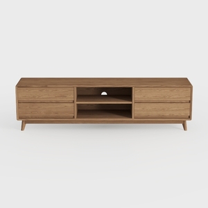
Mid Century Modern Solid Oak TV Stand With Storage Drawers 3D Model
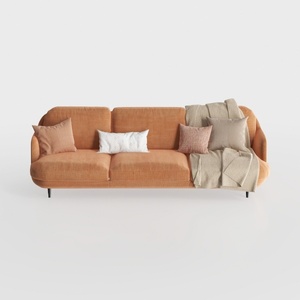

Modern Minimalist Orange Fabric Three Seater Sofa With Throw Pillows 3D Model
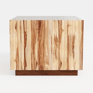
Minimalist Solid Wood Accent Cabinet with Textured Top 3D Model
Homestyler is your go-to online home design platform! With its user-friendly design tool, stunning 3D renderings, a wealth of design projects, and helpful DIY video tutorials, you can easily transform your living space into the home of your dreams. Start designing today!
立即免费设计
































