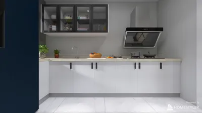


I often chuckle when recalling a particular client who wanted their apartment to embody a 1960s lounge vibe while also being "Instagram-friendly"—I jokingly considered adding an avocado and neon color scheme to the kitchen for fun. After a brief moment of panic and experimenting with numerous sample pots, I discovered that capturing the essence of mid-century color is less about strict adherence to an era and more about achieving a balance between warmth, contrast, and proportion; remarkably, you can even envision mid-century color palettes ahead of time with tools like Homestyler, before you commit to purchasing any paint.
1. Warm Terracotta + Mustard Accent
Terracotta walls evoke a sun-soaked mid-century ambiance while avoiding overt retro vibes. To enhance this look, I typically incorporate mustard-colored cushions or a single painted cabinet as a central focus. This combination provides an immediate sense of warmth; however, the trick lies in avoiding over-saturation of a compact space—keep moldings and ceilings in neutral tones to balance.
2. Avocado Green with Walnut Wood
When combined thoughtfully, avocado green can bring a surprisingly fresh feel, especially when paired with walnut furnishings and brass accents. I successfully transformed a small living room using a soft avocado wall and a walnut sideboard, giving the space an authentic feel devoid of an outdated look. Be mindful of lighting—this pairing thrives under natural light or warm LED fixtures.
save pin
3. Muted Teal and Brass Highlights
Muted teal is my go-to choice when I desire a mid-century aesthetic that doesn’t feel too cold. It beautifully anchors seating areas, while brass lamps or switch plates add a touch of classic elegance. If you're uncertain, consider painting a small wall or door and assessing it in 3D using Homestyler, allowing you to see how the teal interacts across the space—sometimes the perception differs between the can and reality.
save pin
4. Dusty Rose with Charcoal Trim
Dusty rose tones can soften contemporary lines and provide an elegant nod to mid-century style without veering into vintage kitsch territory. When paired with charcoal trim, this combination offers contrast and durability; however, be cautious as some variations of rose may appear overly sweet, so sampling different shades is advisable. A budget-friendly tip: try painting the trim first to evaluate the contrast before finalizing wall colors.
save pin
5. Soft Beige Base with Black Accents
For a timeless mid-century backdrop that endures over time, begin with a warm beige base and introduce black accents for door frames, sills, or shelving. This scheme is both classic and easy to coexist with, allowing your furniture to stand out more dramatically. For those who enjoy experimentation, utilizing AI tools like Homestyler can facilitate quick iterations of color combinations, minimizing paint waste—my studio often employs this method for speedy mock-ups.
save pin
FAQ
Q1: What are the timeless colors associated with mid-century design?
A: Classic hues include warm terracotta, muted teal, avocado green, mustard yellow, dusty rose, and warm beige. These shades harmonize beautifully with walnut and brass finishes that define the era.
Q2: How can I effectively test colors in a compact area?
A: Paint swatches on various walls and observe them during different times of the day. I also recommend using small test pots and capturing images of the swatches under your room's specific lighting conditions.
Q3: Do mid-century colors mesh well with contemporary furniture?
A: Indeed—mid-century palettes can gracefully complement the clean lines of modern pieces, adding warmth and character without creating discord.
Q4: Are vibrant mid-century colors appropriate for rental homes?
A: Absolutely! Consider using removable wallpaper, peelable paint on furniture, or limiting changes to a single accent wall to keep your alterations reversible and landlord-approved.
Q5: What type of paint finish should be chosen?
A: Eggshell or satin finishes for walls create a subtle sheen that's forgiving in small spaces; reserve semi-gloss for trim and highly-used surfaces for easy maintenance.
Q6: How do I coordinate paint with wood tones?
A: Warmer shades like terracotta and mustard complement lighter woods, while cooler tones such as teals and charcoals harmonize with darker walnut. It's wise to test a large swatch next to your furnishings for accuracy.
Q7: Are there reliable resources for color trend insights?
A: Yes—many paint manufacturers issue trend forecasts; for instance, Sherwin-Williams provides annual reports on color trends that serve as valuable references (check out the Sherwin-Williams Color Forecast 2024).
Q8: Can I achieve mid-century aesthetics on a budget?
A: Certainly! Utilize a neutral foundation and accessorize with affordable accents like cushions, a painted shelf, or a single statement wall to capture the look without overspending.
save pin
Homestyler is your go-to online home design platform, perfect for effortless creativity. With its user-friendly design tool, stunning 3D renderings, and a treasure trove of DIY video tutorials, you can transform your space into a masterpiece with ease. Start designing today!
立即免费设计
































