


For over ten years, I have relied on black-and-white wallpapers to bring clarity, a sense of visual height, and tranquility to small rooms. The use of monochrome effectively narrows down the color palette, allowing patterns and proportions to carry the design: a well-chosen motif can elongate walls, create cleaner sightlines, and mitigate clutter. When working in compact spaces, I pay attention to the scale of patterns, contrast ratios, and how they reflect light, anchoring the overall theme with inviting textures and functional lighting solutions, such as those offered by Homestyler.
Performance is key when designing small spaces. The WELL v2 standard recommends maintaining ambient lighting at 300–500 lux to effectively support day-to-day activities, while also managing glare to minimize eye strain. By combining high-light reflectance value (LRV) white walls with diffused lighting, you can brighten small rooms without the harsh effects of direct lighting (source: wellcertified.com). Research from Steelcase indicates that too much visual complexity can increase cognitive load; hence, utilizing streamlined, high-contrast designs can help inhabitants focus and feel more comfortable, a particularly valuable trait in smaller environments (source: steelcase.com/research). These insights inform my choices regarding pattern density and sheen, ensuring that rooms appear more spacious and serene, especially when utilizing tools like Homestyler to visualize layouts.
Choose the Right Scale: Small Repeat vs. Oversized Motif
The first aspect to consider is scale. Small repeating patterns such as pin-dots, pencil stripes, and delicate geometrics can soften room boundaries and create the illusion of higher ceilings by blurring lines. On the other hand, larger motifs—like broad stripes, bold chevrons, and oversized botanicals—convey confidence and reduce visual clutter by simplifying shapes. Typically, I test two size options: one that is tight and another that is bold, assessing their interaction with doors, windows, and furniture arrangements. For narrow hallways, a fine vertical stripe can elongate the space, while a large, airy pattern in a rectangular bedroom can help furniture feel more anchored.
Directional Patterns to Manipulate Perception
The direction of patterns dramatically influences perception. Vertical stripes or linear designs create an impression of height, while horizontal patterns can widen a space. Adding diagonal or herringbone patterns injects energy into a room—ideal for areas that require vivacity but may be overwhelming in busy settings. When choosing vertical designs for lower ceilings, I opt for subtle contrasts (like soft black on warm white rather than stark black on pure white), and increase the contrast slightly for horizontal lines in narrow spaces to maximize breadth. If you're looking for support in visualizing layout and focal walls, tools like Homestyler are invaluable for simulating sightlines and pattern orientation with furniture arrangements in mind.
Contrast Ratios: Crisp vs. Soft Monochrome
In confined areas, strong contrast can delineate edges but also amplify the feeling of clutter. I usually select from three contrast levels: sharp (near-black on bright white), moderate (charcoal on off-white), and soft (wash-like greys on a light base). Crisp contrasts work well in minimalist spaces with hidden storage and few decorative objects, while a moderate contrast provides a balanced option for multipurpose rooms. Soft contrasts harmonize well with textured elements—like wood, linen, or bouclé—allowing the pattern to enhance warmth rather than overwhelm. To prevent a claustrophobic feeling in very small spaces, I recommend keeping black surfaces below 40% of the wall area, utilizing lighter ceilings to maintain an uplifting vibe.
Finish Matters: Matte, Eggshell, and Gloss
The finish of wallpaper affects depth perception and glare. Matte finishes absorb light, helping to minimize hotspots and creating a smoother look for irregular walls. Eggshell finishes provide subtle reflections that keep a room lively without harsh glare. Glossy wallpapers can be chic, but in smaller spaces, they tend to reflect objects and introduce visual noise; therefore, I prefer to reserve gloss for accent elements, such as wainscoting or behind artwork, where reflection enhances the design instead of creating distraction. It's essential to match finishes with appropriate lighting: use matte with wide beam spreads and dimmable lights, eggshell with gentler flood sources, and glossy finishes with focused beams to avoid washouts.
Pattern Types That Work Hard in Small Rooms
- Pinstripes and ticking: They create linear order and gentle rhythm, effectively unifying misaligned doors or shelves.
- Grid and windowpane checks: Providing architectural clarity that pairs well with modern built-ins, keeping line thickness moderate adds sophistication.
- Micro geometrics (dots, diamonds): These subtle textures effectively mask minor wall imperfections while calming visual busyness.
- Large grayscale botanicals: They instill organic movement without adding color chaos; opt for airy designs that incorporate negative space.
- Trompe-l'œil textures (linen or plaster effects): These add tactile depth while remaining monochromatic.
- Art Deco arcs or scallops: Curvilinear repetitions soften angular rooms; select lighter backgrounds and medium contrast for balance.
Feature Walls: Where Monochrome Leads
A singular patterned wall can establish a hierarchy in design, but strategic placement is essential for success. Ceiling height techniques usually see me opting for the wall facing the entrance to create a welcoming flow, or the headboard wall to visually ground the bedroom. Wrapping highly graphic patterns around corners in small spaces can overwhelm; instead, I often use calming wallpapers around storage areas to let the millwork shine. Consider how patterns interact with entrances—align vertical stripes with window frames and keep the center of motifs away from light switches to maintain a seamless look.
Ceilings, Panels, and Borders
In tiny spaces, applying wallpaper to the ceiling, especially in soft black-and-white micro-patterns, can create an uplifting effect when walls are kept tranquil. Alternatively, place monochrome wallpaper above wainscoting, using painted lower panels to add balance. In older homes where lines may not be precise, borders can smooth transitions; I recommend keeping them slim and either fully tonal or strikingly bold for a deliberate framing effect.
Light Environment: Color Temperature, Beam Control, and Glare
Lighting is crucial when working with monochrome. I aim for ambient lighting of 300–500 lux using layered sources, in line with WELL v2 recommendations (wellcertified.com). I suggest color temperatures ranging from 2700–3000K for cozy settings and 3000–3500K for functionality-focused spaces. Utilizing diffusers or indirect lighting aids in protecting matte finishes and reducing hotspots. Accent lighting with focused beams selectively emphasizes patterns without overpowering the room. Ensuring uniformity in light ratios fosters smooth transitions, and with proper lighting, black-and-white themes can shift from stark to sculptural, enhancing your space when paired with Homestyler's tools.
Acoustic and Material Pairings
Monochrome designs can be bold; to soften the ambiance, consider integrating acoustic textiles. Materials such as wool rugs, upholstered furniture, and fabric roman shades can absorb sound and mitigate the echoing effects often found in high-contrast schemes. When using smooth wallpaper, incorporate varied textures to create a balanced tactile experience—consider bouclé, ribbed wood, or textured linens. It's critical to also look for sustainable materials: opt for FSC-certified paper and PVC-free substrates paired with low-VOC adhesives to maintain healthy indoor air quality. The interplay of tactile diversity will balance the visual styles of black-and-white designs, especially when using digital tools like Homestyler for planning.
Furniture and Artwork Integration
Utilize wallpaper to frame the overall design story. For busy patterns, select simple furnishing shapes and limit the color palette to black, white, and one warm wood hue. Against calmer patterns, you can introduce one graphical piece—perhaps a black-frame artwork or an artistic lamp—that echoes the wallpaper’s motif. Intentionally create negative space to guide the eye from the entry point to focal walls, ensuring that mirrors are strategically placed to reflect light without redundantly multiplying patterns.
Layout and Proportion Checks Before You Commit
Prior to installation, I sketch out potential pattern placements in relation to furniture, door movements, and ceiling heights to avoid awkward cuts or misaligned repeats. Digital tools can help visualize how motifs will flow around windows and cabinetry; utilizing an interior layout planner can effectively test focal points, pathways, and the best placement for feature walls.
Five Black-and-White Wallpaper Strategies for Small Spaces
1) Employ gentle vertical ticking in corridors to create elongated sightlines.
2) Utilize a large-scale grayscale leaf design on the headboard wall with a matte finish and some soft contrast.
3) Implement a windowpane grid behind open shelving to introduce structure and minimize visual clutter.
4) Use trompe-l'œil linen wallpaper throughout the walls, limiting glossy black accents to framing art pieces.
5) Opt for a horizontal broken stripe in a galley kitchen to expand visual width—with an eggshell finish for easy cleaning.
Common Pitfalls and Quick Fixes
- Avoid overly high contrast in cluttered rooms by reducing black coverage or switching to charcoal on ivory.
- Prevent a gloss overload by limiting shiny finishes to contained zones and adjusting beam angles to mitigate glare.
- To eliminate pattern misalignment at corners, either choose less rigid repeats or introduce a tonal border to soften transitions.
- Address dark ceilings that lack counterbalance by lightening trim, incorporating higher LRV rugs, and boosting ambient light levels.
FAQ
Q1: Will black-and-white wallpaper make my small room feel smaller?
A1: If you manage the scale and contrast wisely, it doesn’t have to. Opt for vertical or large airy motifs with moderated contrast to visually enlarge the space and simplify edges, ultimately making the room feel more expansive.
Q2: What lighting should I pair with monochrome wallpaper?
A2: Aim for ambient lighting in the range of 300–500 lux, incorporating dimmable options and controlled glare, ideally between 2700–3500K, as indicated by WELL v2 standards.
Q3: Is it better to have a feature wall or full room wallpaper in tight spaces?
A3: Typically yes, as a single feature wall establishes hierarchy without overwhelming the overall space. Full-wall applications are effective with soft, matte patterns that don’t dominate.
Q4: How do I choose between small repeats and large motifs?
A4: Use small repeats to elongate hallways or disguise minor imperfections; select large motifs to diminish visual clutter in boxy rooms and create confident focal points.
Q5: Can glossy wallpaper work in a small room?
A5: Yes, but it should be applied sparingly—especially on panels or behind art pieces—and you’ll want to manage beam angles to reduce excessive reflections. For general coverage, matte or eggshell finishes are safer.
Q6: What are the acoustics considerations in minimalist monochrome spaces?
A6: Introduce sound-absorbing elements like wool rugs, upholstered furniture, and fabric shades to minimize echo while keeping a comfortable yet visually striking palette.
Q7: How can I prevent pattern clashes with my furniture and art?
A7: Consolidate your color palette to black, white, and one warm wood tone. For busy patterns, use simple forms; for calmer ones, incorporate a single graphic piece that resonates with the wallpaper’s motif.
Q8: Are there any sustainability considerations for wallpaper?
A8: Yes, always look for labels indicating FSC-certified paper, PVC-free materials, and low-VOC adhesives to ensure a commitment to indoor air quality and responsible materials sourcing.
Q9: Where should I place striped wallpaper in a small bedroom?
A9: Vertical stripes are ideal for the headboard wall to accentuate height; maintaining moderated contrast and coordinating line spacing with bed width will enhance visual harmony.
Q10: How can I properly plan the layout before installation?
A10: Layout mapping should involve detailing how motifs align around openings and cabinetry. Utilize a digital visualization tool to explore sightlines, focal points, and cut boundaries before starting the installation process.
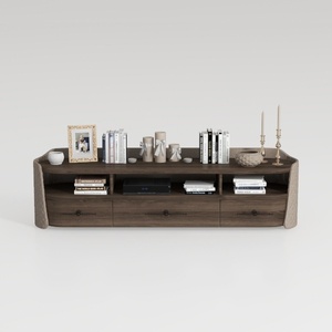
Minimalist Solid Wood Fabric TV Stand Cabinet with Storage Drawers 3D Model

Minimalist Black Velvet Sectional Sofa with Throw Pillows 3D Model

Homestyler is the ultimate online home design platform for anyone looking to unleash their creativity. With its user-friendly design tool, stunning 3D renderings, and a wealth of DIY video tutorials, you can effortlessly transform your space into a personal masterpiece. Start designing today!
Desain sekarang Gratis


