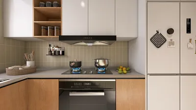


I have always appreciated the understated elegance of a kitchen featuring brown and white tones. The rich brown injects a sense of warmth and depth, while white provides clarity and a feeling of spaciousness. When you achieve the right balance, the kitchen exudes a grounded yet refreshing ambiance, perfectly suited for cooking, socializing, or relaxing. One effective way to visualize this balance is using tools like Homestyler to plan your layout.
Prioritizing performance is crucial when designing your kitchen. The appropriate lighting and color quality can make a significant difference in how these hues are perceived. Ideally, I target lighting levels of 300–500 lux on work surfaces, utilizing sources with a Color Rendering Index (CRI) of 90 or higher. This approach helps maintain the integrity of white tones while enriching the browns, which is in line with the recommendations of the IES. Furthermore, controlling glare and supporting circadian rhythms are vital for well-being. The WELL v2 framework emphasizes the importance of ensuring visual comfort and the availability of appropriate lighting for healthier living spaces.
Layout should reflect behavior patterns. In numerous post-occupancy interviews, it is evident that homeowners often prepare the majority of their meals (70–80%) using a single, well-lit countertop area. Research from Gensler shows that having clear zones aids in improving behavioral flow and reducing frustration, a principle that applies equally to homes. Having designated stations minimizes cognitive overload during routine tasks. If you're considering your kitchen's footprint, utilizing an interior layout planner can help you visualize circulation, sightlines, and the essential working triangle before you finalize any decisions.
Creating a Successful Brown-and-White Palette
My guiding principle involves achieving contrast with a sense of balance. I prefer a 60/30/10 distribution: 60% warm white elements like walls and ceilings, 30% brown components such as walnut cabinetry and cocoa-toned porcelain, and 10% accent pieces including matte black handles or brushed brass fixtures. It's essential to maintain consistent undertones, pairing cooler whites with cooler browns and warm whites with warm browns to avoid the unappealing ‘dirty white’ look.
Material Combinations That Stand the Test of Time
- Cabinets: Use white lacquer or thermally structured melamine for upper cabinetry; consider rift-cut oak or American walnut for the lower portions. The vertical grain creates a visually calming effect and enhances the room's perceived length.
- Countertops: White quartz with subtle veins conveys cleanliness against the brown lower cabinets; alternatively, choose chocolate quartzite or soapstone for a depthier ambiance on a white island.
- Backsplash: A hand-glazed white tile introduces slight variations, ensuring the white doesn't appear stark. For a seamless look, you can carry the countertop material onto the wall to create clean lines.
- Flooring: Mid-tone brown wood or wood-look porcelain helps anchor the space and camouflages daily wear better than very dark flooring options.
Illumination: Elevating Brown Luxury While Keeping White True
- Task Lighting: Aim for 300–500 lux for work areas, while selecting between 2700–3500K depending on the desired atmosphere. Warmer lighting enhances brown textures, while neutral white maintains accuracy in food colors.
- Ambient Lighting: Layer ceiling fixtures with diffused light sources to prevent harsh shadows. A linear LED installed above the toe-kick can subtly uplift the brown bases, enhancing the perception of space.
- Accent Lighting: Wash the backsplash with low-intensity light to highlight the tile's texture, keeping white surfaces dimly illuminated at night.
- Minimizing Glare: Incorporating matte finishes can reduce glare on white quartz; well-recessed downlights ensure comfortable brightness levels in line with the visual comfort goals outlined in the WELL v2 framework.
Designing for Ergonomics and Workflow in the Kitchen
While the classic work triangle remains advantageous, I prefer to segregate tasks: Prep (integrating the sink with primary counter space), Cook (range combined with spice or utensil storage), Clean (dishwasher near waste disposal and towels), and Serve (with an island edge). The optimal spacing is 42 inches (107 cm) minimum between the island and run; allocate 48 inches (122 cm) for kitchens accommodating two cooks. Keeping essentials like knives, cutting boards, and mixing bowls within arm's reach of the sink optimizes flow for common tasks such as rinsing and chopping.
For upper cabinets painted in white, I suggest a slightly lighter material to minimize noise from closing; soft-close mechanisms paired with felt bumpers provide acoustic relief. Utilize under-cabinet rails to keep counters clutter-free. In constrained spaces, simulate dimensions and door movements using a layout tool before finalizing cabinet orders.
Understanding Color Psychology: Achieving Warmth Without Bulk
Browns evoke feelings of stability and comfort, while whites represent cleanliness and openness. This fusion translates into an atmosphere of trust and transparency in kitchens, which is why it remains a popular choice. To maintain a lively energy, I balance heavier brown elements with light-reflective surfaces, such as glossy white tiles or satin brass fixtures. If your kitchen receives north-facing light (cool daylight), opt for warmer whites to prevent a bluish tint; conversely, cooler whites can be more effective in south-facing environments to avoid yellowing.
The Role of Texture and Sheen in Creating Elegance
With a simplified color palette, textures become the narrative. Pair matte white cabinetry with a wire-brushed oak island; juxtapose honed stone surfaces alongside softly finished faucets. Be cautious of making everything matte—introducing at least one glossy element, such as tile or metal, can reflect light and keep the space vibrant throughout the day.
Metals and Appliances: Aim for Coordination, Not Exact Matches
Stainless steel complements a range of brown wood tones and white surfaces. If warmth is your preference, brushed brass or bronze fixtures can harmoniously connect brown and white elements. Limit yourself to two metal finishes to prevent visual clutter. For a cohesive look, consider paneling your refrigerator in brown wood, while placing wall ovens within the white zone to visually reduce mass.
Strategic Storage: White Elements in Low-Touch Areas
White upper cabinets are easier to keep clean since they are situated above more active zones. Position the high-touch, high-traffic items in brown—such as lower drawers, pantry doors, and end panels. Alternatively, you might consider white interiors for drawers, ensuring visibility remains high while protecting the exterior from wear and tear.
Enhancing Acoustic Comfort in Open Kitchens
Brown wood surfaces coupled with soft furnishings (like rugs and upholstered bar stools) help absorb sound, balancing the harder, reflective qualities of white quartz and tiles. When your kitchen integrates with living spaces, consider adding felt underlays, micro-perforated wall panels disguised as artwork, or floor-to-ceiling drapery nearby to diminish echoes without straying from your refined palette.
Sustainability and Maintenance in Design Choices
Opt for FSC-certified wood veneers and low-VOC paints for your white surfaces. Using engineered quartz not only resists stains but also keeps your white counters bright with minimal care. For brown cabinetry, an oil-rubbed finish allows for easy spot repairs, while catalyzed finishes are durable yet trickier to touch up—your choice should reflect your household's usage patterns.
My Favorite Combinations of Brown and White
- Creamy warm white upper cabinets + walnut lower slabs + white quartz featuring soft gray veining
- Bright white Shaker cabinets + rift-cut white oak island + cocoa-toned soapstone
- Linen white flat-panel doors + stained ash lowers + full-height white porcelain backsplash
Optimizing Small Kitchens for an Airy Feel
Leverage white on vertical surfaces (70–80%) and restrict brown to base cabinets and flooring. Extend cabinetry to the ceiling for added height; use integrated pulls to minimize visual distraction. Incorporating mirrors at the end of a galley can bounce light and visually enhance depth without compromising your chosen color palette.
Maximizing Large Kitchens Without Sacrificing Warmth
In expansive kitchens, a double-island strategy can be beneficial, with each island serving a distinct purpose—one in white for food preparation and seating, the other in brown for storage and serving. Alter the thickness of countertops (thinner for white, chunkier for brown) to create a sense of hierarchy. Ensure that the pendant lighting remains proportional, typically half to two-thirds the width of the island, distributed across two or three fixtures.
Considering Daylight, Orientation, and LED Adjustments
North-facing light tends to be cool and even—add warm LED lighting (2700–3000K) in the evening for a cozy feel. West-facing light flares at dusk; introducing dimmable lighting layers can help manage contrast. Utilize lighting with a CRI of 90 or higher to accurately depict both brown wood grains and white paint, in accordance with quality metrics typically cited in IES recommendations.
Designing for Longevity and Timelessness
The classic brown and white combination remains timeless when the lines are cohesive. Avoid fleeting patterns on expansive surfaces; allow personality to shine through accessories like stools, art, and compact appliances. If you are exploring trends, consider ribbed wood panels, fluted glass elements, or micro-bevel door profiles, which keep the palette stable while the textural language adapts over time.
Frequently Asked Questions
I typically begin with a daylight-equivalent appearance around 3500–4000K for whites and choose actual LED lighting in the 2700–3000K range for evening use. When selecting paint, pick a white with complementary warm undertones (like a hint of yellow or red) to pair effectively with walnut and chestnut; reserve cooler whites for espresso or smoked oak pairings.
Limit brown to 20–35% of visible surfaces. Focus it primarily on base cabinets and flooring, while keeping walls, upper cabinetry, and backsplashes in white to maintain brightness and enhance spatial perception.
Opting for honed or suede finishes on white quartz can effectively conceal micro-scratches and fingerprints compared to high-gloss finishes. If dark countertops are in consideration, a leathered finish can help diffuse reflections, ensuring the brown maintains its richness.
Strive for 300–500 lux on work surfaces using a CRI of 90+ for true color representation, aligning with IES guidelines. Implement ambient lighting to lessen contrast and incorporate dimmers for evening settings.
Introduce texture into the space with hand-glazed tiles, ribbed wood accents, woven stools, or veined stone features. Warm metal elements, such as brushed brass or bronze, contribute a soft glow that counters the starkness of white surfaces.
Ensure a minimum aisle width of 42 inches (107 cm)—48 inches (122 cm) is preferable for kitchens with two cooks. Designate at least 15 inches (38 cm) of landing space on either side of the cooktop and 24 inches (61 cm) near the sink for optimal prep work.
Incorporating stainless steel appliances can keep your kitchen contemporary and adaptable, while brushed brass introduces warmth. Aim to limit your selection to two families of metal finishes across your hardware, lighting, and plumbing to avoid visual chaos.
White hard surfaces may reflect sound. Balance this with brown wood fixtures, padded stools, rugs, and even discreet acoustic panels to minimize echoing effects in open-plan environments.
This pairing remains a classic. Maintain simplicity on larger surfaces and refresh the look through lighting, seating, and accessories. Structural texture updates (like fluting or ribbing) can keep the design relevant without necessitating a complete remodel.
Absolutely—ensure that you choose complementary undertones while varying texture rather than just hue. For instance, using rift-cut oak for cabinetry paired with a darker walnut for the island can add visual depth without creating chaos.
Homestyler is your go-to online home design platform! With its user-friendly design tool, stunning 3D rendering, and a wealth of DIY video tutorials, you can effortlessly create and visualize your dream spaces. Unleash your creativity and transform your home today!
Design jetzt kostenlos
































