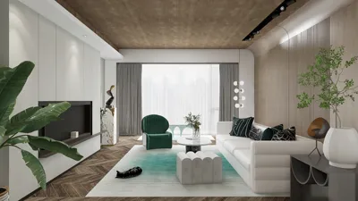


The design of a great hall relies heavily on achieving balance through color, light, texture, and proportion. In my approach to utilizing Sunmica (high-pressure laminate) within living areas, I adhere to principles supported by research—understanding how color affects mood, how light can shift perceived space, and how finishes withstand everyday wear and tear. Research from Gensler highlights that environments that present a cohesive and comfortable visual aesthetic can significantly enhance occupants’ satisfaction and the time they spend in communal spaces. I incorporate this knowledge into color systems that encourage desired behaviors, such as fostering a welcoming atmosphere, promoting social interaction, or instilling a sense of calm (source: Gensler Research Institute). Additionally, according to findings from Steelcase, environments designed with careful visual comfort and clarity in materials aid in minimizing cognitive load. I take this insight as a guide to streamline color palettes while ensuring contrasts are intentional, rather than haphazard (source: Steelcase Research).
Lighting serves as an essential element in any color palette. The Illuminating Engineering Society recommends ambient lighting of around 150–300 lux in living rooms to support conversation and casual activities (IES standards). The perception of color can differ under warm lighting (2700–3000K) compared to neutral lighting (3500–4000K). The WELL v2 guidelines also stress the importance of glare control and visual comfort in living spaces, emphasizing the use of matte or low-sheen finishes to lessen reflections and eye strain (WELL v2). These perspectives influence my selections for Sunmica, where I favor warm whites and woods under 3000K lighting for an intimate feel or opt for soft greiges and cool stones around 3500K for clarity and freshness.
Fundamental Guidelines for Using Sunmica in Halls
- Begin with a primary neutral (60%), a secondary color (30%), and an accent shade (10%). This strategy keeps the hall visually stable and mitigates fatigue.
- Match color temperature with sheen: warm lighting pairs best with warm neutrals and mid-tone woods; neutral-cool lighting complements gray-beige tones, soft taupes, light oaks, and light concrete appearances.
- Manage contrast at eye level. High-contrast combinations should be reserved for feature walls, credenzas, or media units, rather than applied to every surface.
- Treat texture as a color: wood grain, linen-weave laminates, and stone-matte finishes introduce richness without increasing color variety.
- In smaller halls, opt for lighter base shades and tighter contrasts to create the illusion of greater space.
Top Sunmica Color Combinations for Halls
Incorporate warm white panels for storage and walls, light oak for media units or console fronts, complemented by a charcoal edge band or niche backer. Under 2700–3000K lighting, this combination feels inviting and sophisticated, providing a timeless appeal that works harmoniously with beige textiles.
Utilize greige linen-textured laminate for wall panels, walnut for base cabinets, and bronze-toned accents or handles. The linen texture helps to soften acoustic reflections, while walnut provides a balanced focal point without absorbing excess light.
Apply taupe for larger surfaces, pale ash for horizontal areas, and muted sage for niches or fluted panels. Research indicates that sage, as a calming shade, is beneficial in easing social tension and is suitable for multi-generational living. Aim for low gloss to minimize glare.
Use concrete-matte laminate in feature areas alongside warm beige cabinetry with a subtle black outline or handle. This black detail adds dimension, creating a rhythmic design. Best placed under 3000–3500K lighting to ensure the concrete feels inviting rather than cold.
Opt for porcelain white on verticals, with faux-cane or woven-texture Sunmica infill on cabinet doors, and honey oak trims. This micro-texture enhances a simple design while providing tactile warmth and easy maintenance.
For contemporary halls, consider mist gray bases, sand-toned console surfaces, and a navy accent on a single back panel or shelf underside, keeping navy coverage under 10% to maintain an airy feel.
Incorporate cream-dominant walls and storage, rift-cut walnut providing linear elegance, and a terracotta highlight within a display niche. This combination pairs beautifully with warm LED lighting and woven rugs.
Adopt an off-white scheme throughout, with blonde maple introducing Scandinavian lightness, while soft black (not jet) frames open shelving. This design is perfect for compact halls that benefit from visual elevation.
Light, Sheen, and Visual Comfort
- Aim for 150–300 lux for general hall illumination (IES). Layer in wall washers to soften the shadows around cabinetry and media walls.
- Select low-gloss or matte finishes for large vertical surfaces to reduce glare (WELL v2 recommendations for visual comfort). Reserve semi-gloss for smaller accent pieces only.
- Use 2700–3000K lighting for a warm, inviting atmosphere; 3500K can create a fresher gallery-like feel. Always test samples under the actual lighting conditions before making final selections.
Proportion, Rhythm, and Zoning
Spacious halls greatly benefit from conscientious color zoning: anchor seating areas with darker wood or stone laminates, and maintain lighter shades in circulation areas to create a sense of space. In compact areas, I prioritize dark verticals and light horizontals to avoid narrowing perceptions. For those experimenting with different layouts, a visualization tool like a room design tool can be invaluable for simulating storage walls, console configurations, and feature cladding before ordering materials.
Material and Durability Considerations
- Fingerprints: Choose anti-fingerprint matte finishes for darker hues.
- Edges: Micro-beveled or shadow-gap details in soft black or charcoal provide clean lines without appearing harsh.
- Cleaning: Most Sunmica options tolerate mild detergents; steer clear of abrasives on textured weaves or ultra-matte finishes.
- Sustainability: Opt for laminates paired with low-VOC adhesives and ensure adequate ventilation; utilize FSC-certified materials when available.
- Acoustic comfort: Textured and fluted laminates assist in dispersing reflections; introducing soft furnishings can lead to balanced reverberation in open spaces.
Color Psychology for Social Spaces
- Warm neutrals (beige, cream, honey woods) foster conversation and a sense of ease.
- Greens (sage, olive) promote feelings of restoration and are linked with reduced stress according to environmental psychology studies.
- Blues (navy, dusk) exude poise; recommended as accents in smaller spaces to avoid a cramped appearance.
- A well-balanced contrast—light base, mid-tone wood, dark line—keeps visual engagement without causing fatigue.
Design Trends for 2024–2025 Featuring Sunmica
- Fluted panels in soft taupe or ash add dimension without overwhelming with color.
- Mixed metal accents: brushed bronze paired with soft black details convey a current and warm feel.
- Concealed lighting: 2700–3000K LED strips in display niches can dramatize textures while preserving comfort.
- Rounded corners on media walls provide a softer flow to circulation routes and enhance a residential ambiance.
Common Layout Configurations
- Narrow halls: Use off-white or greige walls, light oak storage, ensuring dark accents remain below eye level. Strategically place mirrors to reflect light across the room; avoid direct reflection of windows to minimize glare.
- Square halls: Establish a feature wall (media or artwork) in a slightly deeper tone while keeping surrounding walls lighter to increase perceived space.
- Through-lounge: Maintain a consistent base color throughout both areas, subtly changing the secondary tone to indicate function—such as oak near seating and light concrete by dining spaces. Consider utilizing an interior layout planner to envision these shifts with a room design visualization tool.
Sample Color Palettes for Inspiration
- Cozy Modern: Warm white (matte) + light oak (straight grain) + charcoal trim + brass hardware.
- Soft Contemporary: Greige linen + natural walnut + soft black accents + 3000K lighting.
- Airy Minimal: Porcelain white + blonde maple + pale gray accents + linen upholstery.
- Organic Gallery: Light concrete + beige + black accent lines + terracotta textiles.
Frequently Asked Questions
Q1: Which color of Sunmica can create the illusion of a larger hall?
A1: Opt for warm white or off-white on expansive surfaces, complemented by light oak or pale ash, and keep darker accents under 10%. Ensure ambient light remains in the range of 150–300 lux to maintain clarity without harsh shadows.
Q2: How can I prevent glare from glossy laminates?
A2: Utilize matte or low-sheen Sunmica on prominent vertical surfaces, incorporate wall washers instead of direct downlights, and select 2700–3500K LEDs. The WELL v2 guidelines emphasize glare control for enhanced comfort.
Q3: Is it acceptable to combine cool grays with warm woods?
A3: Absolutely—connect them using neutrals like greige or taupe and adjust lighting to 3000–3500K. This approach maintains a cohesive palette while steering clear of a cold appearance.
Q4: What’s the ideal contrast level for a family-friendly hall?
A4: A light base, mid-tone wood, and subtle dark detailing provide clarity without overwhelming the senses, aligning with findings that suggest visual comfort can reduce cognitive load (Steelcase).
Q5: What textures offer durability for everyday usage?
A5: Linen weaves, fine-grain woods, and concrete-matte surfaces are effective at concealing fingerprints and micro-scratches, particularly with anti-fingerprint technology for darker hues.
Q6: How do I create effective color zoning in an open-plan hall?
A6: Maintain a consistent base across zones, then assign secondary colors based on the function of each area (for instance, oak in the lounging section and light concrete in the dining area). Consider using a layout simulation tool to explore sightlines and transitions.
Q7: What color temperatures are most conducive to social gatherings?
A7: Temperatures between 2700–3000K create a warm and welcoming ambiance; use 3500K if you wish for a more refined gallery atmosphere. Control dimming to adjust the mood from day to night.
Q8: Are bold colors like navy or terracotta too risky?
A8: Not if they are limited to niche accents, shelves, or small fluted panels (≤10% coverage). They can be balanced with lighter bases and mid-tone woods to avoid visual heaviness.
Q9: How can I revitalize a hallway with minimal daylight?
A9: Use off-white bases with soft textures (like linen or micro-stucco laminate), add warm wood accents, and layer indirect lighting to achieve gradients rather than harsh light spots.
Q10: What maintenance steps prolong the life of laminates in halls?
A10: Clean with mild soap, avoid using abrasive tools, safeguard edges with quality banding, and place felt pads beneath decor. Re-seal shadow gaps as needed to prevent dust accumulation over time.
Q11: Which metal finishes work well with these color schemes?
A11: Brushed bronze and soft black pair nicely with warmer palettes. For cooler gray-based designs, stainless steel or brushed nickel is suitable. Limit metal finishes to two for a cohesive look.
Q12: Is it possible to use dark wood as the primary tone?
A12: Yes, in larger spaces—balance it with high-reflective off-whites and abundant lighting. In smaller areas, confine dark wood use to lower cabinetry or a single accent wall.

Minimalist Brown Velvet L Shaped Sectional Sofa 3D Model
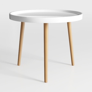
danpinera Round Side Table, Metal Legged Accent
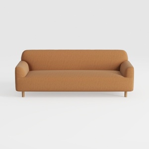
Minimalist Fabric Wooden Legs Sofa 3D Model
Discover the world of home design with Homestyler! This user-friendly platform offers a powerful online design tool, stunning 3D renderings, a variety of design projects, and informative video tutorials. It's perfect for transforming your ideas into reality—no experience needed!
Design jetzt kostenlos
































