


The Complementary Color: Red and Green Style Decoded
The 'Complementary Color: Red and Green' style is not a historical interior design movement—but a bold, psychologically charged spatial language rooted in color theory, chromatic tension, and intentional emotional contrast. Far beyond holiday clichés or seasonal decor, this aesthetic leverages the most visually potent complementary pairing on the color wheel: red (a warm, advancing, emotionally activating hue) and green (a cool, receding, grounding, biophilic tone). Their opposition generates dynamic visual energy—yet when calibrated with precision in proportion, materiality, lighting, and spatial hierarchy, they achieve equilibrium: passion meets peace, intensity meets calm, focal drama meets atmospheric serenity. This style thrives in modern residential, boutique commercial, and conceptual art spaces where designers demonstrate mastery of color psychology—not just pigment selection—and use Homestyler’s real-time rendering engine to test saturation ratios, surface reflectivity, and ambient light interaction before finalizing a composition.

Designed by Zuzana Bila as 'Design Elegance', this living room exemplifies how Homestyler enables rapid, photorealistic iteration of red–green balance: users can instantly swap wall hues (e.g., deep forest green vs. sage), adjust furniture fabric saturation (crimson velvet vs. brick-toned wool), and toggle HDR lighting presets (g_ljz_day) to observe how warmth and depth shift. With one click, designers simulate natural daylight diffusion through large windows—critical for avoiding visual fatigue—making Homestyler an indispensable tool for mastering this high-stakes color dialogue.
Start Designing Now🎨 Chromatic Proportion & Hierarchy
Successful red–green design avoids equal dominance. Instead, it deploys a deliberate ratio—typically 60% green (as base walls, flooring, or upholstery), 30% red (as statement furniture, artwork, or cabinetry), and 10% neutral or metallic accents (gold, brass, warm wood)—to anchor the eye and prevent chromatic overwhelm. This hierarchy creates visual rhythm: green establishes calm context; red delivers energetic punctuation.

Cecilia Botha’s 'Color Red and Green' kitchen demonstrates precise chromatic hierarchy: emerald green upper cabinets (60% visual weight) ground the space, while rich red lower cabinetry and barstools (30%) provide grounded contrast—not aggression. Homestyler’s Material Editor lets users drag-and-drop PBR textures (velvet, lacquered wood, brushed brass) and instantly preview how light interacts with each surface, ensuring red elements read as luxurious—not garish—and green as serene—not clinical.
Design Your Dream Kitchen🌿 Materiality & Texture Dialogue
Material choice mediates the red–green tension. Smooth, reflective surfaces (glossy red lacquer, polished emerald marble) amplify vibrancy and energy; matte, organic textures (nubby red wool, mossy green linen, rough-hewn green timber) soften contrast and invite tactility. Layering opposing textures—e.g., plush red velvet sofa against raw-edge green oak coffee table—adds depth and prevents flatness, transforming color theory into sensory storytelling.

Naama Cohen’s 'A Symphony of Red and Green' living room uses texture to harmonize opposites: soft, floral-print red cushions rest on a structured green linen sofa; glossy red ceramic vases sit beside matte green terracotta planters. In Homestyler, designers select from thousands of curated, physically accurate materials—including Maximalist Furniture Model Collections—and apply them with one click. Real-time ray-traced previews show exactly how light scatters off velvet versus linen, enabling confident, data-informed texture pairings that elevate color into embodied experience.
💡 Lighting as Chromatic Conductor
Lighting doesn’t just illuminate—it modulates color perception. Warm white lighting (2700K–3000K) enhances red’s richness and softens green’s coolness; cooler daylight (4000K–5000K) sharpens green’s clarity and tempers red’s intensity. Directional lighting (e.g., spotlights on red art) creates focal drama, while diffused ambient light (e.g., green-tinted uplighting) fosters immersive harmony. HDR environment presets in Homestyler replicate real-world conditions—from g_ljz_day to g_spring_garden—so designers predict how their palette behaves at dawn, noon, or dusk.

Becca R’s 'Une superbe oasis aux nuances rouge et vert' dining area uses layered lighting to orchestrate its palette: warm pendant lights (3000K) cast gentle halos over red velvet chairs, while recessed LED strips beneath green banquettes emit a soft, upward wash—enhancing depth without glare. In Homestyler, users adjust light temperature, intensity, and position in real time, then toggle between HDR environments (g_tropical_beach) to see how sunlight angle affects red saturation on textiles or green reflection on tabletops—turning lighting from afterthought into a core design lever.
FAQ
Q: Can I participate in the Complementary Color: Red and Green challenge without professional design experience?
A: Absolutely! Homestyler’s intuitive drag-and-drop interface, AI-powered suggestions, and pre-curated model libraries—including Bauhaus and Maximalist Furniture Collections—empower beginners to explore red–green balance confidently. Thousands of global creators, from students to hobbyists, have joined this challenge to grow their spatial intuition.
Q: How does Homestyler help me avoid 'clashing' red and green tones?
A: Homestyler provides real-time color harmony feedback via its Color Palette Inspector. When you select a red fabric, it suggests scientifically balanced green complements based on CIELAB delta-E thresholds—and renders them instantly in your 3D scene under accurate lighting, so you see true visual impact, not just swatch approximations.
Q: Are there recommended Homestyler tools or presets for this style?
A: Yes. Use the g_spring_garden and g_ljz_day HDR presets for natural, flattering light; leverage the 'Material Swap' feature to test velvet, linen, and stone textures side-by-side; and explore the 'Red & Green Design Inspiration' story (linked in contest resources) for curated palettes and layout strategies—all built natively in Homestyler.

Luxury Velvet Tufted Chesterfield Sofa With Leopard Print Cushions 3D Model
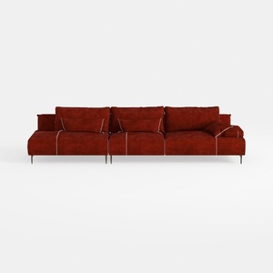
Modern Burgundy Velvet L Shaped Sectional Sofa 3D Model

Modern Red Fabric Wavy Backrest Sofa 3D Model
Homestyler offers an easy-to-use online design tool with stunning 3D renderings, inspiring design projects, and helpful DIY video tutorials—perfect for turning your home design ideas into reality effortlessly.
Desain sekarang Gratis


