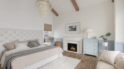


A client once approached me with an interesting request: to paint their dining room walls in a shade that matched their Labrador's coat — brown all around! At first, I chuckled, but then I recognized the potential in the idea. A personal color narrative can create a cozy ambiance in any room. For those wanting to experiment with color combinations prior to making a commitment, utilizing digital mockups like Homestyler can help you save both time and emotional stress.
1. Dramatic Accent Wall Using Two-Tone Technique
I thoroughly enjoy employing a single, striking wall to anchor the table and artwork in a dining area. This approach is cost-effective and impactful, making it ideal for renters; keeping other walls neutral prevents overwhelming the space. However, one challenge is that this method tends to expose any misplacement of furniture, so I always plan out the positioning of items like the sideboard and lighting beforehand using 3D mockups.
save pin
2. Delicate Ombre for Subtle Dimension
Ombre techniques can introduce depth to a room without overwhelming it — particularly suited for open-concept spaces where a gentle transition is desired. Although this approach may be more expensive due to the need for meticulous blending, the results can yield a distinctive and customized aesthetic that creates an illusion of greater volume.
save pin
3. Highlighting Trim and Painted Ceilings
Applying a contrasting color to trim or extending paint to the ceiling has the potential to elevate a modest dining room into a more layered and intentional space. I often suggest clients select a trim color that is two shades darker than the walls for better definition. To provide a closer visualization, I recommend utilizing tools like Homestyler to simulate how light interacts with the ceiling and moldings.
save pin
4. Utilizing Color Blocking to Define Areas
In homes where the dining space is integrated with living or kitchen areas, color blocking is my preferred technique. By painting a band behind a bench or adding a vertical stripe beside a buffet, you can clearly delineate the dining zone without any construction work. However, it’s crucial to keep scale in mind — an overabundance of colors can lead to a chaotic look — but when executed correctly, this method appears modern and cost-effective.
save pin
5. Chalkboard or Washable Accent for Versatility
Chalkboard paint or durable washable coatings work wonders for creating a fun, adaptable wall. Families with children or decor enthusiasts will appreciate the ability to update messages or artwork regularly; nevertheless, some maintenance is required to avoid ghosting. If you're curious about color combinations, you can also explore AI-powered tools like Homestyler for quick inspiration.
Transforming small areas into creative dining nooks can spark significant innovation — with only paint and a thoughtful approach, I’ve successfully turned tight spaces into inviting conversational spots. Budget-conscious homeowners can begin with sample pots and a tester wall to avoid costly adjustments. If interested, I can guide you through my mockup process and the essential tools I always bring to any project.
save pin
FAQ
Q1: What paint finish works best for dining room walls?
My go-to recommendation for dining rooms is usually eggshell or satin as they strike a balance between washability and a subtle sheen. High gloss is lovely for trim, yet it tends to accentuate imperfections on larger wall surfaces.
Q2: What is the estimated cost for repainting a dining room?
Prices can vary depending on the region, but a DIY refresh using mid-range materials typically ranges between $100 and $300. Employing a professional can increase labor costs but ultimately saves time and yields neater lines, especially for projects requiring stripes or ombre finishes.
Q3: How can I select a color that won't go out of style?
I recommend classic neutral tones complemented by a single accent that showcases your unique style — think deep blue, warm terracotta, or soft green. While trendy vivid colors can be fun as accents, it’s better to choose neutrals for larger surface areas for lasting appeal.
Q4: Should lighting be a consideration before painting?
Absolutely. Natural light alters color perception throughout the day, with warm bulbs giving paint a more yellowish tint. I suggest assessing paint swatches at various times to understand how they react under your specific lighting conditions.
Q5: Are washable paints suitable for areas where kids eat and play?
Yes! Washable and scrubbable coatings are perfect for family dining areas as they can withstand spills and maintain the fresh look of your walls with minimal effort.
Q6: Is low-VOC paint really a necessity?
Low-VOC paints are beneficial as they limit indoor air pollutants, making them a wiser choice for homes in use. The U.S. Environmental Protection Agency (EPA) suggests that selecting low-VOC options contributes to improved indoor air quality.
Q7: What’s the best way to correct paint errors like drips or uneven coverage?
Usually, light sanding followed by a touch-up coat will fix minor drips and streaks; for more extensive problems, I recommend repainting the entire wall to achieve consistent sheen. Remember, preventative measures are cheaper than corrections — use appropriate rollers and avoid overloading brushes.
Q8: Can paint alone influence the perceived size of my dining room?
Absolutely! Lighter and cooler colors can visually expand a space, while darker tones create a cozier atmosphere. Horizontal or vertical stripes can also affect perception, so choose direction judiciously based on ceiling height and furniture layout.
save pin
Looking to design your dream home? Homestyler makes it easy with its user-friendly online design tool. Explore stunning 3D renderings and a wealth of inspiring design projects. Plus, enjoy DIY video tutorials that guide you every step of the way. Start your home transformation today!
立即免费设计
































