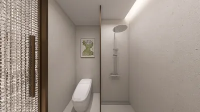


The subtlety of tan is calming rather than overwhelming. In a dining area, this serene neutrality creates an ideal atmosphere for savoring excellent cuisine, fostering relaxed discussions, and achieving effortless elegance. I strategically use tan as a primary shade to mitigate glare, harmonize natural light, and add warmth without visual distraction, layering textures and lighting to enhance character and depth. By utilizing tools like Homestyler, you can visualize and perfect your tan palette before finalizing your design.
Proper lighting design is essential for setting the ambiance. Following IES guidelines for dining areas, aim for general ambient illumination levels between 10–30 foot-candles (around 100–300 lux), supplemented by stronger task and accent lighting to define key areas while still prioritizing comfort. Additionally, the WELL Building Standard highlights the importance of minimizing glare and achieving a balanced light spectrum that supports comfort and aligns with circadian rhythms, especially in spaces that serve dual roles, like a dining room that functions as a home office. In this article, I will detail how to effectively implement these standards into your trim project using Homestyler for visualization and execution, and demonstrate where contrasts can be increased for dramatic flair.
Establish the Atmosphere: Purposefully Craft a Tan Color Scheme
Begin by focusing on undertones. Warm tans infused with hints of red or yellow beautifully complement oak, walnut, and brass accents, whereas tans that lean toward greige pair excellently with blackened steel, concrete, and cooler marbles. Maintain a light reflectance value (LRV) ranging from 45–65 for walls to gently reflect light without overwhelming the space. Elevating the ceiling a shade lighter can create an illusion of increased height, while slightly deeper baseboards can anchor the room effectively.
From a psychological perspective, neutral browns and tans evoke stability and foster feelings of trust. Color psychology research indicates that earth tones promote comfort and security—this can be particularly advantageous around the dining table, encouraging longer, more leisurely dining experiences. Include a single contrast accent, such as an inky blue, deep green, or terracotta, to invigorate the space without causing chaos.
Designing the Layout for Seamless Flow and Fostered Conversation
A successful tan dining room should allow for effortless circulation and clear sightlines. Ensure at least 36 inches of free space around the table to facilitate smooth movement, with 42–48 inches being ideal in busier households. In a rectangular setting, position the table along the room's long axis to elongate the view. For square rooms, consider a round or softly oval table that promotes social equality, as it enables everyone to face the center, enhancing conversational balance. Tools like the Homestyler interior design planner can help you visualize furniture sizes and spatial allocations before making any decisions.
Lighting Layers: Creating Ambient, Task, and Accent Effects
My approach emphasizes layered lighting that corresponds with how spaces are used. For ambient lighting, consider dimmable ceiling fixtures or cove lighting set at about 150 lux for dining. Task lighting, such as a chandelier or pendant cluster, should hang 28–34 inches above the tabletop to avoid glare and maintain sightlines. Accents such as wall washers or picture lights can enhance artwork, while discreet LED strips concealed under shelves can add depth. Opt for warm to warm-neutral correlated color temperatures (CCT) between 2700–3000K to create intimacy during meals, and if your dining area serves as a workspace, incorporate a 3000–3500K option to adjust the mood as required. Keeping the Unified Glare Rating (UGR) low is crucial; using matte finishes on shades and walls will help minimize direct reflections.
Material Appeal: Texture Elevates Tan to Luxurious
The beauty of tan flourishes through tactile textures. Combine limewash or plaster walls with oiled oak or walnut for an engaging backdrop. Incorporate a woven jute or wool rug, preferably with a low, dense pile, to prevent chair snags. For seating, choose performance fabrics in sandy or camel shades that endure daily wear mingled with a couple of leather chairs to enrich the color palette. Metallic accents in brushed brass, burnished bronze, or aged nickel enhance dimensionality without glare. Stone options like travertine and Breccia marble pair exquisitely with tan's warmth while providing subtle dynamism.
Enhancing Acoustic Comfort: Mitigating Noise
Dining spaces can become quite loud. Balance hard surfaces with sound-absorbing elements: use a thick rug beneath the table, padded chairs, and drapery lined and positioned to stack widely to allow sunlight through. Acoustic art panels that look like framed fabric can further contribute to a quieter environment. These adjustments can lead to clearer conversations at reduced volumes, minimizing listener fatigue and cultivating a more pleasant dining experience.
Furniture Sizes and Proportional Relationships
Scale is key to achieving elegance. Allocate at least 24 inches in width per seat, with 28–30 inches offering a more spacious feel. For tables: a rectangular 72 x 36-inch can seat six; an 84 x 40-inch accommodates eight; a 60-inch round table fits six comfortably. Sideboards should measure 18–22 inches in depth while allowing at least 36 inches of clearance in front for ease of access. Striking a balance in visual weight is important: for a heavier table (like those made from stone or dark wood), opt for lighter chairs and rugs; conversely, if the table is light (for instance, glass with slender legs), enhance the space with a richer rug or a darker wall hue.
Managing Daylight with Effective Window Treatments
Natural light is a wonderful asset—manage it wisely. Layer sheer curtains (for soft diffusion) with lined drapery (for glare management). In bright, south-facing rooms, select a tan with a bit more gray to prevent it from appearing too yellow under intense sunlight. In contrast, north-facing rooms thrive with warmer tans to counteract the cooler light. Employing a simple, continuous rod with wide stack-back can enhance the appearance of your windows.
Artwork, Styling, and Color Highlights
Use tan as a backdrop to showcase bolder artistic pieces. Photographs in black and white, botanical art featuring deep greens, and abstract pieces with navy blues and rust accents all provide visual intrigue. Maintain a curated tabletop look: one sculptural bowl, a subtle floral arrangement, and a pair of candlesticks. Incorporating books or ceramics in neutral textures on the sideboard can fill the space while preventing distraction from your centerpiece. For seasonal alterations, consider swapping out accent textiles—such as napkins, cushions, or table runners—without the need for repainting.
Sustainability and Ease of Maintenance
Opt for FSC-certified wood, low-VOC paints, and natural fibers like wool and linen. Utilizing performance finishes on fabrics and water-based sealers on wood can significantly extend the life of your materials. In high-traffic areas, choose removable chair covers or wipeable leather options to ease maintenance while preserving style.
My Preferred Tan Dining Room Concepts
Warm tan plaster walls, a walnut table with chamfered edges, camel leather seating, a brushed brass linear pendant, alongside a Persian-inspired wool rug with muted reds and indigos.
Greige-tan walls paired with a white oak round table, sand boucle chairs, a slender blackened steel chandelier, a travertine bowl centerpiece, and delicate sheer linen drapes.
Textured tan paint, an ash table with rounded corners, olive-green upholstered seating, bronze dome pendants, terracotta accents, and a jute-wool flatweave rug.
Design Planning and Visualization
Before making any purchases, it’s vital to check clearances, seating ratios, and rug dimensions. Employing an interior design tool like Homestyler enables you to adjust table shapes, mounting elevations, and traffic flows to thoroughly evaluate hosting scenarios, whether you're planning for casual weeknight meals or gatherings for twelve during holidays.
Data-Informed Comfort Insights
Research by Steelcase illustrates that the comfort and control individuals experience correlate with longer stays and improved experiences—this concept can seamlessly translate into creating a hospitable home environment: provide your guests with visual comfort (through softer reflections), acoustic comfort (by incorporating absorbent materials), and thermal comfort (ensuring there are no drafts at seating areas). Reflecting on WELL v2 guidelines, it's essential to consider lighting that enhances visual clarity while mitigating glare; utilizing dim-to-warm options can help align evening lighting with circadian rhythms, rendering a tan dining room naturally inviting.
Frequently Asked Questions (FAQ)
Q1: Which paint finish is most suitable for a tan dining room?
A finish of satin or eggshell offers a balanced approach between ease of cleaning and minimal glare. High-quality, washable matte formulas can also work well, particularly on textured plaster finishes.
Q2: What level of brightness is ideal in a dining room?
Target ambient lighting around 100–300 lux, utilizing layered accent lights. Ensure pendant fixtures feature dimming capabilities so you can lower lighting to 50–100 lux for intimate dinners while preserving accent focal points.
Q3: What color temperature should I choose?
For evening dining, use 2700–3000K lighting. If the space serves dual purposes, incorporate a 3000–3500K environment for daytime activities while switching to warmer settings in the evening.
Q4: How large should the rug be under the dining table?
Ensure the rug extends at least 24 inches beyond the table edges on all sides, allowing chairs to remain fully on the rug even when pulled out; 30 inches is recommended for larger chairs.
Q5: Which types of wood complement tan colors best?
Walnut, white oak, and ash are ideal pairings. Walnut introduces richness, oak offers versatility, while ash contributes a lighter, modern aesthetic.
Q6: How can I keep a tan color scheme feeling dynamic?
Incorporate diverse textures—such as plaster walls, boucle or linen textiles, natural fiber rugs, and mixed metals—to create interest. Integrating contrasting accent colors and subtle variations in gloss can also add dimension.
Q7: What table shapes are ideal for a compact square dining area?
Opt for a round or gently oval table to ensure freedom of movement without crowding corners, leading to a visually larger space and improved conversation dynamics.
Q8: How can I diminish echo in the dining room?
Implement a dense area rug, upholstered seating, lined drapery, and art with acoustic backing to minimize sound reflections, thus enhancing speech clarity.
Q9: Is it possible to mix black accents with tan?
Certainly! Blackened steel fixtures, slim picture frames, or hardware can introduce sharp contrast and a modern flair against the warmth of tan.
Q10: What is the standard height for pendant lighting above the dining table?
Generally, pendants should hang 28–34 inches above the tabletop, adjusting based on the size of the fixture and sightlines. Larger fixtures will often need to be slightly elevated.
Q11: Are leather dining chairs a practical choice?
Quality leather offers wipeability and develops character over time. For family homes, consider protected (pigmented) leather or performance textiles that provide a similar effect.
Q12: How do I choose a tan that complements northern lighting?
Select a warmer tan with subtle red or yellow undertones to counteract the cool tones of northern light. Always test larger paint samples in different lighting throughout the day.

Modern Pink Velvet Gold Metal Bow Back Dining Chair 3D Model
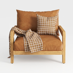
Modern Solid Wood Frame Leather Armchair With Decorative Throw Pillow 3D Model

Minimalist Solid Wood Cane Fabric Armchair 3D Model
Homestyler is your go-to online platform for home design. Its user-friendly design tool and stunning 3D renderings allow you to visualize your ideas effortlessly. With a wealth of inspiring design projects and helpful video tutorials, transforming your space has never been easier or more enjoyable.
تصميم الآن مجانا
































