Cool-Toned Living Space Design
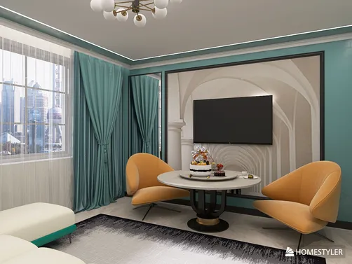
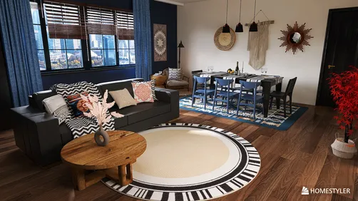
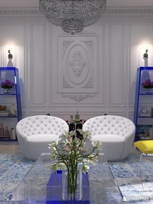
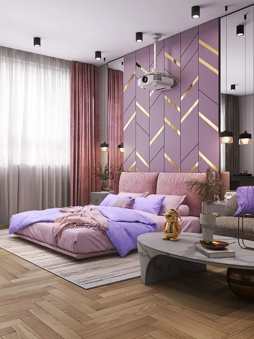
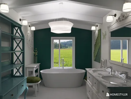
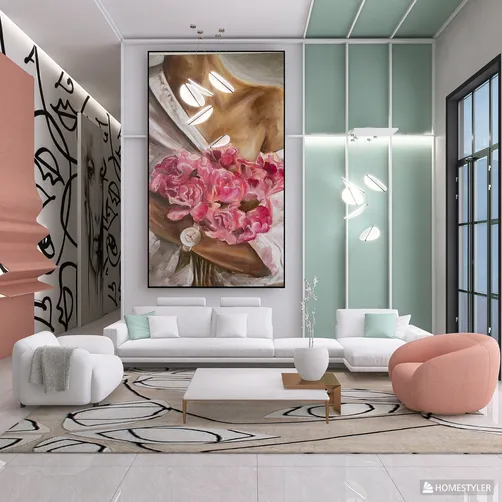
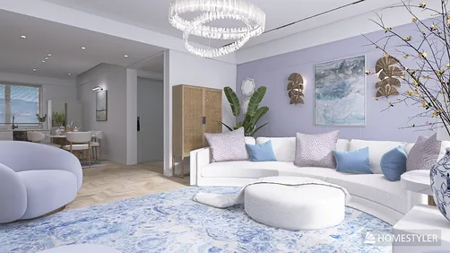
The 'Cool-Toned Living Space' is a versatile, climate-responsive interior design concept centered on psychological and physiological comfort during hot seasons. Drawing from the contest theme — 'During the unbearable heat of summer, cool colors like blue, green, and lavender can bring a touch of coolness and tranquility' — this scene transcends literal room types (e.g., living room or bedroom) to represent any primary residential zone where occupants gather, relax, or recharge: open-plan LDKs (Living-Dining-Kitchen), studio apartments, multifunctional lofts, or compact urban homes. It prioritizes visual freshness through intentional chromatic harmony, strategic material selection (e.g., matte finishes, natural textures), spatial layering for airflow perception, and integration with daylight and views — all key aspects of effective indoor space planning.
Design Challenges and Common Pitfalls
Designing a truly cool-toned living space goes beyond simply painting walls blue. Common challenges include color imbalance (e.g., over-saturation causing visual fatigue), poor tonal layering (lacking depth between wall, furniture, and accent hues), insufficient contrast leading to flatness, mismatched undertones (e.g., warm wood against cool gray), and neglecting how lighting conditions — especially natural light intensity and time-of-day shifts — dramatically alter perceived color temperature. Additionally, many designers overlook the critical role of texture and reflectivity in amplifying or muting coolness — glossy surfaces can feel clinical, while layered linen, matte ceramics, and raw timber add warmth without sacrificing serenity. Effective indoor space planning must resolve these holistically, not decoratively.
🎨 Strategic Color Layering
Avoid monochromatic monotony by building three distinct tonal layers: a dominant base (e.g., soft sage walls or pale limestone flooring), a supportive mid-tone (e.g., dove-gray sofa or oatmeal linen curtains), and vibrant yet restrained accents (e.g., muted lavender throw pillows or teal ceramic vases). This hierarchy creates visual rhythm and prevents sensory overload — essential for small or multifunctional spaces. Use Homestyler’s real-time 3D rendering to preview how each layer interacts under different HDR lighting presets (e.g., 'g_ljz_day' vs. 'o_sea_sky') before committing.

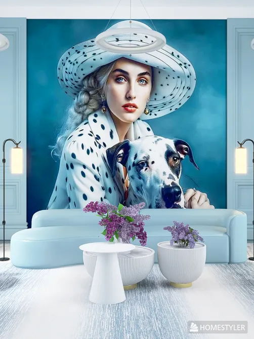
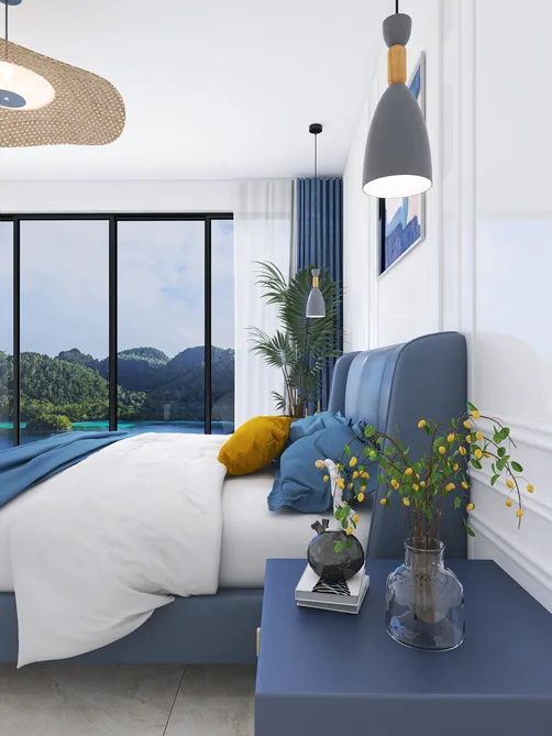
Rirri Turtakova’s 'Soft Glow' masterfully applies Strategic Color Layering in a spacious bedroom. She anchors the space with pale coastal-blue walls (dominant), pairs them with warm-ivory bedding and natural oak bedside tables (mid-tone), and introduces subtle mint-green botanical prints and sea-glass-toned glassware (accent). Using Homestyler AI design tools, she leveraged the 'sea_sky' HDR preset to validate how morning light enhances the cool palette without washing out warmth — a nuanced application of indoor space planning that balances serenity with livability.
Start Free Design🌿 Texture-Driven Thermal Perception
Coolness is felt as much as seen. Introduce tactile contrast using matte, porous, and organic materials: unglazed stoneware, nubby bouclé upholstery, bleached rattan, and linen-wrapped accessories. These absorb light rather than reflect it, reducing glare and enhancing a grounded, tranquil atmosphere. Avoid cold, hard surfaces (e.g., polished concrete floors without rugs) unless softened by layered textiles — crucial for human-centered interior space planning. Homestyler’s material library allows instant swapping of surface finishes to test thermal perception virtually.

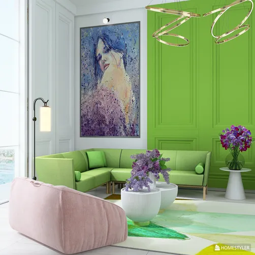
ROBERTA GIULIETTI’s 'Fresh, fresh, Fresh' uses Texture-Driven Thermal Perception to elevate a compact dining area. She pairs matte lavender upholstered chairs (absorbing light, feeling soft) with a honed travertine tabletop (cool-to-touch but not icy) and woven seagrass pendants — all selected via Homestyler’s smart material filter. The result avoids sterility while delivering authentic summer coolness, demonstrating advanced Homestyler design techniques for emotionally intelligent interiors.
Begin Free Decor🌬️ Spatial Breathability & Light Flow
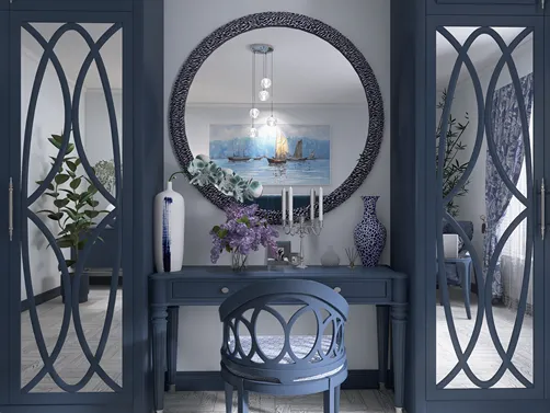
Cool-toned spaces must ‘breathe’. Prioritize visual continuity: use reflective surfaces (e.g., mirrored cabinets, glass-top side tables) to amplify light and perceived volume; minimize visual clutter with concealed storage and floating furniture; and align window treatments with natural light paths (e.g., sheer linen drapes instead of heavy blackout curtains). In narrow layouts, employ vertical lines (tall bookshelves, floor-to-ceiling mirrors) and cool-toned gradients (lighter ceiling → deeper wall → grounding floor) to enhance spatial flow — core principles of efficient indoor space planning.

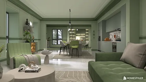
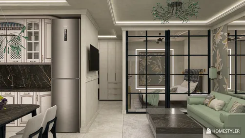
Amy ✨’s 'A Serene Green Haven' exemplifies Spatial Breathability & Light Flow in a 181.96 m² apartment. She uses full-height mirrored closet doors opposite windows to double natural light, selects low-profile emerald-green sofas to maintain sightlines, and arranges built-in shelving as a translucent hallway divider — all planned using Homestyler’s AI-powered smart furniture arrangement. Her design transforms spatial constraints into assets, proving how Homestyler design techniques support holistic indoor space planning for comfort and clarity.
Launch Free LayoutFAQ
Q: Do I need professional design experience to participate in the Cool Color Space contest?
Not at all! Homestyler’s intuitive AI tools — including one-click style transfer, automatic furniture layout, and real-time 3D rendering — empower beginners to explore cool-toned palettes confidently. Focus on intentionality: choose 2–3 harmonizing cool hues and let Homestyler handle proportion and placement.
Q: Can I combine cool colors with warm materials like wood or terracotta?
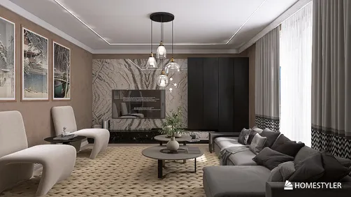
Absolutely — and it’s highly recommended. The contest-winning designs (e.g., Asia Nita’s ‘living room of photografer and crafter’) prove that warm-undertone woods or terracotta accents add depth and prevent sterility. The key is balance: let cool tones dominate 70%, warm elements anchor 30%.
Q: How does Homestyler help me avoid common cool-color mistakes like ‘coldness’ or ‘flatness’?
Homestyler’s lighting simulation (HDR presets like 'g_ljz_day' or 'o_sea_sky') lets you preview how your palette behaves at dawn, noon, or dusk — revealing hidden warmth or unexpected dullness. Its texture library and color harmony assistant also flag clashing undertones before rendering, making indoor space planning both precise and forgiving.

Modern Minimalist Blue Fabric Wood Base Two Seat Sofa 3D Model


Modern Minimalist Royal Blue Velvet L Shaped Sectional Sofa 3D Model

Modern Dark Velvet Curved Sectional Sofa With Throw Pillows 3D Model
Homestyler offers an easy-to-use online home design tool with stunning 3D renderings, inspiring interior projects, and helpful DIY video tutorials. It's perfect for anyone looking to create and visualize beautiful home designs effortlessly.
지금 무료로 디자인하세요