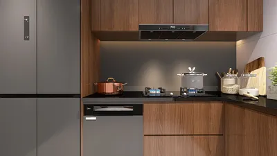


For over ten years, I have been selecting kitchen laminates for residential homes, display apartments, and upscale hospitality projects. Choosing the right laminate can significantly enhance a bustling kitchen, transforming it into a durable and aesthetically pleasing workspace. Beyond just color and texture, I consider how the laminate interacts with light, its resistance to wear and moisture, and how it supports smooth movement within the sink-preparation-cooking triangle. This guide acts as my go-to reference, detailing my favorite pairings of tones and textures, and identifying where laminates are most effective across cabinets, panels, splashbacks, and countertops, often utilizing tools like Homestyler to visualize layouts.
When it comes to kitchen performance, durability and ease of cleaning are paramount. Research indicates that the visual comfort of materials impacts task efficiency; design choices that minimize glare and offer balanced lighting help reduce mistakes and eye strain. According to IES lighting guidelines, general kitchen tasks should have a light intensity of about 300–500 lux, with low glare levels to prevent reflective laminates from creating bright spots. For health and wellness considerations, the WELL v2 Materials standards guide the selection of low-emitting laminate materials and adhesives, crucial for promoting a healthier indoor environment.
The psychology of color plays a critical role in influencing mood and appetite in kitchen design. A neutral base paired with warm accent colors tends to promote comfort and focus, whereas deeper reds can spark energy but might feel overwhelming on larger surfaces. Research shows that warm tones stimulate excitement, while cool shades foster calmness; hence, it’s vital to create a balance by combining warm cabinetry with cooler countertops or the other way around to maintain a visually pleasing balance.
Essential Laminate Varieties I Depend On
High-Pressure Laminate (HPL): This robust material is ideal for doors, drawer fronts, and visible carcass panels thanks to its outstanding durability and resistance to wear. I often choose textured or matte HPL for spaces with intense lighting to minimize reflections. Pairing it with rounded edges can also prevent chipping in family-oriented kitchens.
Compact Laminate: Featuring a sturdy phenolic core, this type can function as a self-supporting panel. It works perfectly for open shelves, waterfall edges, or areas exposed to moisture. Its density allows for sharp edge details, such as beveled or chamfered edges, adding to the sleek profile.
Postforming Laminate: This option is particularly useful for achieving curved edges on countertops or doors, as it minimizes the visibility of seams. I opt for this type when budget constraints are a priority, and the client desires seamless, easy-to-clean edges.
Anti-Fingerprint / Super-Matte: In modern kitchens, low-gloss finishes are often favored for their tactile appeal. These laminates are designed to reduce smudging and provide a soft touch, making them ideal for pantry doors and integrated appliance panels, especially under focused LED lighting.
High-Gloss: This finish is perfect for kitchens with controlled lighting or those benefiting from diffused natural light. For those who love a dramatic reflective finish, balancing it with textured or ribbed surfaces can reduce glare, and it’s wise to avoid glossy finishes in areas prone to splashes.
Matching Finish Families and Their Pairings
Woodgrains: Ranging from light ash and white oak to rich walnut and charred styles, I look for authentic grain patterns that don’t appear repetitive. Woodgrain laminates work best on vertical surfaces—like doors and side panels—anchored with solid color countertops for visual continuity.
Solid Neutrals: Colors like bone, greige, clay, and graphite serve as timeless foundations. In kitchens where tasks are frequent, I steer clear of ultra-white for lower cabinetry, as scuff marks become more apparent; instead, I reserve white for the splash area or upper cabinets.
Stone and Concrete Appearances: Ideal for countertops where real stone may be too costly or difficult to maintain, these laminates with a honed finish present a more authentic look and disguise micro-scratches effectively.
Metallics: Shades such as brushed champagne, gunmetal, or copper make excellent accent pieces or appliance spotlights. I recommend limiting their use to 10–20% of the total surface area to avoid overwhelming the space, while ensuring fingerprint-resistant technology is present on darker metallics.
Light, Glare, and Comfort in Task Lighting
The sheen of laminates can drastically affect a kitchen's visibility. Under-cabinet lighting should provide 300–500 lux at the countertop to clearly define edges and textures, adhering to IES guidelines. I choose matte or low-sheen finishes beneath these fixtures to eliminate direct contrast. For overhead lights, broader beams can soften the glare from glossy surfaces. If you’re strategizing the proportions of cabinet runs and islands, utilizing tools like Homestyler can assist in visualizing luminance on various finishes and addressing potential glare issues before ordering panels.
Ergonomics and Design Proportions
The choice of laminate can either facilitate or hinder workflow. Handles-free designs paired with soft-touch matte finishes work well with push-to-open mechanisms, reducing wrist strain. I ensure the working triangle (sink-prep-cook) remains compact and use moisture-resistant materials, such as compact laminate or HPL with sealed edges, on vertical surfaces near the sink. Lighter upper cabinets create a perception of space; deeper bases ground the room visually. The ideal ratio of 60:30:10 for primary, secondary, and accent finishes maintains both serenity and expressiveness.
Moisture, Heat, and Maintenance
In proximity to dishwashers and stovetops, exposure to steam is a genuine concern. I recommend using edge banding that matches the laminate and effectively seals chipboard cores. For splash zones, laminates are fine with proper backing and minimized seams; otherwise, opt for solid surfaces or compact laminates. Maintenance is key—using a microfiber cloth with pH-neutral cleaners is advisable; avoid abrasives. Anti-fingerprint finishes significantly reduce daily upkeep. In kitchens where heavy cooking occurs, glossy panels should be positioned away from frying stations to prevent unsightly film build-up.
Application of Color Psychology
Warm timber interiors foster an inviting atmosphere for gatherings, while cool greys in countertops promote a sense of calm during meal preparation. Insights from color psychology suggest that blues and greens enhance focus and rejuvenation, which I incorporate modestly through splash areas or upper cabinetry. Should a client desire vibrant colors, I prefer to introduce them through bar stools or small appliance components rather than extensive cabinetry.
Acoustics and Touch Sensations
Given that kitchens can contain many hard surfaces, I find that soft-touch laminates alleviate the harsh auditory sharpness common in open-plan spaces. My approach includes combining textures—ribbed fronts, fabric-covered bar stools, and matte laminates—to manage sound without compromising hygiene.
Sustainability and Material Health Considerations
I request documentation regarding formaldehyde emissions, opting for low-emitting core materials in line with the WELL v2 Materials guidelines. Durable laminates that mitigate the need for frequent replacements contribute to sustainability. Whenever possible, I choose laminates that incorporate FSC-certified sources and select finishes with high reflectance values to reduce dependency on artificial lighting.
Preferred Palette Configurations
Scandinavian Serenity: Pale ash woodgrain cabinetry, ultra-matte bone-colored tall units, soft-grey concrete-inspired countertops, and brushed nickel hardware for a cohesive look.
Urban Simplicity: Matte graphite base cabinets with anti-fingerprint technology, a white solid splash area, compact laminate shelving with black trim, complemented by warm LED under-cabinet lighting.
Warm Contemporary: Walnut woodgrain with a subtle sheen, clay-colored upper cabinetry, honed stone-inspired counters, and champagne metallic accents for sophistication.
Layout Choices that Define Finishing Outcomes
The success of finishes heavily relies on thoughtful layout. Strong sightlines necessitate low-contrast fronts; conversely, compact galley kitchens can support bolder grain patterns. Employ an interior layout planner to visualize cabinet runs, island dimensions, and lighting angles, then overlay laminate samples to assess their appearance from various angles and heights.
Client Checklist for Specifications
- Door and drawer materials: HPL or anti-fingerprint matte; confirm abrasion ratings and warranty details.
- Areas exposed to steam: utilize compact laminate panels or ensure edges are sealed; avoid any visible chipboard.
- Countertop selection: opt for stone-look laminate with a honed texture; verify the use of heat pads near cooking zones.
- Edge banding: ensure color consistency, proper sealing, and rounded finishes for longevity.
- Lighting standards: target 300–500 lux at countertops; use matte finishes under task lighting for optimal visibility.
- Color palette ratio: maintain a 60:30:10 distribution for primary, secondary, and accent colors; trial with full-size samples.
- Hardware requirements: include soft-close hinges, considering push-to-open features where handles are omitted.
- Documentation: demand emission certifications, substrate validation, and maintenance resources.
Frequently Asked Questions
Q1: Can laminates be used for countertops in kitchens that see heavy use?
A1: Absolutely, given the right specifications. Opt for compact or high-grade HPL with a honed finish, and always use trivets to protect against hot pots. Laminates typically have good abrasion resistance, but direct high temperatures can compromise the resin, making heat pads crucial near stovetops.
Q2: What light levels should I install over counters to prevent glare on glossy laminates?
A2: It’s recommended to achieve 300–500 lux on work surfaces with wide-beam or diffused LED lights, following IES guidelines. If glossy finishes are preferred, ensure task lighting is diffused and complement it with matte surfaces to balance reflections.
Q3: What type of laminate finish best hides fingerprints and facilitates cleaning?
A3: Anti-fingerprint super-matte finishes are excellent at concealing smudges and can be easily cleaned with a microfiber cloth. These options are particularly suited for tall units and surfaces that experience frequent contact.
Q4: Are laminates appropriate for use behind sinks as splash zones?
A4: Yes, provided the seams and edges are effectively sealed and the substrate is moisture-resistant. For utmost durability, compact laminate is my preferred selection for areas behind sinks.
Q5: Which colors enhance focus during meal preparation?
A5: Cooler neutrals—soft greys, muted blues, and greens—are ideal for promoting calm and concentration, aligning with insights from color psychology. I combine these with warm wood tones for an inviting kitchen atmosphere.
Q6: How should laminate selections be planned in an open kitchen design?
A6: Keep expansive surfaces in low-sheen neutrals to reduce glare throughout the living space. Incorporate textures—like ribbed or fluted styles—to add depth without creating visual clutter. Utilizing layout simulation tools like Homestyler can help finalize designs before making laminate decisions.
Q7: What cleaning routine will extend the lifespan of laminates?
A7: Regularly clean with a damp microfiber cloth and pH-balanced cleaner. Avoid abrasive materials and solvent-rich products. Adding felt pads inside drawers and employing soft-close mechanisms can minimize impact damage.
Q8: Are there health-related factors to consider when selecting laminates?
A8: It’s essential to ask for low-emission materials and verify VOC documentation. Choosing products consistent with the WELL v2 Materials concept supports better indoor air quality.
Q9: How can metallic laminates be integrated into a residential kitchen design?
A9: They can effectively serve as accent pieces—used for appliance facades, niche backsplashes, or limited door runs. Brushed finishes and anti-fingerprint technology should be prioritized, ensuring they occupy only 10–20% of the visible surface area for perfect visual harmony.
Q10: What is the best method to evaluate finish combinations?
A10: Purchase full-sized samples, view them under your actual lighting at various times of day, and create a mock-up of proportions using a room design visualization tool to assess how edges, grain direction, and sheen play together across cabinetry.
Looking to transform your home? Homestyler is your go-to online platform! With its user-friendly design tool, stunning 3D renderings, inspiring design projects, and helpful video tutorials, you can effortlessly create your dream space—no prior experience needed!
Design Now for FREE
































