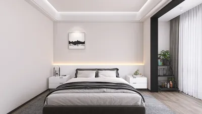



While dark paint is often thought to make spaces feel smaller, it can actually enhance edges, enrich visual depth, and even create a tailored ambiance in compact areas. The results vary based on factors such as lighting, contrast, and surface interactions. In my experience, deep colors have revitalized narrow living rooms and awkwardly shaped bedrooms, resulting in cohesive, intimate settings that feel thoughtfully designed rather than cramped.
Understanding light and human perception provides a clearer picture. The WELL Building Standard recommends ambient lighting levels between 215 and 300 lux for most tasks, with higher requirements in work zones, while the Illuminating Engineering Society suggests about 300 lux for general residential activities and 50-100 lux for circulation space. When these standards are achieved, dark finishes can appear rich and dimensional instead of oppressive. Steelcase research indicates that visual control and environmental consistency help lessen cognitive strain; well-managed contrast can enhance focus and comfort, particularly when glare is reduced and task lighting is thoughtfully layered. For deeper insights on color perception, take a look at Verywell Mind's article on color psychology.
How Dark Colors Impact Space
Dark colors redefine edges. Their lower reflectivity softens boundaries, minimizing visual clutter. In small areas with intricate trims or multiple doorways, deep-walled settings unify the space, allowing furniture and artwork to take center stage. However, when dark walls interact with high-gloss white ceilings or overly bright windows, the contrast can amplify the perception of closeness. Achieving balance is often more crucial than the colors chosen themselves.
Lighting Considerations: Lux, Color Temperature, and Glare
I assess lighting conditions before selecting paint. In living spaces, warm white lighting at 2700–3000K keeps deep hues feeling inviting, while 3500K can introduce sharpness in kitchens or workspaces. Maintain ambient light at about 200–300 lux, with task lighting providing 500 lux on work surfaces, and accent lighting around 150–200 lux for artwork or shelves to create visual hierarchy. The direction of lighting is also key; wall washing helps even out dark surfaces, while shielded fixtures can help prevent bright spots that make adjacent dark areas look more prominent. Guidelines from WELL v2 and IES can serve as helpful benchmarks.
Understanding Spatial Ratios and Visual Equilibrium
Proportion plays a subtle yet significant role in color perception. I often choose to paint three walls in darker shades while keeping one lighter to add depth, or opt for lighter ceilings to maintain an uplifting feel. For spaces with high ceilings, a darker ceiling can provide a sense of grounding; in lower rooms, a lighter ceiling helps keep the atmosphere airy. Baseboards and trim can either match the wall color for a seamless look or contrast to highlight furniture pieces. When dealing with complex layouts, using a room layout tool can effectively help visualize where dark hues should be applied to enhance flow and focus.
Room Layout Tool
Exploring Color Psychology and Desired Ambiance
Colors evoke emotional responses. Deep blues radiate steadiness and contemplation; charcoal creates an elegant, serene environment; and forest greens promote a sense of restoration and nature. Research from Verywell Mind highlights the calming and focusing effects of blues, while greens symbolize balance—key considerations when creating a color palette for spaces like bedrooms, libraries, or creative studios. Combining enveloping darker shades with warm textures—like walnut, wool, and linen—ensures the room remains cozy and inviting.
Considering Human Factors: Behavior, Functions, and Navigation
Rooms are dynamic environments that support various behaviors. Dark paint can clearly delineate spaces by using lighter shades on work surfaces and pathways, while richer colors can designate lounge areas. According to research from Steelcase, environments that minimize visual noise optimize attention; a unified dark color scheme around a workspace can reduce distractions. In family rooms, darker rear walls can effectively anchor the television space, diminishing glare and enhancing contrast.
Balancing Acoustic Comfort with Visual Warmth
The choice of materials affects both auditory and visual experiences. Textured rugs, upholstered panels, and rich drapes can absorb mid- to high-frequency sound, working harmoniously with deeper color schemes. The result is a cozy setting where sound levels are controlled, allowing dark hues to feel purposeful rather than oppressive. In apartments, I frequently recommend using fabric-wrapped panels behind couches to minimize echo and visually enhance the overall space.
Natural Light and Its Impact: Window Orientation and Light Reflection
The orientation of windows is crucial. North-facing rooms with cooler daylight might render some dark hues flat, but warm lighting and richer undertones (like ink blue, olive, or camel) can counterbalance this effect. West-facing spaces receive intense late-afternoon sunlight that may enhance red undertones; using neutral charcoal or deep green shades can stabilize the overall tone. Sheer curtains can help diffuse harsh light and prevent stark contrast between bright openings and dark walls.
When Dark Walls are Appropriate
- Intimate powder rooms where privacy is key.
- Media rooms that require low reflectivity to manage glare.
- Narrow hallways that benefit from visual continuity; painting doors and trims to match the walls reduces visual interruptions.
- Bedrooms aiming for a restful retreat; a darker headboard wall can highlight the bed without making the room feel smaller.
Selecting Materials with Sustainability in Mind
Opting for low-VOC paints helps maintain good indoor air quality. Matte or eggshell finishes can conceal surface imperfections and manage brightness; satin finishes may offer durability but also run the risk of creating bright spots that make dark areas more intense. It's beneficial to pair deeper colors with sustainably sourced woods and eco-friendly textiles, ensuring a balance of visual weight and tactile warmth.
Ceilings, Trim, and the Three-Plane Principle
Consider the three planes: floor, walls, and ceiling. If two planes are painted dark, keep the third lighter to maintain spatial awareness. Dark floors combined with dark walls can create a cozy atmosphere; a light-colored ceiling prevents the feeling of confinement. Conversely, light floors and dark walls evoke a gallery-like ambiance; sufficient vertical lighting (approximately 300 lux) should be maintained to avoid the perception of a tunnel.
Common Challenges and Solutions
- Insufficient lighting: incorporate layers of illumination and wall washing.
- Severe contrast: soften this with medium-tone textiles and artwork.
- Shiny finishes on dark walls: switch to matte to minimize glare.
- Random accent walls: connect them to a purpose (e.g., bed, fireplace, desk) to eliminate visual chaos.
My Design Process
I initiate my process with the lighting strategy and target lux levels, sampling 3-4 undertones on every wall. I evaluate the effect of light during different times of the day and finalize the desired finish. Then, I align furniture contours with the wall hue—using low, sculptural pieces against dark backgrounds and brighter surfaces for work zones. This sequence—light, color, proportion—ensures that dark paint feels like an intentional choice.
Frequently Asked Questions
Is it true that dark paint can unify spaces and lessen visual clutter? Generally, yes. In a well-lit environment, dark hues can create harmony among surfaces, often leading to a calmer and more purposeful atmosphere. Perception relies heavily on factors such as lighting, contrast, and proportions.
What are the recommended lighting levels? Aim for approximately 200–300 lux of ambient light, 500 lux for task areas during reading, and around 150–200 lux for accent lighting. These figures align well with standard IES recommendations for residential settings.
Should ceilings be kept lighter? Typically, yes, to retain vertical openness. In tall spaces, a darker ceiling can help ground the room—be sure to check samples and utilize dimming if needed to prevent a compressed feeling.
What finishes work best? Matte or eggshell options help minimize glare and hide blemishes, while satin finishes provide sturdiness but may create hotspots that exaggerate contrast against darker hues.
How can colder colors be warmed up? Utilize warmer undertones and select lamps that provide light in the 2700–3000K range. Layer different types of lighting to prevent the color from appearing flat or overly cool.
Can dark color schemes improve focus? Definitely. A cohesive dark color scheme around a workspace helps diminish visual distractions. Steelcase research connects environmental consistency with lowered cognitive load.
Do dark finishes reduce glare? Often, yes. Lower reflectivity limits bounced light. Ensure task lights are shielded and position accent illumination away from screens.
What can be done to mitigate harsh contrasts? To balance intense contrasts, keep the ceiling lighter, incorporate warm lighting layers, and choose tonal trim to elongate visual planes. Employ soft textures to balance the overall palette.
Is it advantageous to mix light and dark shades? Absolutely. Maintain vertical illumination close to 300 lux and opt for mid-tone furniture to bridge contrasts. Adding wall-wash lighting can help soften transitions between colors.
Can color influence mood? Yes, indeed. Blues are associated with tranquility and concentration, while greens indicate balance and rejuvenation. Verywell Mind provides accessible insights into these associations to aid in mood planning.
Built on technology originally developed at Autodesk, Homestyler empowers anyone to design beautiful, realistic spaces in minutes. Join over 20+ million registered users (platform data, 2026) who have already discovered a smarter way to plan, visualize, and bring their dream homes to life — all from the comfort of a browser.
Homestyler is your go-to online home design platform, offering a user-friendly design tool and stunning 3D renderings. Unlock your creativity with a vast collection of design projects and DIY video tutorials. Transform your space with ease and inspiration—homestyling has never been more accessible!
立即免费设计



















![[For my dearest Sabrinik 🧡]](https://hs-designs.homestyler.com/production/design/images/3f463715-5ed6-4c49-9346-16d464510aa6/1714085722568.jpg?x-oss-process=image/resize,w_502,m_mfit/format,webp)
