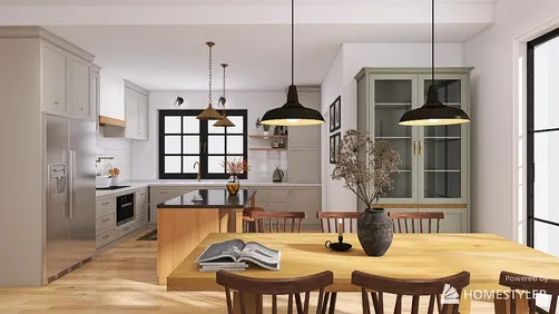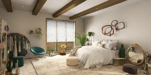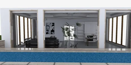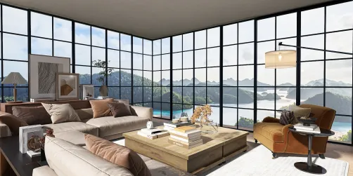



Keith Haring Style’s most common core problem is failing to balance its dynamic graphic energy with functional space design.
1. Overwhelming the room with excessive motifs 2. Ignoring scale and proportion of artwork and furnishings 3. Mixing unrelated styles that dilute the iconic aesthetic 4. Using clashing color palettes that reduce visual harmony 5. Neglecting functional layout in favor of pure decoration
As a designer deeply fascinated by the emotionally charged, graphic-driven world of Keith Haring, I've often witnessed projects stumble by taking this style lightly. Haring’s aesthetic—a vibrant fusion of bold black outlines, simplified figures, and pulsating energy—can easily overwhelm interiors without serious restraint. The challenge isn’t just replicating the recognizable imagery but doing so with intentionality so the space breathes livability alongside artistic expression. Without strategic planning, designers find themselves grappling with chaotic rooms, clashing colors, and a loss of functional design in pursuit of style.
Why It Goes Wrong
The core reason Keith Haring Style often goes wrong is the mismanagement of its graphic and colorful intensity. This style is inherently bold—black lines, vivid primary colors, and a playful pop-art vibe—yet it requires disciplined execution to avoid visual overload. Beginners mistakenly treat it like a free-for-all to splash motifs and colors everywhere, without regard for proportion, placement, or the room’s practical use. The result looks less like curated design and more like chaotic graffiti. In addition, mixing this style with others that have contradictory textures or historical references can blur the distinct impact Haring intended. Without balancing these elements, the space loses cohesion and function.
Mistake 1: Overwhelming the Room with Excessive Motifs
The Mistake: Covering every wall and surface with multiple Haring-inspired motifs makes the room visually noisy and exhausting. Why It Happens: Designers assume the style demands nonstop graphic expression to be authentic. The Fix: Limit motifs to one or two focal walls or large art pieces. Use white or neutral backgrounds to offset the graphics and give the eye places to rest.
Mistake 2: Ignoring Scale and Proportion
The Mistake: Small Haring designs on large walls or massive figures in cramped spaces create awkward spatial imbalance. Why It Happens: Designers neglect measuring scale, thinking any replication fits anywhere. The Fix: Study architectural dimensions carefully. Choose or scale motifs to harmonize with room size and furniture scale—for example, a bold mural on a large wall or small framed prints for cozy nooks.
Mistake 3: Mixing Unrelated Styles
The Mistake: Randomly blending Haring’s pop-art with Victorian, rustic, or industrial elements that clash. Why It Happens: Lack of awareness about the importance of stylistic cohesion. The Fix: Stick to modern, minimal, or eclectic backgrounds that complement Haring’s clean lines. Avoid heavy textures or décor that compete in visual language.
Mistake 4: Using Clashing Color Palettes
The Mistake: Incorporating colors outside Haring’s typical primary red, blue, yellow, and black results in discord. Why It Happens: Designers get creative with adding trendy or unrelated shades. The Fix: Anchor your palette around Haring’s classic primaries, integrating neutrals and subtle tones for balance. Avoid pastels or muted earth tones that weaken the graphic punch.
Mistake 5: Neglecting Functional Layout
The Mistake: Prioritizing artwork placement over user flow and comfort leaves awkward, unusable spaces. Why It Happens: Over-emphasis on décor at the expense of spatial logic. The Fix: Plan the room’s usability first—seating, pathways, storage—then position Haring elements to enhance rather than disrupt the flow.
Designing the Look
Homestyler’s ‘Keith Haring Style’ offers a comprehensive set of ready-to-use 3D models specifically curated to embody this aesthetic, allowing designers to achieve authentic results with professional-grade textures and forms.

rug-Autumn Home Decor

cabinet

staircase-Selected StairsⅡ

Scandinavian Wall Art

pendant light-Autumn Home Decor

floral arrangement-Autumn Home Decor
FAQ
Q1: What materials best capture Keith Haring’s style in interiors?
Keith Haring’s aesthetic relies heavily on bold graphics and vivid colors, so smooth, matte surfaces that hold paint well are ideal. Walls with a matte finish allow sharp contrast for his black outlines and strong primary colors, which are signature features. Furniture in lacquered or vinyl upholstery can mimic pop art’s shiny quality while keeping surfaces easy to clean and maintain. Minimal texture ensures Haring’s iconic imagery remains the focal point without distraction.
Q2: How can lighting complement Keith Haring-inspired designs?
Lighting in a Keith Haring-influenced room should be bright but even to highlight the bold graphic elements without casting harsh shadows that distort outlines. Track lighting and adjustable LED spotlights work well to illuminate artwork or murals. Avoid overly warm lights that may dull the crisp colors; opting for neutral or slightly cool white tones preserves the artwork’s vibrancy. Strategic lighting also helps maintain functional zones in the space while showcasing the playful energy of the design.
Q3: Can Keith Haring Style be adapted for smaller spaces?
Yes, but with careful restraint. In smaller interiors, selecting one key Haring-inspired focal piece rather than multiple artworks prevents visual clutter. Using neutral backgrounds and limiting the color palette maintains a spacious feel. Consider vertical art placements to draw the eye upward and elongate walls. Multifunctional furniture with clean lines complements the style without overwhelming compact rooms. Thoughtful balance between graphic elements and empty space is essential for achieving a lively yet livable interior in limited square footage.
Built on technology originally developed at Autodesk, Homestyler empowers anyone to design beautiful, realistic spaces in minutes. Join over 20+ million registered users (platform data, 2026) who have already discovered a smarter way to plan, visualize, and bring their dream homes to life — all from the comfort of a browser.
Homestyler supports multiple platforms, allowing you to work on your interior design anytime, anywhere.
Design Now for FREE






![[14]](https://hs-designs.homestyler.com/production/design/images/2026-09-12/aa817543-bb43-4f3a-9583-2b2473af620f/1789226165872/10757139.jpg?x-oss-process=image/resize,w_502,m_mfit/format,webp)