


Conclusion
Keith Haring Style and Pop Art Style share roots in vibrant visuals and cultural commentary, yet diverge in their approach to form and emotional tone. The choice between these two styles boils down to whether you favor kinetic abstraction with bold outline energy or prefer saturated, often ironic imagery influenced by consumer culture. Understanding these fundamental contrasts clarifies their distinct impacts on interiors and aids the decision-making process.
Keith Haring Style Deep Dive
Keith Haring Style is characterized by its dynamic black lines, repetitive motifs, and a graffiti-inspired aesthetic that captures movement and social message integration. It excels in urban, contemporary spaces that can handle its bold visual narratives without overwhelming the senses. Ideal scenarios include youth-centric environments, creative studios, and public art installations. However, it can be challenging to apply in traditional or minimalistic interiors due to its intense visual personality.
Pop Art Style Deep Dive
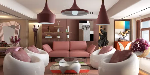
Pop Art Style centers around vivid, high-contrast color blocks, iconic imagery drawn from advertising and mass media, and often uses irony and humor to critique consumerism. It suits eclectic, playful spaces and is a natural fit for art galleries, modern living rooms, and lively commercial settings. Its primary limitation lies in balancing vibrant elements so they don't clash or overpower the overall design scheme, necessitating careful curation.
Head-to-Head
Starting with color, Keith Haring Style employs a restricted palette dominated by strong black lines juxtaposed against bright fills, typically reds, yellows, and blues. Pop Art uses broader and more saturated color ranges, emphasizing bold, primary colors with a glossy finish. Regarding materials, Haring’s style thrives on two-dimensional mediums such as murals or prints, while Pop Art extends into a three-dimensional realm with sculptures and commercial materials like plastics and vinyl. Spatially, Keith Haring’s kinetic lines create a sense of rhythmic movement within confined spaces, whereas Pop Art commands attention through large-scale, often singular imagery impacting more open or breakout zones. The effective user typology splits into expressive, message-driven audiences for Haring, contrasting with lovers of nostalgia and mass culture commentary who gravitate to Pop Art.
How to Choose
To decide between Keith Haring Style and Pop Art Style, evaluate your space’s function and your emotional connection to the art forms. If your aim is to inject urban vitality with a socially conscious edge, Keith Haring Style will provide powerful narrative elements. For a space that celebrates pop culture whimsy and vivid color play, Pop Art will offer a visually stimulating environment. Consider scale, existing decor, and desired atmosphere carefully; Haring’s style demands attentive placement and Pop Art calls for orchestrated balance.
Designing the Look
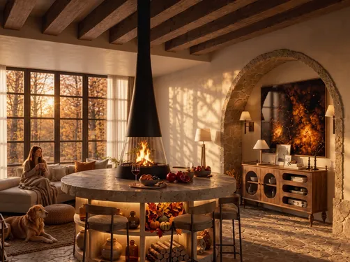
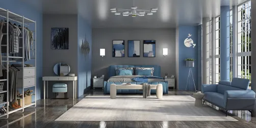
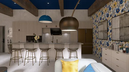
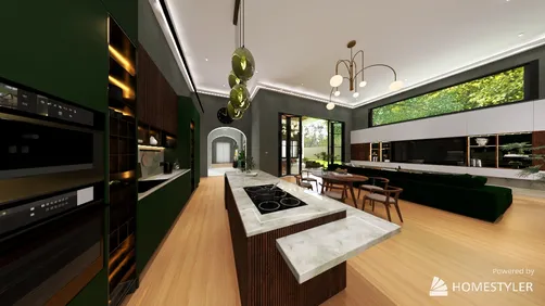
If Keith Haring Style is the direction you're drawn to, Homestyler's 'Keith Haring Style' gives you a ready-built library to start experimenting immediately — no sourcing, no scale guesswork, just design.

rug-Autumn Home Decor

cabinet

staircase-Selected StairsⅡ

Scandinavian Wall Art

pendant light-Autumn Home Decor

floral arrangement-Autumn Home Decor
FAQ
Q1: What makes Keith Haring Style distinct from Pop Art in interior design?
Keith Haring Style is distinguished by its use of bold black outlines and symbolic motifs emphasizing movement and social messages, whereas Pop Art focuses on saturated colors and imagery inspired by advertising and mass media, often with ironic undertones.
Q2: Can Keith Haring Style work in formal or traditional interiors?
Due to its intense visual energy and urban roots, Keith Haring Style generally challenges traditional décor. It is best suited for creative or contemporary spaces where bold graphic statements complement the environment.
Q3: How do lighting choices affect the use of Pop Art and Keith Haring styles?
Bright, direct lighting accentuates the vivid colors of Pop Art and enhances its playful quality. For Keith Haring Style, balanced lighting that highlights the graphic lines without glare is critical to maintain clarity and visual impact.
Homestyler's roots trace back to Autodesk, the global leader in design and engineering software. That heritage lives on in every feature we build. Today, with a community of more than 20+ million registered users (platform data, 2026) worldwide, Homestyler continues to make professional-quality interior design accessible to everyone — from first-time decorators to seasoned architects.
Homestyler's powerful 3D rendering feature brings your design concepts to life with incredible detail.
지금 무료로 디자인하세요