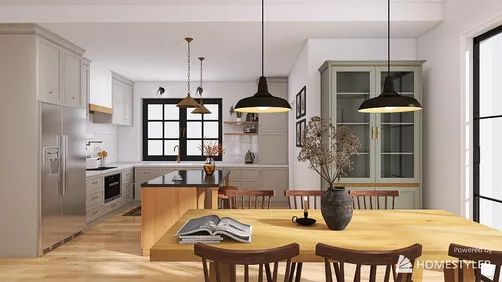
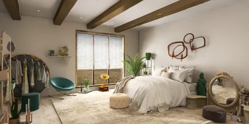
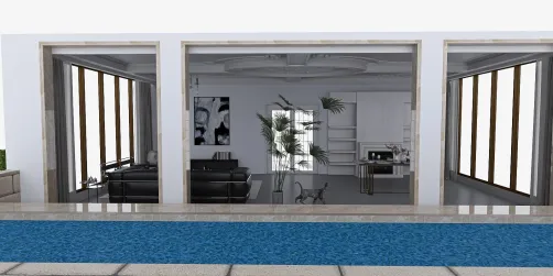
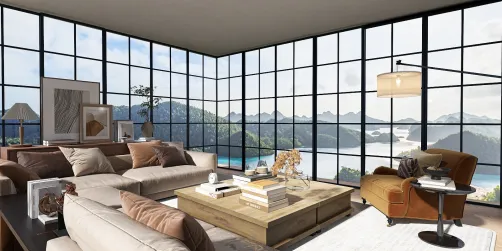
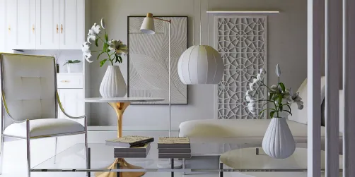
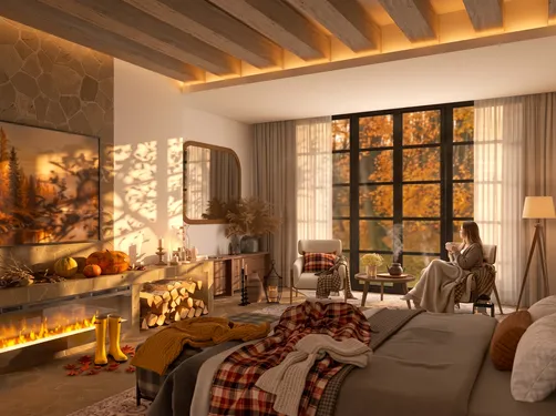
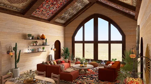
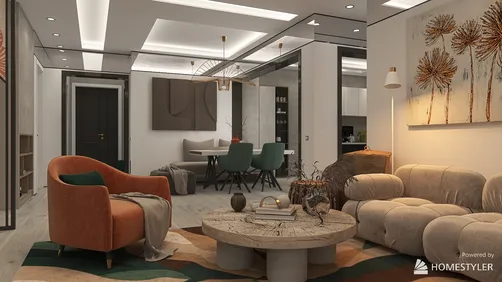
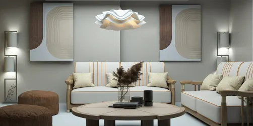
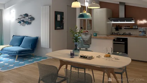
The Keith Haring Style interior design poses a distinctive challenge: harmonizing its iconic boldness and vibrancy with liveable spatial dynamics and functionality. This style is immediately recognizable for its vivid, cartoon-like forms and highly expressive linework, which demands a spatial environment that neither dulls its impact nor overwhelms daily living. The core challenge lies in balancing these eye-catching graphic elements with the room’s structure, circulation, and emotional ambiance without turning the space into visual chaos. Designers must be vigilant with proportion, segmentation of the area, and integration of furniture that respects Haring’s dynamism but avoids competing with it. This pushes the limits of traditional minimalism or conventional maximalist layering; instead the space becomes a gallery in motion—where every surface is a statement and every object a participant in the narrative. The designer’s task is to control this vibrant energy through disciplined placement and rhythm, ensuring the spatial flow supports both function and aesthetic vibrancy. In practice, walls become canvases while the furniture's form and finish need to assert harmony by either contrasting boldly or receding elegantly, depending on placement. Achieving sophisticated balance without diluting Haring’s artistic expression demands strategic staging: opting for quality over quantity in decor, purposeful color blocking to guide movement, and crafted lighting strategies that enliven the vivid graphics while maintaining spatial comfort. This confrontation between expressive art and livable space engineering is the defining tension of designing with the Keith Haring Style, requiring both creative audacity and spatial intelligence.
Step 1: Layout Logic — Spatial Proportion and Furniture Arrangement
Shape and scale coordination is paramount when dealing with the Keith Haring Style's dynamic motifs. Begin by dividing your interior into zones that honor visual hierarchy and user flow rather than cramming graphics indiscriminately. Select furniture with simplistic geometric forms to anchor the focus on the artwork-inspired patterns around them. Low-profile seating, cubic storage units, and open metal frames reduce visual weight yet frame Haring's energetic lines effectively. Arrange furnishings to create clear sightlines to accent walls that showcase signature motifs, ensuring these areas become focal points rather than competing surfaces. Balance is vital — offset large graphic elements with plenty of negative space to avoid sensory overload. Pay particular attention to ceiling height and window scales to accommodate oversized patterns without overcrowding surfaces. Use modular pieces to shape flexible spaces that can adapt, allowing the bold graphic language to breathe. A linear or grid-based layout supports the style’s structural energy by reinforcing rhythm, so position seating and tables in clean rows or angular formations echoing Haring’s signature black outlines. Circulation paths must be unimpeded and intuitive, integrating the energetic style without compromising comfort or functionality.
Step 2: Light and Color — Tone Choices and Lighting Combinations
The vividness typical of the Keith Haring Style demands precise color planning and lighting control to both amplify and ground the space. Begin by considering primary colors as the core palette—reds, yellows, and blues in saturated tones—to replicate the style’s iconic vibrancy. Use these bold hues predominantly on wall art or accent pieces, keeping adjacent surfaces neutral to mitigate over-saturation. Natural light serves as a crucial ally, softening the palette and revealing the texture underneath graphic patterns. Supplement ambient light with track spotlights or adjustable recessed fixtures aimed at highlighted art pieces to enhance their visual punch after dark. Introducing subtle LED strip lighting along furniture legs or baseboards can create floating spatial effects that harmonize with the kinetic energy of the design. Avoid warm yellow illumination which can distort the clarity of Haring’s sharp lines; instead, lean on cooler whites or daylight-balanced LEDs for faithful color rendering. Shadows can be employed creatively as compositional tools to add depth and dimension—arranging fixtures to cast deliberate shapes that complement the stylized forms. The interplay of light and color in this style is more than mere highlight; it becomes a co-creator of mood and visual rhythm, demanding a layered approach that recognizes both functional needs and artistic impact.
Step 3: Accent Decor — Elevating with Smaller Pieces
Small objects and details offer subtle opportunities to amplify the Keith Haring Style without overshadowing its dominant graphics. Look for decor that incorporates repetitive motifs or the signature dancing figures inspired by Haring’s oeuvre, but rendered in three dimensions through sculptural elements or textiles. Structured cushions, ceramics, or wall hangings in black-and-white or primary color schemes provide continuity and texture while reinforcing visual themes. Incorporate playful, abstract forms in accessory materials—think resin, brightly glazed pottery, or molded plastics—that echo the bold contour lines. Opt for low-lying coffee tables or side units with graphic cutouts or painted surfaces that reflect Haring’s shapes, creating a multi-layered spatial narrative. Careful curation is essential; avoid over-cluttering to preserve the clarity and movement fundamental to the style. Functional accents such as lighting fixtures or clocks can take design cues from street art aesthetics, mixing raw industrial materials with bursts of color. Even seemingly random details like patterned rugs or pop art-inspired books help to ground the vibrant energy, working as visual punctuation rather than noise. Thus, small-scale models become integral to the design’s authenticity and tactile experience.
Designing the Look
For designers working in Homestyler, the Keith Haring Style is a practical shortcut to authenticity. It removes the guesswork from sourcing — every piece is pre-matched in scale, material, and proportion to deliver a coherent Keith Haring Style result.

rug-Autumn Home Decor

cabinet

staircase-Selected StairsⅡ

Scandinavian Wall Art

pendant light-Autumn Home Decor

floral arrangement-Autumn Home Decor
FAQ
Q1: How can I prevent the Keith Haring Style’s strong graphics from overwhelming a small room?
A1: To avoid visual overcrowding, introduce ample negative space around graphic elements. Use neutral or muted tones on secondary walls and for furniture to offset bold colors and lines. Consider modular, low-profile furniture that doesn’t compete visually. Avoid placing multiple high-impact artworks in close proximity and distribute visual focal points thoughtfully to allow the design to ‘breathe’.
Q2: What lighting techniques best enhance the vibrancy of Keith Haring-inspired interiors?
A2: Utilize a combination of natural daylight and adjustable cool-white LED spotlights aimed directly at artwork to enhance clarity and saturation of colors. Layer lighting by adding indirect sources such as LED strips under furniture edges or backlighting to add depth. Avoid warm yellow bulbs which can dull the graphic crispness and interfere with accurate color perception.
Q3: Which furniture finishes work best in a Keith Haring Style interior?
A3: Matte or semi-gloss finishes in solid primary colors or stark black and white emphasize the graphic visual language without creating glare. Smooth, uniform surfaces help maintain the style’s clean linework aesthetic. Avoid overly textured or patterned upholstery that might conflict with wall art; instead, lean on color blocking and simple forms to complement the dynamic graphics.
Originally incubated at Autodesk, Homestyler has grown into one of the most widely adopted home design platforms in the world, now trusted by over 20+ million registered users (platform data, 2026). Whether you're a homeowner exploring ideas or a professional designer delivering client-ready renders, Homestyler brings industry-leading 3D technology to your fingertips — no experience required.
Homestyler is a professional interior design software that helps users effortlessly create their dream home.
Zaprojektuj teraz za darmo






![[14]](https://hs-designs.homestyler.com/production/design/images/2026-09-12/aa817543-bb43-4f3a-9583-2b2473af620f/1789226165872/10757139.jpg?x-oss-process=image/resize,w_502,m_mfit/format,webp)