


What is the most common core problem in the Bauhaus aesthetic?
The most common core problem in Bauhaus aesthetic interiors is balancing functionality with minimalistic form without slipping into cold or impersonal spaces.
Quick Takeaways
1. Over-decoration destroys the minimalist clarity. 2. Ignoring proportions disrupts harmony. 3. Mixing incongruent styles causes confusion. 4. Overlooking material authenticity weakens design integrity. 5. Neglecting functional purpose undermines Bauhaus principles.
Introduction
As someone deeply engaged in interior design, I have repeatedly witnessed how Bauhaus aesthetic interiors can easily fall into traps that undermine their core ethos. The temptation to add decorative excess, disregard precise proportions, or blend incompatible elements often strips the style of its purposeful simplicity. Such missteps not only dilute its visual clarity but also its functional intent. This guide aims to reveal these common pitfalls and practical remedies to help retain the Bauhaus spirit authentically.
Why It Goes Wrong
The root cause of failure in applying the Bauhaus aesthetic lies in misunderstanding its foundational emphasis on the unity of form and function. Many attempt either to beautify excessively or to treat furniture and spaces as mere art objects rather than practical tools. This leads to disproportionate elements and style clashes that confuse rather than clarify. The lack of genuine materials or clarity of purpose further distances the space from Bauhaus ideology, resulting in environments which feel either hollow or overcrowded.
Mistake 1 – Over-decoration
The Mistake: Excessive decorative items and embellishments dilute the signature minimalist look. Why It Happens: Many designers conflate minimalism with emptiness, fearing barren spaces and thus overcompensate with ornamental details. The Fix: Limit décor to essentials that have clear functional or structural purpose. Aim for a ratio where 80% of the visible design serves a practical role, reserving 20% for subtle accents.
Mistake 2 – Ignoring Proportions
The Mistake: Furniture or architectural lines that lack precise scaling cause visual disharmony. Why It Happens: A lack of measured planning or rushing selection of elements leads to mismatched sizes and awkward spacing. The Fix: Use precise measurements and scale references before choosing pieces. For example, tables should relate proportionally to seating height, ideally within a 2:3 ratio, to maintain ergonomic and visual balance.
Mistake 3 – Mixing Styles Incongruently
The Mistake: Combining Bauhaus with unrelated stylistic themes results in confused spatial identity. Why It Happens: Enthusiasm for eclecticism or trending styles tempts abandonment of Bauhaus simplicity. The Fix: Identify core Bauhaus features such as geometric forms, primary colors, and tubular steel frames, and restrict additions to complementary elements. Avoid decorative styles like Baroque or ornate Victorian which clash with this aesthetic’s discipline.
Mistake 4 – Overlooking Material Authenticity
The Mistake: Using synthetic or cheap imitations undermines the tactile and visual honesty of the space. Why It Happens: Budget constraints or improper sourcing lead to choosing materials that lack the durability and character Bauhaus demands. The Fix: Prioritize authentic materials such as bent tubular steel, clear glass, and natural wood finishes. Ensure finishes are matte or lightly polished to preserve the raw integrity rather than gloss or plastic look.
Mistake 5 – Neglecting Functionality
The Mistake: Prioritizing form over function betrays Bauhaus philosophy, resulting in impractical spaces. Why It Happens: The visual coolness of geometric designs tempts designers to overlook human ergonomics and usability. The Fix: Every piece, from chairs to lighting, must support its user comfortably and efficiently. Incorporate proven ergonomic standards—for example, seat depth around 16-18 inches and backrests angled between 95° and 105°—to balance aesthetics with physical ease.
Designing the Look
Homestyler’s ‘Bauhaus Aesthetic’ offers a comprehensive set of ready-to-use 3D models specifically curated to embody this aesthetic, allowing designers to achieve authentic results with professional-grade textures and forms.

Modern Leather Brass Metal Lounge Chair with Attached Side Table 3D Model
Modern Minimalist Metal Fabric Folding Armchair 3D Model

Modern Silver Metal Black Shelved Rolling Utility Cart 3D Model

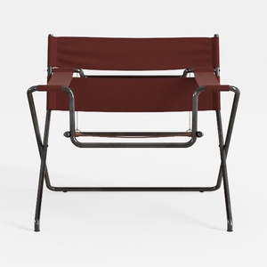
Modern Minimalist Red Leather Metal Armchair 3D Model

Modern Black Leather Upholstered Tufted King Size Bed 3D Model

Modern Walnut White Metal Mobile Storage Cabinet Rolling Sideboard 3D Model
FAQ
Q: How can I effectively balance minimalism and warmth in Bauhaus interiors?
Balancing minimalism and warmth requires careful material and color selection within Bauhaus parameters. Introducing natural wood tones alongside steel or glass elements helps offset the perceived coldness without clutter. Incorporating textiles like woolen throws or simple geometric-patterned cushions in primary shades adds tactility while remaining true to the aesthetic’s core principles.
Q: Are bright colors appropriate in Bauhaus design, or should I keep a monochrome palette?
Bauhaus embraces primary colors—red, blue, yellow—as integral components alongside black, white, and grays. Rather than a purely monochrome palette, use these colors judiciously as deliberate highlights on furnishings or accent pieces. This reinforces the style’s grounding in simplicity combined with artistic boldness.
Q: What lighting styles align best with Bauhaus interiors?
Lighting in Bauhaus spaces should be functional yet sculptural. Look for fixtures with tubular steel frames, simple geometric shapes, and minimal ornamentation. Adjustable desk lamps or pendant lights with matte finishes support tasks while contributing to the design coherence. Avoid overly decorative or ornate lighting that conflicts with the aesthetic’s rationality.
Homestyler's roots trace back to Autodesk, the global leader in design and engineering software. That heritage lives on in every feature we build. Today, with a community of more than 18 million users worldwide, Homestyler continues to make professional-quality interior design accessible to everyone — from first-time decorators to seasoned architects.
Homestyler's powerful 3D rendering feature brings your design concepts to life with incredible detail.
Diseño ahora GRATIS


