


Exploring the BoldColorContest: Diverse Interpretations of Bold Colors
The BoldColorContest challenged designers to move beyond soft tones and fully embrace the power and vibrancy of bold colors. This theme stimulates creativity across a spectrum of design approaches — from striking contrasts to harmonious color blends, from maximalist expressions to subtle focal points.
🎨 Vivid Beach vs. Bold Bedroom: Natural Brightness vs. Dramatic Intensity
In the "Vivid Beach" by maisarh Janabi, the approach uses bright, natural light combined with vibrant ocean-inspired hues to construct an energetic and refreshing atmosphere. The materials and layout evoke openness and lightness. In contrast, "Bold Bedroom" by koji nakahira adopts a more intense, dramatic lighting paired with deep, saturated colors and rich textures to create an intimate, luxurious feeling. This comparison highlights how lighting and material choices define spatial mood even under the umbrella of bold color use.


🌿 Giraffe Love vs. Happiness: Playful Patterns vs. Joyful Simplicity
Create Bold Bedroom StyleKate Charman's "Giraffe Love" creatively employs bold color through playful animal patterns and dynamic layouts, adding a joyful personality and an eye-catching centerpiece to the space. Meanwhile, Rachel Wallen's "Happiness" opts for simpler color combinations and clean lines to evoke uplifting emotions through color balance and subtle elegance. These approaches illustrate distinct ways to energize a space with bold color, from excitement to refined positivity.


💅 Bright and Bold Nail Salon vs. Vivid Beach: Commercial Flair vs. Relaxed Vibe
Craft Joyful SimplicityRuth's "Bright and Bold Nail Salon" reflects a bold color usage that is oriented towards creating a visually stimulating commercial environment with high contrast colors, reflective surfaces, and focused lighting to energize clients. When compared to maisarh Janabi’s "Vivid Beach," the latter evokes a casual, airy home vibe through naturalistic colors and soft light. These distinctions show how bold colors adapt to different functions and emotional goals within spaces.

🎉 Bold Colors Challenge: Try Your Hand and Join Homestyler Weekly Competitions
Explore Vivid Beach DesignsInspired by these diverse interpretations of the BoldColorContest? We invite you to explore different bold color styles in Homestyler, the platform where you can easily experiment with colors, materials, lighting, and layouts in 3D. Join our weekly competitions to showcase your creativity, receive feedback from our vibrant community, and perhaps get featured for your innovative bold designs!
Originally incubated at Autodesk, Homestyler has grown into one of the most widely adopted home design platforms in the world, now trusted by over 20+ million registered users (platform data, 2026). Whether you're a homeowner exploring ideas or a professional designer delivering client-ready renders, Homestyler brings industry-leading 3D technology to your fingertips — no experience required.

Minimalist Red Fabric Hourglass Side Table 3D Model

Solid Wood Walnut Modern Coffee Table With Storage Compartment 3D Model
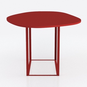

Modern Minimalist Red Metal Irregular Top Coffee Table 3D Model
Homestyler is a user-friendly online home design platform offering powerful 3D rendering tools, inspiring design projects, and easy-to-follow DIY video tutorials. It lets you create and visualize your dream space quickly, making home decorating simple and fun.
Design Now for FREE





