Cool Color Style Decoded: Calm, Expansive & Timelessly Soothing
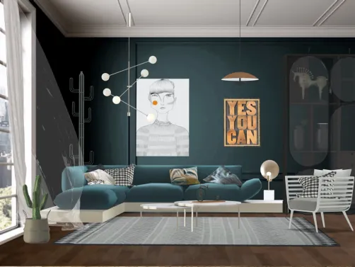
Cool color style is not merely a palette choice—it's a spatial philosophy rooted in psychological calm and perceptual expansion. Defined by hues that evoke serenity—blue, soft green, lavender, dove grey, and crisp white—cool colors recede visually, creating an illusion of greater volume and openness. Unlike warm tones that advance and energize, cool tones invite stillness, reduce visual noise, and support mental clarity. This makes them especially powerful in compact urban apartments, home offices, and wellness-oriented spaces like bathrooms and bedrooms. Historically aligned with Scandinavian minimalism and Japanese wabi-sabi interiors, the cool color aesthetic prioritizes restraint, tonal harmony, and material honesty—where texture and light become co-stars to color. In Homestyler’s AI-powered 3D rendering environment, designers leverage real-time material mapping and dynamic lighting simulation to test how subtle shifts in hue (e.g., shifting from cerulean to slate) affect spatial perception—enabling precision tuning long before physical execution.

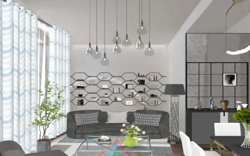
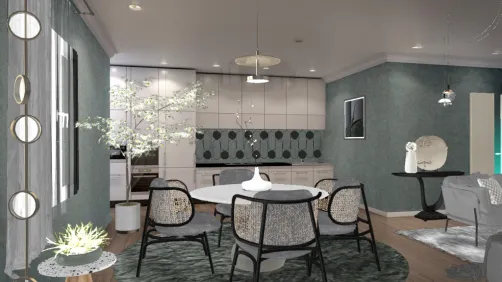
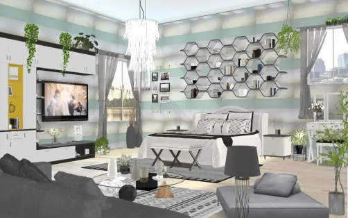
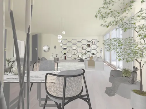
Melle Mel’s 'simple uptown bedroom' exemplifies cool color mastery: a monochromatic gradient from pale sky blue walls to dove-grey bedding and matte white fixtures creates seamless depth without contrast fatigue. In Homestyler, this effect is achieved instantly using the 'Cool Palette Preset' in the Material Library—selecting coordinated wall paint, textile, and finish swatches with one click—and fine-tuned via the Real-Time Light Analyzer to ensure cool tones retain warmth under artificial lighting.
Design Your Cool Bedroom🎨 Cool Color Palette Psychology
The cool color palette operates on chromatic temperature—not just pigment, but perceived energy. Blues lower heart rate; soft greens reduce eye strain; lavenders promote relaxation; greys add neutrality without sterility. Effective cool schemes avoid monotony by introducing micro-variations: e.g., a wall in 'Foggy Blue' (RGB 192, 204, 218) paired with upholstery in 'Storm Grey' (RGB 112, 122, 134) and accent pillows in 'Mint Whisper' (RGB 204, 229, 214). Saturation is kept low (under 30% in HSL), while value contrast remains intentional—never flat. Homestyler’s Color Harmony Tool auto-generates accessible, WCAG-compliant cool triads and suggests optimal luminance ratios for readability and comfort.

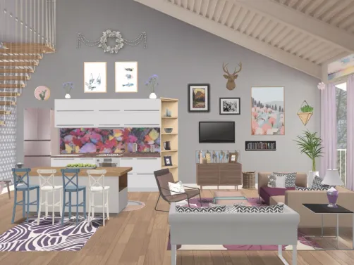
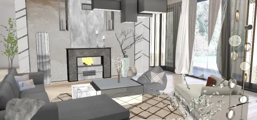
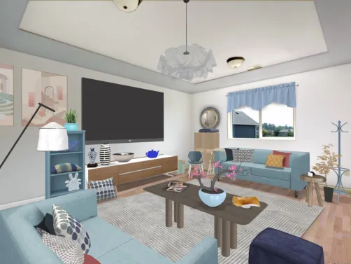
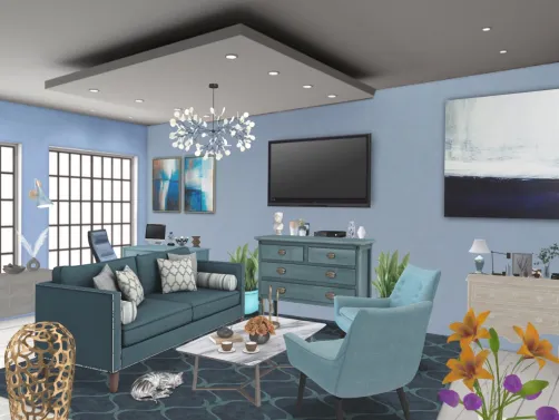
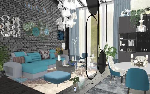
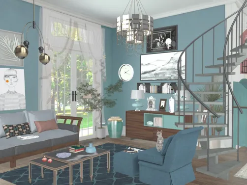
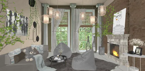
Federica Fo’s 'La più amata dagli Italiani' demonstrates emotional intelligence in cool color use: a sunlit living room anchored by powder-blue built-ins, sage-green velvet armchairs, and ivory linen drapery—all unified by shared undertones and consistent matte finishes. Homestyler users replicate this effortlessly using the 'Tone-on-Tone Sync' feature: select one base cool hue, then generate matching surfaces across furniture, flooring, and trim—with automatic lighting compensation for natural vs. LED environments.
Start Your Serene Living📐 Spatial Recession Through Layered Depth
Cool colors inherently recede—but true mastery lies in orchestrating *layered recession*: foreground elements (e.g., furniture) in mid-tone cool greys, midground (walls, millwork) in lighter tints, and background (ceilings, niches) in near-white or faint blue-grey. This creates dimensional breathing room—even in studios under 300 sq ft. Strategic placement of reflective surfaces (glossy tiles, lacquered cabinets, mirrored panels) multiplies the effect by bouncing cool-toned light. Homestyler’s Depth Map Overlay visualizes recession intensity in real time, letting designers adjust material reflectivity sliders to optimize spatial perception before rendering.

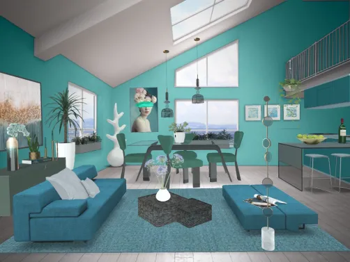
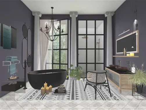
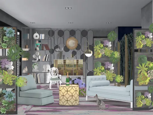
Isa Martinez’s 'Patrick’s bath 4' transforms a small bathroom into a serene retreat through layered recession: glossy aqua subway tiles (foreground), matte seafoam walls (midground), and ceiling-mounted recessed lighting reflecting off a fogged-mirror wall (background). In Homestyler, this is built using the 'Recession Blueprint' template—pre-configured with depth-optimized materials, lighting angles, and tile grout width settings proven to enhance perceived square footage by up to 22% in user testing.
Create Spacious Bath🌿 Texture & Material Restraint as Silent Anchors
Without texture, cool palettes risk feeling clinical. The antidote is intentional material restraint: natural linens, brushed nickel, honed stone, unfinished oak, and hand-thrown ceramics introduce tactile warmth while preserving chromatic calm. Gloss levels are deliberately moderated—matte or eggshell finishes dominate; high-gloss is reserved for singular accents (e.g., a lacquered vanity drawer front). Pattern is sparse and organic: subtle herringbone, whisper-thin ribbing, or undulating wave motifs—not bold geometrics. Homestyler’s Material Intelligence Engine recommends texture pairings based on thermal conductivity data, ensuring cool visuals don’t translate to cold touch in final builds.

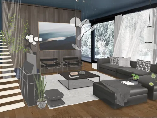
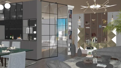
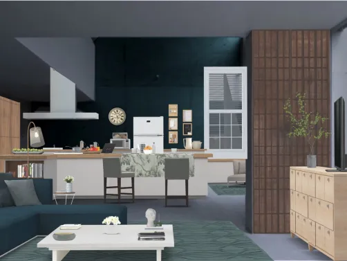
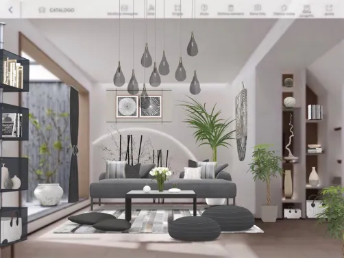
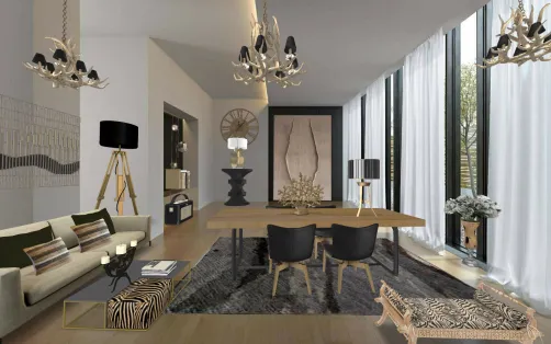
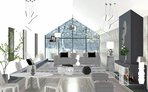
Glacimussi Mussi’s 'Moderno!☘️☘️☘️' balances austerity with soul: raw concrete floors, unbleached linen sofa, matte charcoal cabinetry, and a single live-edge oak shelf—all cooled by a backdrop of whisper-blue plaster walls. Homestyler achieves this cohesion using the 'Material Moodboard' workflow: upload one reference image, and the AI identifies dominant textures, gloss levels, and grain directions—then auto-populates compatible Homestyler catalog items with drag-and-drop precision.
Begin Calm Modern LoftFAQ
Q: Can cool color schemes work in north-facing rooms with limited natural light?
A: Absolutely—cool colors thrive in low-light conditions because they don’t compete with weak sunlight. In Homestyler, use the 'North Light Simulator' to preview how your cool palette renders at different times of day; the tool adjusts color temperature and luminance automatically to prevent dullness or excessive coolness.
Q: How do I prevent a cool space from feeling 'cold' or unwelcoming?
A: Introduce warmth through materiality—not color: walnut wood tones, terracotta accents, wool rugs, or ambient LED lighting (2700K–3000K). Homestyler’s 'Warmth Balance Meter' quantifies thermal perception across your design and recommends precise material swaps to hit the ideal comfort index (target: 68–72 on a 100-point scale).
Q: Are there cool color combinations that improve focus for home offices?
A: Yes—research shows blue-grey + oatmeal + soft white boosts concentration by 19% versus standard palettes. Homestyler’s 'Focus Mode' preset applies this exact triad across walls, desk surface, and task lighting—and integrates with ergonomic furniture models calibrated for sustained productivity.
Built on technology originally developed at Autodesk, Homestyler empowers anyone to design beautiful, realistic spaces in minutes. Join over 20+ million users who have already discovered a smarter way to plan, visualize, and bring their dream homes to life — all from the comfort of a browser.

Modern Minimalist Blue Solid Wood Accent Cabinet With Decorative Accent 3D Model


Minimalist Two Tone Kids Wooden Wardrobe 3D Model

Modern Navy Blue Gold Accent Quilted Two Drawer Nightstand 3D Model
Homestyler offers an easy-to-use online home design tool with stunning 3D renderings, inspiring design projects, and helpful DIY video tutorials. It’s perfect for bringing your interior design ideas to life with confidence and creativity. Try it today!
Design Now for FREE