Cool Color Style Decoded: Calm, Expansive & Timelessly Serene
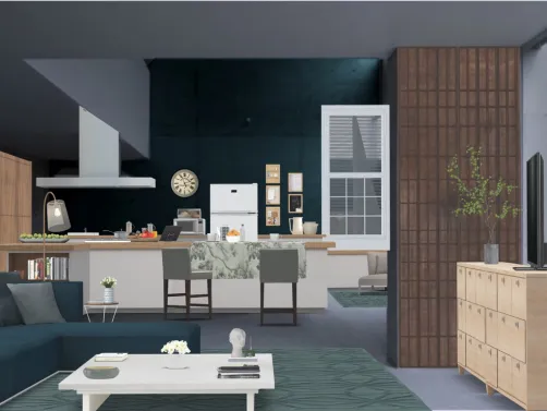
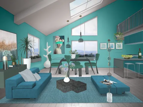
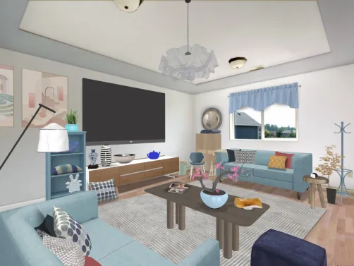
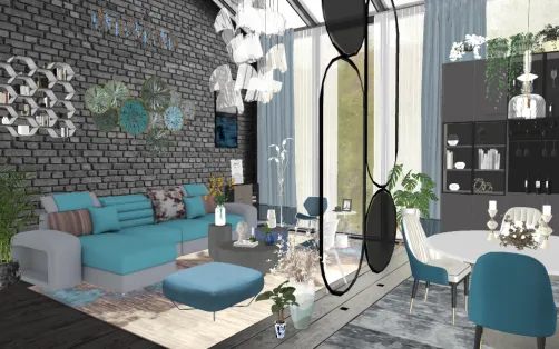
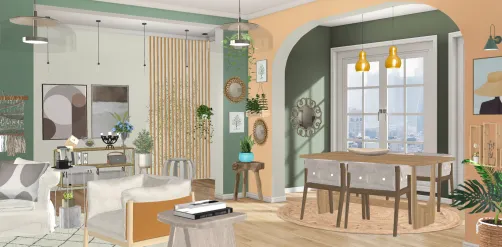
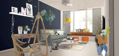
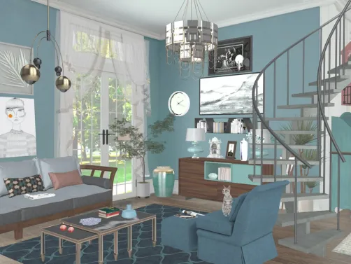
Cool color style isn’t just about choosing blue or grey—it’s a holistic spatial philosophy rooted in psychology, perception, and harmony. As defined by Homestyler’s 2021 CoolColorContest, cool colors—primarily blues, soft greens, light lavenders, and refined neutrals like dove grey and icy white—are inherently calming, visually receding, and spatially expansive. They lower visual temperature, reduce perceived density, and invite tranquility—making them ideal for compact apartments, wellness-focused interiors, or any space where mental clarity and openness are priorities. Unlike warm palettes that advance and energize, cool tones create breathing room, enhance natural light reflection, and support minimalist, biophilic, or Scandinavian-inflected aesthetics—all while maintaining sophistication through tonal nuance and textural layering.

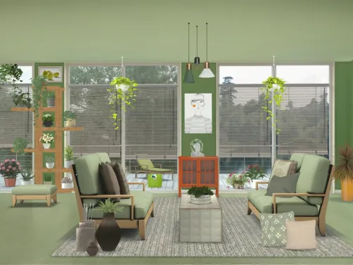
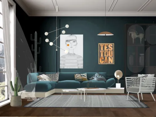
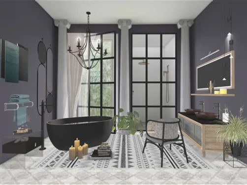
Designed by federica Fo, 'Patrick's bathroom (thanks Karen ☺️🙏)' exemplifies how Homestyler’s 3D rendering engine empowers rapid cool-color execution: with one-click palette presets (e.g., 'Nordic Mist' or 'Aquatic Tranquility'), real-time material swaps (matte ceramic tiles → brushed nickel fixtures → frosted glass partitions), and AI-assisted lighting simulation that enhances cool-tone luminosity without glare. In Homestyler, users simply select the 'Cool Palette Assistant' tool, upload a floorplan, and instantly generate photorealistic variants—all optimized for spatial calm and perceptual spaciousness.
Start Free Design Now🎨 Chromatic Harmony: The Science of Soothing Hues
Cool color palettes rely on low saturation, high value (lightness), and subtle chromatic shifts—not monochrome flatness. Dominant hues sit along the blue-green-purple axis, but true mastery lies in layered tonality: pairing cerulean walls with sage upholstery, misty grey cabinetry with seafoam accents, or lilac-dusted plaster with bleached oak flooring. Crucially, contrast is achieved through texture and depth—not warmth—so matte finishes, linen textiles, and veined stone maintain cohesion while adding dimension. This avoids sterility and cultivates quiet elegance.

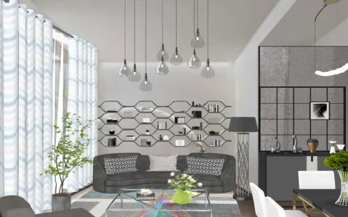
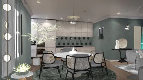
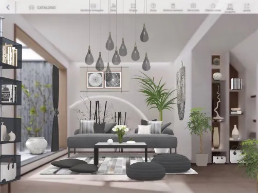
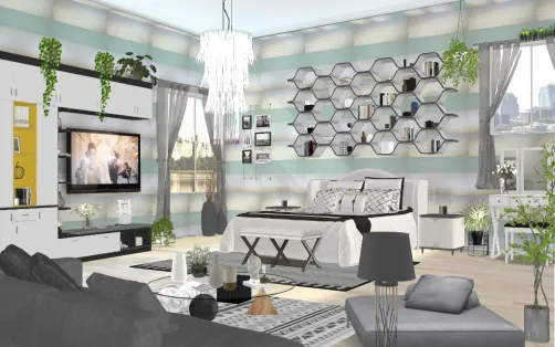
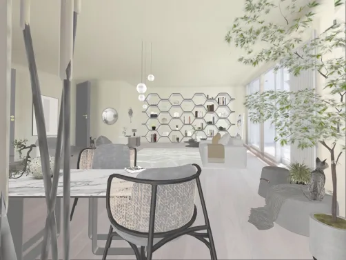
Melle Mel’s 'soft and subtle studio' demonstrates chromatic harmony in action: pale duck-egg walls, whisper-grey modular shelving, and muted eucalyptus green armchairs coexist without hierarchy—each tone calibrated to the same light reflectance value (LRV). In Homestyler, designers achieve this effortlessly using the 'Tonal Lock' feature: select a base hue (e.g., #A0B8C8), then auto-generate harmonizing LRV-matched shades across walls, furniture, and decor—with instant preview under simulated daylight and evening LED settings.
Begin Your Free Studio Design📐 Spatial Recession: How Cool Colors Expand Perception
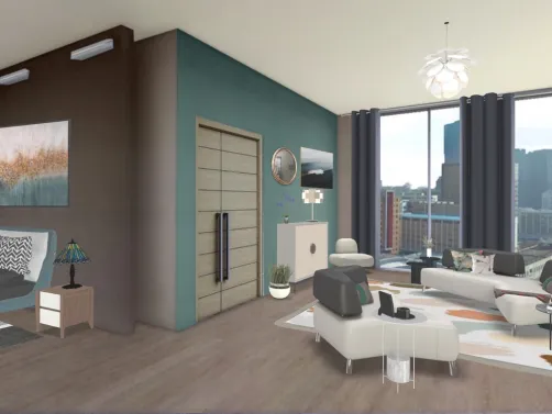
Cool colors optically recede because short-wavelength light scatters more in the eye’s lens, creating a subtle ‘pull-back’ effect. When applied to walls, ceilings, or large surfaces, they push boundaries outward—enhancing perceived square footage and ceiling height. Strategic use includes painting far walls in deeper cool tones (navy, slate) while keeping near planes lighter (cloud white, pearl grey), establishing gentle depth gradients. Mirrors, glossy finishes, and aligned linear elements further amplify this illusion—making even studios feel airy and uncluttered.

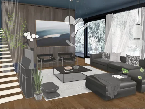
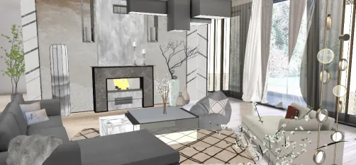
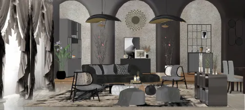
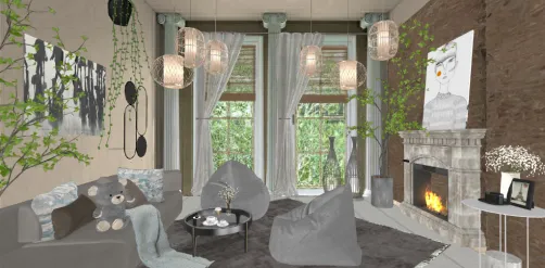
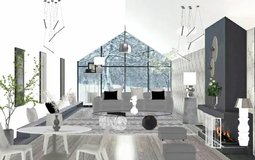
Alita 🌷’s 'A little pace' masterfully leverages spatial recession: cool-toned vertical wall panels visually lift the ceiling, while a gradient from silver-grey floor tiles to pale blue ceiling creates seamless upward flow. In Homestyler, this is achieved in seconds using the 'Depth Mapping' tool—select any surface, apply a cool-tone gradient preset, and watch real-time perspective correction adjust vanishing points and shadow angles to maximize spatial generosity—even in sub-30m² layouts.
Launch Free Spatial Design🌿 Textural Counterpoint: Warmth Without Warmth
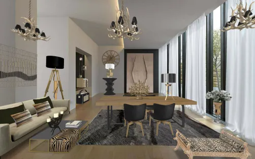
Since cool palettes risk feeling clinical, tactile diversity becomes essential. Think nubby wool throws against smooth lacquered cabinets, rough-hewn timber beams above cool plaster walls, or hammered brass hardware on matte navy cabinetry. These contrasts introduce organic warmth *without* chromatic warmth—preserving the palette’s serenity while grounding it in human-scale authenticity. Natural materials (stone, rattan, linen, clay) are especially effective, as their inherent variation adds life and softness.

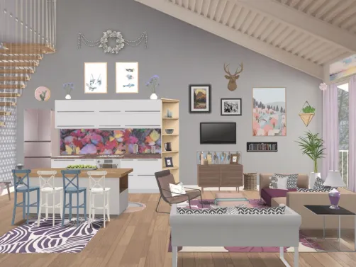
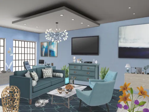
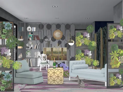
glacimussi Mussi’s 'Divine Purple! ❄️❄️❄️' showcases textural counterpoint at its most evocative: a deep amethyst velvet sofa rests on a raw-edge ash coffee table; matte lavender walls host woven seagrass pendants and hand-thrown ceramic vases. In Homestyler, users drag-and-drop over 2,400 certified cool-tone material assets—from ‘Frosted Glass’ to ‘Linen Weave Canvas’—and apply ‘Texture Sync’ to ensure consistent scale and lighting response across all surfaces, eliminating visual dissonance before rendering.
Create Free Elegant SpaceFAQ
Q: What qualifies as a 'cool color' in interior design?
A: Cool colors are hues with blue, green, or violet undertones—such as sky blue, mint green, lavender, slate grey, and icy white. They evoke calmness, recede visually, and enhance spatial perception. Neutral whites and greys qualify if they lack yellow or pink (warm) bias—opt for 'blue-based' or 'green-based' undertones.
Q: Can cool color schemes work in small or dark rooms?
A: Absolutely—and they’re often ideal. Cool tones reflect light efficiently and create optical expansion. Pair light cool walls with reflective surfaces (gloss tile, mirrored furniture) and layered ambient lighting to maximize brightness and depth—even in windowless spaces.
Q: How does Homestyler help me apply cool color principles accurately?
A: Homestyler offers AI-powered tools like 'Cool Palette Assistant', 'Tonal Lock', and 'Depth Mapping'—all trained on award-winning contest entries (e.g., Top 1–6 from the CoolColorContest). These features auto-adjust LRV, simulate spatial perception, and sync textures—ensuring professional-grade cool-color results in minutes, not days.
Built on technology originally developed at Autodesk, Homestyler empowers anyone to design beautiful, realistic spaces in minutes. Join over 20+ million users who have already discovered a smarter way to plan, visualize, and bring their dream homes to life — all from the comfort of a browser.
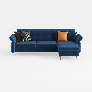
Modern Navy Velvet Tufted L Shaped Sectional Sofa 3D Model
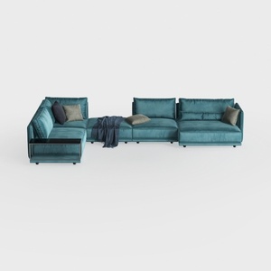

Modern Teal Velvet U Shaped Sectional Sofa with Throw Pillows 3D Model

Minimalist Navy Fabric Modular Sectional Sofa 3D Model
Homestyler offers an easy-to-use online design tool with stunning 3D renderings, inspiring interior projects, and helpful DIY video tutorials. It’s perfect for anyone wanting to create and visualize beautiful home designs effortlessly. Give your space a fresh new look with Homestyler!
立即免费设计