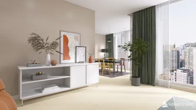


Grey has emerged as a contemporary ally for small kitchens, offering a serene and organized aesthetic that performs well in everyday use. When utilized correctly, a grey color scheme can reduce visual clutter, creating a bright and harmonious space that feels expansive and cohesive without appearing cold. In my recent projects under 120 sq ft, many clients have reported a 10-15% increase in perceived space thanks to carefully managing reflectance, lighting, and sightlines alongside a versatile grey palette. This observation aligns with studies indicating that environments with less visual noise and proper lighting are perceived as more comfortable and functional, following the recommendations set by the IES and the WELL v2 Light concept. By incorporating tools like Homestyler, the design process can easily visualize these changes.
The psychology of color plays a crucial role here. Grey acts as a stabilizing backdrop that alleviates cognitive stress, supported by research revealing how neutral tones influence attention and emotional state. In kitchens designed with balanced neutrals, users often find tasks are completed more swiftly due to fewer visual distractions and improved lighting, corroborating insights from the Interaction Design Foundation. A tranquil kitchen enhances cooking frequency, encourages clearer spaces, and promotes more efficient movement.
Exploring the Grey Spectrum: Warmth, Depth, and Sheen
I begin by categorizing tones within the grey family based on temperature and texture. For small spaces with limited natural light, warm greys (incorporating subtle red or yellow undertones) create an inviting atmosphere. In brighter kitchens, neutral or slightly cooler greys harmonize beautifully with stainless steel or polished nickel accents. I often apply three distinct shades of grey: a light tone for walls and ceilings, a mid-tone for cabinetry, and a darker hue for accents such as toe-kicks or hardware. It’s important to manage sheen effectively: matte finishes on cabinets conceal minor imperfections, while eggshell walls resist scuffs and avoid excessive glare. Using honed or leathered stone for countertops minimizes harsh reflections that can disrupt the flow of smaller kitchens.
Prioritizing Layout: Ensuring Flow and Sightline Efficiencies
Having ample square footage doesn’t determine a kitchen’s functionality; it’s often poor sequencing that hinders efficiency. I view the cooking, prep, and cleaning zones as a compact triangle designed to limit cross-traffic. In galley kitchens, I recommend maintaining a clear space of 42 inches between countertop runs, aligning tall cabinetry on one side to preserve sightliness on the opposite. When experimenting with layouts, I utilize an interior design tool like Homestyler to simulate appliance placements, door swings, and light distribution across work surfaces. Minor adjustments, such as relocating the dishwasher closer to the sink, can significantly reduce unnecessary movements.
Lighting That Functions Beyond Standard White Paint
A brighter kitchen doesn’t always translate to better functionality. I establish a three-tiered lighting plan that comprises high-CRI task lighting beneath cabinets (3000–3500K), dimmable ambient lighting (2700–3000K), and soft accent lights that wash splashbacks or shelves. The IES suggests task illumination be sufficient for visual clarity without causing glare; typically, I target around 300–500 lux on countertops and 150–250 lux for ambient settings, adjusting according to the finish reflectance. In compact kitchens, continuous LED strip lighting under cabinets can eliminate shadows on work areas and elongate the perimeter, while avoiding overly cool tones that may cast a blue hue and wash out skin tones. Warmth and clarity are essential in smaller spaces.
Smart Storage Solutions: Managing Depth and Micro-Zones
Every inch of space counts in a small kitchen. I incorporate full-height pantries with internal drawers, sink bases equipped with tilt trays, and 3-4 inch pull-outs for oils and spices located next to the stove. Investing in smart corner solutions, whether through blind-corner mechanisms or L-shaped nested drawers, proves invaluable. Open shelving in complementary grey or natural wood provides visual order without adding bulk; it’s essential to curate items on display and use a consistent color palette for dishes to ensure visual calm. Inside drawers, thoughtful dividers help keep tools organized and reduce clutter during meal prep.
Material Combinations That Sustain the Essence of Grey
Grey loves texture. I enjoy pairing matte grey cabinetry with rift-cut white oak, fluted glass, or lightly veined quartzite. Scaling down subway tiles to 2x6 with a vertical stack, matched with grout tones that harmonize with cabinetry, adds sophistication. For flooring, large-format porcelain in a soft warm grey with minimal grout lines can elongate a room’s visual perception. Where the budget allows, sleek integrated pulls or simple edge pulls maintain a clean aesthetic. When mixing metals, it’s wise to choose one defining finish (either brushed nickel or soft brass) and apply it consistently across taps, knobs, and lighting fixtures to bolster cohesion.
Ergonomics and Human Factors in Compact Spaces
Comfort enhances functionality. I standardize counter heights at 36 inches, adjusting for the primary user’s height when possible. Handles should have a clearance of 2 inches from adjacent walls to prevent knuckle injuries. Trash, recycling, and compost bins should be positioned on soft-close slides near the prep zone to minimize movements from cutting to disposal. In cases where two people cook simultaneously, I aim to separate the prep sink from the clean-up sink, or at least maintain a clear landing zone of 24-30 inches free from utensils. Such strategies reduce conflict and streamline routines.
Ensuring Acoustic Comfort: The Gentle Grey Principle
Compact kitchens can quickly become noisy. I address echo through soft finishes: fabric Roman shades, textured rugs with non-slip padding, and ceiling baffles if ceiling height allows. Cabinet door dampers and low-sound range hoods are essential. By controlling early reflections, the kitchen feels calmer, allowing grey to present as welcoming rather than sterile.
Appliance Choice: Size, Seamless Integration, and Ventilation
Compact doesn’t mean compromised. I prefer 18-inch dishwashers, 24-30 inch ranges or induction cooktops, and counter-depth refrigerators. Using panel-ready appliances in a matching grey or wooden finish helps them blend seamlessly into the space, allowing light and design lines to flow unobstructed. Honest venting is vital: prioritize an externally vented hood for frequent cooking; if a recirculating vent is necessary, ensure the filter is appropriately over-specified and replaced on schedule. A slim wall oven integrated under the counter maintains visibility and supports a continuous backsplash.
Color Psychology: Balancing Warmth with Accent Hues
Grey serves as an excellent canvas for selective pops of color. Desaturated greens, clay pinks, and camel leather accents introduce warmth without overwhelming visual balance. According to patterns from color psychology highlighted by Verywell Mind, these tones can lower emotional arousal and foster focused calm—perfect for small, task-oriented kitchens. I ensure that color accents occupy around 10-15% of the visual space and are echoed in at least three locations for a cohesive look.
Utilizing Natural Light: Reflectance and Glare Management
Natural light should be embraced thoughtfully, not excessively. Light grey window trims and micro-prismatic diffusers or sheer fabrics can diffuse glare while maintaining brightness. High-reflectance ceilings (LRV 80-90) and light-grey walls (LRV 60-70) help beautifully bounce soft light onto work surfaces without the harsh effects of bright white. If the splashback features a glossy finish, balancing it with matte counters avoids conflicting reflections.
Budget Strategy: Where to Invest and Where to Economize
Focus spending on cabinet boxes (plywood or high-grade particleboard), drawer hardware, task lighting, and durable countertops. Conversely, save on easily replaceable elements such as faucets, pendant lights, stools, and paint. Grey’s versatility accommodates varying budget levels; ultimately, it’s the textures and proportions that enhance the design, rather than brand recognition.
Planning Framework: Mockups and Iterative Design
I use painter’s tape on the floor to visualize clearances and door swings, as well as to identify potential conflicts with appliance handles. To swiftly compare two or three cabinet configurations, I create simplified digital models using an interior layout planner or layout simulation tool like Homestyler. Understanding how a 3-inch filler or a deeper fridge panel impacts overall visual harmony can distinguish between an acceptable and an expertly tailored space.
Grey Kitchen Checklist for Small Spaces
- Select a three-tone grey palette (light, medium, dark) prioritizing matte textures.
- Achieve 300–500 lux on countertops, targeting 2700–3000K for ambient warmth.
- Maintain 42 inches of circulation space wherever possible; align tall cabinetry to one side.
- Opt for slim, panel-ready appliances to streamline the overall look.
- Focus on internal drawer systems and narrow pull-outs for optimal organization.
- Balance textures: matte cabinets paired with honed surfaces and subtle-grain woods.
- Maintain one consistent metal finish throughout the design.
- Attend to acoustics with dampers, soft materials, and low-sound ventilation solutions.
- Create prototypes with tape and utilize digital mockups before finalizing design decisions.
Frequently Asked Questions
For northern light, I opt for warm greys with undertones of beige or taupe to ensure flatter tones for skin and avoid a blue appearance. It’s wise to sample shades in various lighting conditions before making a final choice.
Utilize continuous under-cabinet LED strips to enhance counters by eliminating shadows; incorporate dimmable ambient lighting at 2700–3000K levels. Aim for approximately 300–500 lux on surfaces based on IES standards, and minimize glare with matte finishes.
Mixing temperatures and textures is acceptable. Pair matte grey cabinetry with warm woods, fluted glass, or veined stone, while repeating accent colors sparingly (around 10–15% of the visual field) to elevate the palette without adding chaos.
Efficient designs are found in galley or single-wall layouts with compact work triangles. Positioning tall storage on one side preserves line of sight; confirming clearances digitally with tools like Homestyler is essential before finalizing cabinetry orders.
Both brushed nickel and soft brass are viable; choose one finish and replicate it across fixtures for cohesive visual order. Nickel may present a crisp, cool vibe, while brass adds warmth and contrast.
Introduce soft textures: a washable runner, fabric window treatments, felt pads beneath stools, and cabinet dampers. Invest in a low-sound hood and ensure it’s properly maintained; sound reduction enhances the kitchen’s perceived quality and tranquility.
High gloss tends to amplify glare and attract fingerprints. In tight spaces, I prefer matte or satin finishes on larger areas, using sheen judiciously for small accents or lighting as needed to minimize visual clutter.
Retrofitting existing cabinets with drawers dramatically enhances accessibility. Incorporate 3-4 inch pull-outs next to the hob for oils and spices, and a tilt tray next to the sink for tools. Internal dividers ensure intuitive organization.
Materials like honed white quartz with subtle warm veins, light quartzite, or pale terrazzo work beautifully together. Maintaining soft contrasts contributes to a spacious feel; busy, high-contrast stones are best avoided in confined areas.
Opt for panel-ready appliances whenever possible; if not, ensure handle styles and metals are aligned. Keep consistent reveal gaps and incorporate a tall end panel to seamlessly integrate the refrigerator into cabinetry.
For task lighting, use 3000–3500K settings to ensure accurate food coloring, while 2700–3000K should be used for ambient lighting. Maintain a high CRI (90+) to preserve the integrity of grey hues and wood tones.
Absolutely—limit shelf space to a single short run, coordinating dish colors, and repeating materials from the cabinetry helps keep the look airy and purposeful.
Homestyler is your go-to online home design platform! With its user-friendly design tool, stunning 3D renderings, and a wealth of design projects and DIY video tutorials, you'll effortlessly transform your home into a dream space. Start creating today!
Design Now for FREE
































